“What separates design from art is that design is meant to be… functional.” ― Cameron Moll
The mobile industry has developed by leaps and bounds in the last decade. This has led many web developers to seek shelter in the sector of mobile design. Mobile devices are an inseparable part of our lives now and mobile web browsing has gained great eminence. Having multiple versions of a site, under multiple URLs, to accommodate all of the different mobile devices is the need of the hour.
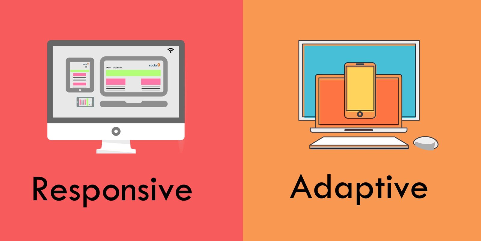
The challenge that every web and app designer now faces is to cater to the variation in screen sizes. From a 52 inch LED to a wrist watch, internet is accessible from all sources and they have to adapt a design approach that is accessible through every available source. Now in order to assist in the same the designers have two options of designs to choose from adaptive or responsive. Which one to choose? Which one is best suited to your site needs, budgets, and goals? Let’s find out. But before delving into which one is better, let us first try and understand each of them individually.
What is An Adaptive Design?
Also known as progressive enhancement of a website, it is centred on usage of distinct multiple fixed layout sizes. When the site detects the available space, it selects the layout most appropriate for the screen. Therefore, when you open a browser on the desktop, the site chooses the best layout for that desktop screen; resizing the browser has no impact on the design.
Basically, you’ll need to create different layouts, one for each screen size. In adaptive design, it’s normal to develop six designs for the six most common screen widths; 320, 480, 760, 960, 1200, and 1600 pixels. For example, there could be a specific layout for mobile phones, tablets, and desktop computers – each of which are made in advance. These three designs wait on standby until someone visits the site. The site detects the type of device used, and delivers the pre-set layout for that device. Who’s leveraging this approach? Amazon, USA Today, Apple, and About.com have been quick to embrace adaptive design. Why use adaptive?
“Adaptive layouts adapt to the width of the browser only at specific breakpoints.” – Geoff Graham
Adaptive is useful for making an existing site more mobile friendly. This helps you to design and develop for specific, multiple viewports. The choice of viewport depends upon you, your company or budget. However, you have a certain amount of control over the content and layout which you won’t have in responsive web design. Let us list down some advantages and drawbacks of using adaptive web design.
Advantages
1. It helps you to design different layouts for different screen resolutions instead of one single layout, which has to be shrunk or spanned to fit different screen resolutions.
2. It is a modern and user-centric approach to web design.
3. You’re not creating the “best”, but the “best for each” one of the devices that your users will be accessing to open your website.
4. Websites using adaptive designs are faster than the ones using responsive.
5. Coding an adaptive design is more time-efficient.
6 Implementing a website design is more cost-effective.
7.Managing it is also easier since you have to design 6 layouts catering to six different dimensions.
8.Testing of a website which is using adaptive design is easier as compared to the one using responsive. Also , it increases the probability of getting accurate results.
Drawbacks
1. This design is less flexible. They only work on as many screens as its layouts are able to. So if a new device with a new screen size is released, you may find out that none of your adaptive layouts fit with it well.
2. It usually requires more work. One has to design six different layouts for different screen size widths.
3. Tablets and notebook users are left stranded when it comes to adaptive design because it is desktop or smartphone focused.
4. Search engines have the ability to spot and impose fines on websites displaying identical content. This in return impacts the websites’ SEO strategy.
5. Modification of adaptive sites is also more complex since it’s likely you’ll have to ensure that everything is still working sitewide when it’s time for implementation.
Why use responsive?
“Responsive layouts adapt to the browsers’ width at any given moment in time.” – Geoff Graham
The changes in browser width by adjusting the placement of design help the elements to fit in the available space. The layout is ‘fluid’ and uses CSS media to change styles. This ‘fluid’ grid enables the page to resize its width and height to adapt to different screen sizes. You will be designing with all layouts in mind and your focus should be on creating a viewport for mid-resolution. You can adjust for low and high resolutions later on.
Advantages
1. Even though it does not give as much control as adaptive design but it is easier to set-up and its implementation is less time-consuming than adaptive design.
2. It helps to instill a sense of familiarity among the users because it seamlessly formulates the same design on all available devices.
3. Responsive sites load faster. All those extra layouts in the adaptive design take extra time and hence it loads slower than its counterpart.
4. It is more flexible as all “sizes” can fit into it. Be it a monitor or a tablet, responsive ‘responds’ to each of those.
5. Since there is no duplicity here, so it is SEO- friendly.
6. It’s collection of affordable templates is particularly suitable for brand new websites and content management systems.
7. Responsive web designs do not demand redirection to switch between desktop and mobile site.
8. The cost of maintaining it is also lower as compared to adaptive design.
Drawbacks
1. Responsive requires more effort in the process of coding in order to ensure that the site fits each and every screen that accesses it. It requires extra attention to the site’s CSS and organization to make sure it functions well at any possible size.
2. Responsive design offers less control over the screen size design.
3. The download time increases when accessing this through mobile.
4. There is no possibility to fine tune the advertisements showing up on your website.
5. When the design readjusts itself to the screen’s width, there are chances of scattering of elements displayed on the screen.
Our Take On This…
Well, the bottom line is that both responsive and adaptive web design are the same in the way that they are methods for dealing with the reality that websites are often viewed on different devices in different contexts. They just happen to go about it in their own ways. The web designers at Orange County understand that the key here is to understand your audience first and then choose what design technique to adopt. When you understand your audience and the devices they use to gain access to your website, it becomes easier to design.
It will also depend on whether one has to work on an already existing site or start from the level.
However, responsive design is the “traditional” option and remains the more popular approach because of the following reasons:
1. It allows consistency between what a site shows on a desktop and what it shows on a handheld device.
2. It is almost always the safer option to go with for your site. It is a more suitable option for the long run as it will keep adapting itself to the emerging screen sizes.
3. Unlike adaptive design, where one has to design everything from scratch for every display, responsive design offers more flexibility.
So, the ball is in your court now. You can choose whatever suits you and your business best. The End!


