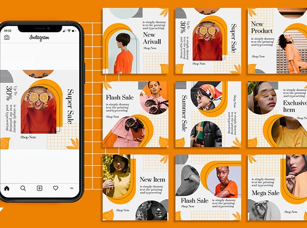
We at Urban Geko deal with all aspects of graphic and web design; everything from ease of usability to SEO website design to visual hierarchy. One subject that our team of design professionals is especially skilled at is typography; something that can often be misused in everyday advertisements. Not sure what typography is? Watch this short video introduction by the Vancouver Film School:
As you can see several elements are utilized in the creation and use of typography: kearning, leading, serifs, san-serifs etc. (A good way to remember the difference between serif and san-serif is to know that “sans” means without.) To expand your typographic knowledge here are few rules to live by when you sit down to design:
Medium
Determine the medium on which you are using for your design. What looks good in print does not always look the best on a computer screen. For example, if you are designing for the web, you want to make sure you use a web-friendly font.
Typeface
Good typography communicates to the viewer effectively and efficiently. If you choose a typeface that does not fit what you are trying to get across, consider your design useless. The first question you should ask yourself is what are you trying to say in your design. You want your typeface to be appropriate to the message so that the viewer can visually see what you are typing. Think about the mood of your piece or the emotional response you want them to feel.
Another element when deciding on a typeface is to consider who your audience is and whether or not that typeface will be appropriate. If you were designing a piece for a corporate professional company you would most likely not use the same typeface in a piece for a local rock band.
When deciding on a font to use, experiment with a few different typefaces but remember to keep it simple and do not overwhelm your viewer. Rule of thumb is do not use too many typefaces together. It is best to stick with one font family.
Purpose
Different typefaces have different purposes so it is important to determine what it is that you want your type to do or say. Make sure to use a font that fits the audience you are trying to reach.
Readability
The type you use needs to be easy to read. Increasing the leading, or space between lines is an easy way to help readability. Another way to help is to increase the tracking, or space between a group of letters. You also want to consider the font color. It is best to use contrasting colors to make the font stand out from the background.
Narrow your selection
You can spend hours going back and forth between hundreds of fonts, but if you narrow your selection you will save yourself lots of time.
Limit the number of typefaces
An important rule of thumb is to remember to not use more than two typefaces. If you have to use more than one typeface, it is best to use one serif and one San-serif. Adding too many typefaces can make your design look cluttered and disorganized.
Don’t leave widows and orphans bereft on a page
Widow: When a paragraph leaves fewer than seven characters on the last line.
Orphan: When the last line of a paragraph won’t fit at the bottom of a column and must end itself at the top of the next column.
- These elements are not only visually unappealing, but it also makes it more difficult in the readers’ mind to process. Like this.
Make only one space between sentences
Use only one space after periods, colons, exclamation points, question marks etc. Forget what they taught you about double spacing in school.
Dashes
Don’t substitute a hyphen for a dash. Hyphens are fine for word continuation (which should be avoided if possible as well), dashes should denote a break in the sentence – just like that.
Hypen: –
Dash: –
Avoid Underlining
Use italics instead of underlining. It appears more professional for noting the names books, movies, magazines and newspapers. It’s also best to italicize the space before an italicized word.
Kerning
Adjust the spacing between letters according to your visual perception– optical kerning. A great trick for perfect kerning: turn the letters upside down so that your brain is not distracted by your ability to read the word. By turning the letters upside down you will be able to identify the negative space between each letter to make sure it is perfectly kerned.
Tabs and Indents
Use tabs and first-line indents properly. The space bar should never be used to align text.
Paragraph Distinction
If you chose to indent the first line of a paragraph don’t add a space between paragraphs too. It needs to be one or the other.
Leading
Keep your line spacing consistent. It’s best to tighten up the leading for text that has all caps or few ascenders and descenders.
Serif & Sans Serif
Serif type is more readable for body text while sans–serif type is more legible and is best used for headlines.
Questions? Contact our Experts!
The selection of the right typeface can significantly influence the aesthetics and ambience of your website design. Yet, with numerous elements to consider, the process can often feel overwhelming. But don’t worry, that’s where Urban Geko steps in! Our team has not only identified exceptional examples but also assembled a collection of handy tips to guide you in selecting the perfect typeface for your design.
Reach out to Urban Geko Design now and let us help you select the ideal typeface to enhance your website and make it truly stand out. Harness the power of typography with us today!


