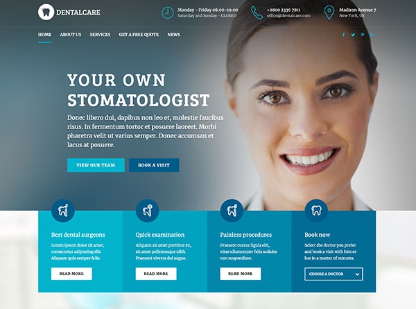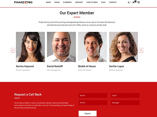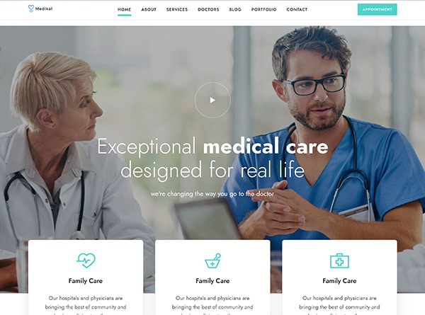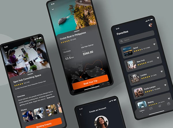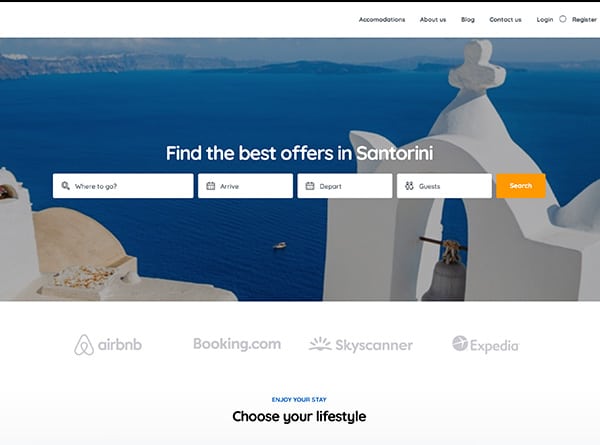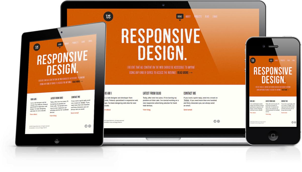
For the ones who are ignorant or unfamiliar with the term responsive websites, they are websites that are compatible across all devices from a huge desktop monitor down to a tablet or smartphone. They provide a seamless viewing experience for users of different devices. Many people use more than one device to view online content on any given day. They may look at a website on a computer at work and then return later on a smartphone. But they expect to be able to see all of the same content no matter what devices they happen to be using.
A responsive website delivers the best user-experience across all devices. Having a responsive web design can also prepare you for technological changes in the future. New devices with different screen sizes will be introduced and a website with responsive web design can adapt easily to the expected changes.
Google and Responsive Websites
Google is built for users. It is for the millions who are searching on the web. And Google is the most used search engine today. Users are accessing Google through various mediums, from a mobile phone to a laptop. Google will obviously act accordingly and favor those sites that meet the needs of the Google users. Google encourages responsive web design because it makes things easier for Google and improves the user experience. If there is only one version of a website, Google will only need to crawl and index one site.
Having a responsive design makes it easier for users to find and share content across devices, resulting in a good user experience. The designers at Orange County Website Design are renowned for creating mobile responsive websites for your smartphone or tablet. Now the question that arises is that do responsive websites really attract traffic? If yes, then how do they do that? Let me list down 10 ways in which responsive websites succeed in getting high traffic.
1.Faster Page Speed
Google, over the years, has stated that fast-loading sites are favored in search results. This is one of the reasons why Google recommends responsive websites. Responsive websites will adapt to the screen of the device and load faster providing a better user experience. Hence every website should be optimized to load as quickly as possible as page loading times is an important factor that is considered while giving ranking in search engine results.
2.Lower Bounce Rate
Users hate it when a particular website is slow and difficult to use. Users look for websites that are easy and quick in responding. If your website does not adapt to the user’s device and the page loading speed decreases then the user will definitely go back and look for more responsive websites. Faster sites that are easier to use will encourage visitors to use your site. A responsive website, therefore, will reduce the bounce rate with fast loading and easy to use navigation.
3. Preferred For Seo
Google and the other search engines show preferences for responsive websites. Keyword performance can help you create a responsive website that will help your business improve your SEO and increase conversions. In order to improve their search results for mobile users, Google is now going to change their algorithm so that the results of the responsive websites appear higher in the search engine results.
4. Less Duplicate Content
It is a hard task to get noticed online. But if you have good SEO then it is possible to increase traffic on your website. The ones who have designed separate mobile sites have to face duplicate content issues because having a separate website for mobile requires a separate URL. The content on the mobile and the desktop site remains the same but the URLs are different. This hampers the Google search rankings and hence you fail to attract traffic to your website. A responsive website provides you with a single URL irrespective of the device and thereby focusing your SEO on a single site.
5. Convert Mobile Traffic
Presently there is a major shift from desktop preference to mobile. More and more consumers are browsing online using mobile devices instead of desktops. Maximum number of people, nowadays, uses the internet on their smartphones or tablets. People like to visit websites that are quick and responsive. Hence, maximum traffic can be directed through mobile phones to your website. If your website is not responsive and cannot adapt itself to changing devices quickly then your bounce rate will be high and conversions will be low. If it is responsive, users will be able to scroll through your website quickly, thereby increasing traffic and online purchases and enquiries.
6. Optimized Marketing Strategies
The most important required element to achieve the goal of any enterprise is a good marketing strategy. Every business aims to earn as many customers from the target audience as possible. Responsive websites help in fulfilling this agenda as they tend to work smoothly in a variety of media and device types – desktops, tablets, smartphones etc. Thus, your website can be accessed by a larger audience which in turn will increase traffic on your website and attract more potential customers.
7. Enhance User Experience
Remember the time when you are searching for a certain topic and you finally think you have found it. But as soon as you open the link it reads- Go To Full Site. So frustrating, right? Fortunately with responsive websites there has been a change. Now there is no redirection, no awkward page or site renditions which appear different on the different platforms or may not load properly in many cases, and no duplicate content either. There is a website with the same appearance and works equally well on all available devices. This helps in improving the user experience and attracts more traffic to your website leading to increase in conversions.
8. Improved Conversion Rates
As discussed in the previous point, responsive website enhances user experience. Hence by providing a seamless user experience, the chances of increasing conversion rates is higher. This is possible because your website reaches a larger audience now. For example, a mobile responsive site doesn’t need redirection, which in turn increases load times. This means that a user searching for a product or service on your website will find it easily and faster and thereby increase the chances of making a purchase.
9. Boost Social Sharing
Responsive websites work on making the life of the most dominant group online- the smartphone or tablet users. They try to make social sharing easier for this section of internet users. Although social sharing won’t have a direct impact on your rankings, it will help in the growth of an audience for your website. A bigger audience will imply increased traffic and your brand will be searched more. This will for sure attract Google’s attention to your site. A website, on the other hand, not designed to work smoothly with the various devices will have a difficult time garnering an audience and convincing them to try social sharing on desktops or other devices.
10. Stay Relevant
Last and the most important point is to keep up with the changing time. If you fail to update your website to the latest responsive trends, you will not only lose a section of your visitors, but will also miss out on the chance to get new ones from various other platforms. By employing the latest technology for designing your site, you not only enhance the user experience but also your website looks great when displayed across all platforms. This will increase your traffic and lower the bounce rates.
Other Ways Responsive Websites Help Generate High Traffic
Everyone on the Internet is in a rush. Whether they’re browsing on a computer or a mobile phone, visitors to your site expect content to appear at lightning speeds. Hence the need for websites which render well on a variety of devices and window or screen sizes. When your website receives thousands of visitors every day, the underlying infrastructure must be able to support the traffic.
High traffic means a large number of simultaneous requests from users expecting fast load times. Delays can cost you visitors, reduce revenue and undermine your reputation. Therefore the websites have to create a design which can handle high traffic and be responsive in order to cater to a larger clientele.
But the question is how does responsive web design work? Responsive sites use fluid grids. All page elements are sized by proportion, rather than pixels. So if you have three columns, you wouldn’t say exactly how wide each should be, but rather how wide they should be in relation to the other columns. Responsive web design is not without its technical challenges. Some of the biggest stumbling blocks include:
Content
Do people looking for a certain material on a mobile want the same thing as those using the full site on a desktop? How will the content served differ between devices?
Asset management
Large images and other media can be scaled down to fit smaller devices, but how do we combat the page bloat and slow site speed that this can create?
Pixel density
How do web developers produce content that looks just as good on large desktop displays as it does on small devices with different pixel densities?
Testing
How can we test a responsive web design website on all of the different devices on which it might be accessed? All of these challenges all boil down to one thing: Different devices. This is the area a responsive website aims to conquer. In order to achieve that there are certain factors that you need to take into account for generating the best possible user experience. Taking a smart approach to high traffic website maintenance cuts down on the load from a large number of visitors and ensures peak performance from your site.
For e-commerce websites, losses are reflected in low revenue and less trust between consumers and brands. If you’re selling products and services but slow load times are driving potential customers away, you could be missing out on a lot of business.
The same is true for any form of revenue you bring in from your high traffic site. Slow speeds and the resulting drop in visitor engagement means fewer people clicking on ads and making purchases through affiliated links. Credibility suffers when user experience is poor.
Be a Good ‘Host’
An appropriate hosting plan is required to manage high traffic. A shared hosting plan is not something you can rely upon when your site grows bigger. You need something more reliable.
Upgrade! You need to have a plan that has the bandwidth to handle high traffic. The host can penalize your site if it uses more than its allotted share of server capacity daily.
The best host for your site is one with the ability to handle the highest number of visitors you expect to receive and still deliver superior results. Opt for plans with adequate RAM and bandwidth, and check the average page load speed to determine if it’s fast enough.
Simplicity Is the Key To Perfection
Pages with a great deal of scripts or media are more likely to be slow to load. The easiest way to make your websites responsive is by making the page designs simpler. However, for sites requiring images, scripts, videos and other dynamic content, you’ll have to take the following steps to ensure good performance:
1. Clean up scripts to remove unnecessary characters
2 Use an image optimizer when uploading media
3. Set specific image dimensions for display
4. Combine all CSS into one file
5. Upload images at their intended display size rather than resizing large images
6. Use “lazy loading” to load media on demand rather than all at once
7. Minimize plugin use or choose lightweight plugins on CMS platforms
8. Avoid using redirects whenever possible
9. Find and fix broken or dead links
Note: Keep mobile users in mind as you implement these design improvements. Page loading speed matters even more for mobile visitors as they’re not going to wait for a media-heavy site to load when they could go elsewhere to find what they need.
CDN
CDN refers to Content Delivery Network, a collection of servers that are spread around the world and used to optimize content delivery for local visitors. Using CDN is another approach that high traffic websites can take. A CDN caches static files across multiple servers and delivers them from the location closest to each visitor to eliminate as much lag time as possible.
Choosing the right CDN is a good idea if your site hosts content or media with a frequent number of viewings. The reduced latency decreases page load times to give users the content they want as quickly as possible.
Zip Up!
To be a responsive website you need to cut down on your content delivery time. File compression is another useful tool for this purpose. Many high traffic websites and top website builders like WordPress.org, WordPress.com, Go Daddy enable compressors like Gzip compression, CSS compressor, Google Closure Compiler etc to reduce file sizes during retrieval and delivery.
Gzip, for example, works by searching for duplicate strings within a file and then replacing the second string with a pointer to the previous string. this method can reduce file sizes by 70 percent, resulting in a significant increase in load speeds.
Google Will Love You!
When your responsive website is up and running, it brings in a lot of benefits not only for the users but it has plenty of SEO benefits too.
Google loves responsive web design!
Why?
• A responsive design’s single code base and single URL structure means no content duplication issues
• This means that there is only one set of pages for indexation. Thereby, improving crawling efficiency
• There is no reliance on user agents for redirection. User agents are often error prone and can devalue the users’ experience
Therefore, every small change you make to optimize your high traffic website improves user experience and decreases the likelihood of visitors abandoning pages due to slow load times. Greater satisfaction among visitors translates into improved performance for content, products, and services.
Orange county web design, a CA based company, for example, offers custom built responsive web designs. They believe that responsive layouts provide a fast and unique interface. Having a separate desktop and mobile site requires separate SEO campaigns. Merging them together makes it far easier and accessible.
But again why should we take all this pain?
This is a time-consuming and, not to ignore, a pretty expensive process. The process of design, creation, implementation and testing asks for excellent skills and expertise. But what many people fail to realize is how this initial investment can provide them with a brighter future.
It’s not just the SEO and user benefits that make responsive web design rewarding. By creating one responsive web design codebase, there is no need to maintain two or more codebases for each of the different devices throughout the life of the website. This is substantial to cut costs in the long run. So the cost is actually justified!
The reality is that mobile responsiveness is not just about smartphones anymore. More and more people are using tablets. With all of this, having a website that is responsive is becoming a requirement, not an option. Not everyone is connecting to the mobile web on a high speed connection. It is still vital to keep the size of your website down so that you have the fastest possible page loads.
Increasing Website Traffic; Best Tactics
If you’re looking to increase the amount of traffic to your website, then you’ve probably already tried a variety of tactics. But what if I told you there are some traffic tactics that you might haven’t even considered yet? Let’s dive in.
1. Focus on creating good internal links
If you want to increase your website’s traffic, one of the best things you can do is focus on creating good internal links. By linking to other pages on your site, you can help visitors navigate their way around and find the information they’re looking for.
Not sure how to create internal links? Here are a few tips:
- Use keyword-rich anchor text. This will help both search engines and visitors understand what the linked page is about.
- Link to relevant pages. There’s no point in linking to a page about cat food if you’re writing about dogs – it just confuses people!
- Use descriptive link text. Don’t just link to a page with the word “click here.” That doesn’t tell visitors anything about what they’ll find on the linked page. Instead, use descriptive link text that gives visitors an idea of what they’ll see when they click through.
By following these tips, you can create internal links that are both helpful for visitors and good for your website’s traffic. So, get started today and see how much of a difference it makes!
2. Implement schema markup correctly
Schema markup is a code that you can add to your website to help search engines understand your content better. By adding schema markup to your website, you can make your site appear more prominently in search results.
To implement schema markup correctly, you will need to add the correct code to your website. The code for schema markup can be found on the Schema.org website. Once you have found the code, you will need to add it to your website’s HTML code.
3. Spy on your competitors
One of the best ways to find out what’s working for your competitors is to simply spy on them. There are a few different ways you can do this:
- Use a tool like BuzzSumo to see what content is performing well for your competitor. This will give you an idea of what topics are resonating with their audience and what kind of content is getting the most engagement.
- Check out their social media accounts and see what kind of content they’re sharing and how their audience is responding to it. This can give you some insights into what content is performing well for them and what kinds of posts get the most engagement.
- Take a look at their website and see what kind of traffic they’re getting. You can use a tool like Similar Web to see how much traffic they’re receiving from different sources, including organic search, paid search, direct traffic, and referral traffic. This can give you an idea of which marketing channels are giving them the most success.
- Finally, you can also try contacting them directly and asking for tips! Many businesses are happy to share information about their successes with others, so this could be a great way to get some insights into their top traffic tactics.
4. Try and add new content or product every day on your website
Adding new content to your website on a daily basis is a great way to keep visitors coming back for more. Not only does it give them something new to read or watch, but it also shows that you are an active business that is constantly growing and changing.
This can be anything from a new blog post to a new product in your online store. If you can find a way to add something new every day, you will keep people coming back for more.
5. Set up a blog on 3rd. party platforms like Medium
There are a number of great third-party platforms out there that can help you get your blog off the ground. Medium is one of the most popular, and it’s easy to see why. With Medium, you can easily create and format your posts, and reach a large audience with minimal effort.
If you’re not familiar with Medium, it’s basically a blogging platform that allows anyone to sign up and start writing. There’s no need to worry about hosting or design; everything is taken care of for you. And because Medium has such a large user base, it’s easy to get your articles in front of potential readers.
Best of all, setting up a blog on Medium is completely free. So, if you’re looking for a low-cost way to start blogging, Medium is definitely worth considering.
6. Be strategic with your time of posting on Social-media
The time of day that you post on social media can have a big impact on the reach and engagement of your posts. To maximize your results, it’s important to be strategic about when you post.
Here are some general guidelines to keep in mind:
- The best times to post on social media are weekdays from 10am to 3pm.
- The worst times to post on social media are weekends and evenings.
- The most popular days for social media usage are Monday, Wednesday, and Friday.
- The least popular days for social media usage are Tuesday, Thursday, and Saturday.
- Keep these guidelines in mind when planning your social media strategy and schedule your posts accordingly to get the most exposure and engagement possible.
7. Create your product or personal brand leverage on LinkedIn
If you want to create a product or personal brand, LinkedIn is the perfect platform. With over 500 million members, LinkedIn provides ample opportunities to reach your target audience. Here are some tips on how to create a product or personal brand on LinkedIn:
- Start by creating a strong profile. Your profile should be keyword-optimized and include a professional photo. Be sure to include information about your products or services in your profile.
- Next, join relevant groups and participate in discussions. This will help you build relationships with potential customers and promote your product or brand.
- You can also use LinkedIn Ads to promote your product or brand. LinkedIn Ads offers highly targeted advertising that can be very effective in reaching your target market.
- Finally, consider creating a company page for your business on LinkedIn. This is an excellent way to showcase your products or services and generate leads for your business.
Final Thoughts on Website Traffic, Responsiveness, Traffic Tactics
With all this being said, we need to remember that all of this works to bring in more traffic and help turn more of your website visits into conversions, boosting your online profitability and overall revenue. Today, the design of your website must have the capability to adapt to the medium your visitors will be viewing it from, be it a laptop, a desktop, a smartphone, a tablet or any other type of device. Remember, as Andy Clarke says: “Responsive web design is web design, done right.”
So if you have still not taken the road to responsive web design or tried one of the traffic tactics listed above, you are missing out on an amazing opportunity to boost your business. If you are curious about UrbanGeko’s website design you can view our website design services here.


