Are you a business trying to understand our graphic design service industry lingo? Look no further! In this article, we will explore the top terms that graphic designers near me use on a daily basis. From typography to color theory, we have got you covered.
Whether you are a marketing guru, seasoned professional or just starting out, understanding these key terms will not only enhance your communication within the design community but also help you better express your ideas to clients and colleagues. Graphic design is a language of its own, and by familiarizing yourself with these terms, you will be able to confidently navigate through design projects with ease.
From kerning to rasterization, we will demystify the jargon often used by graphic designers, making it accessible and easy to understand. So, if you have ever wondered what “bleed” means or wanted to know the difference between “CMYK” and “RGB,” stay tuned.
Get ready to elevate your design vocabulary and impress with your knowledge. Let’s dive into the world of graphic design terms together!
Typography Terms Every Graphic Designer Should Know
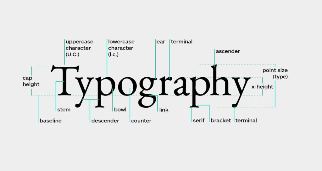
Typography is a crucial aspect of graphic design, and understanding its terminology is essential for creating visually appealing and effective designs. Here are some key typography terms every graphic design company services should know:
1. Kerning
Kerning refers to the adjustment of space between individual characters in a word or a block of text. It ensures that the spacing between letters is visually pleasing and consistent. Proper kerning can greatly enhance the readability and aesthetics of a design.
2. Leading
Leading, also known as line spacing, is the vertical space between lines of text. It plays a significant role in legibility and readability. The right amount of leading can make a design more comfortable to read, while inadequate leading can cause the text to appear cramped and difficult to comprehend.
3. Tracking
Tracking refers to the uniform adjustment of space between all characters in a word or a block of text. Unlike kerning, which adjusts the space between individual characters, tracking adjusts the overall spacing between characters. It is often used to achieve a more open or condensed appearance in typography.
Understanding and utilizing these typography terms will allow you to create visually harmonious and professional designs . Now, let’s move on to color theory and terminology.
Color Theory and Terminology in Graphic Design
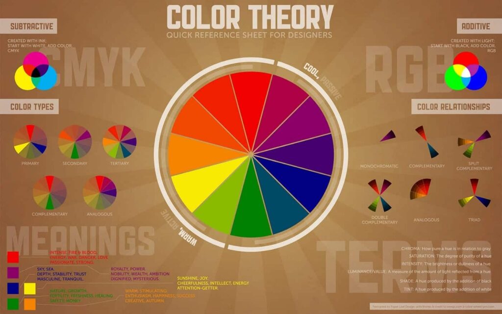
Color is a powerful tool in graphic design, and having a solid understanding of color theory and terminology is essential for creating captivating visuals. Here are some key color terms every graphics design service should know:
1. Hue
Hue refers to the purest form of a color. It is the attribute that allows us to differentiate between red, green, blue, and other colors on the color spectrum. Understanding hues is crucial for selecting and combining colors effectively in your designs.
2. Saturation
Saturation, also known as intensity or chroma, refers to the purity or vividness of a color. Highly saturated colors are vibrant and intense, while desaturated colors appear more muted or washed out. Manipulating saturation can create different moods and effects in your designs.
3. Value
Value, also known as brightness or lightness, refers to how light or dark a color appears. It is determined by the amount of black or white added to a hue. Understanding value is crucial for creating contrast and establishing hierarchy in your designs.
By mastering these color terms, you will be able to create visually appealing designs that effectively communicate your intended message. Now, let’s explore layout and composition terms in graphic design.
Layout and Composition Terms in Graphic Design
Layout and composition are fundamental elements of graphic designing services, and understanding the terminology associated with them is essential for creating visually balanced and aesthetically pleasing designs. Here are some key layout and composition terms every graphic design near me should know:
1. Grid
A grid is a system of horizontal and vertical lines that helps organize elements on a page. It provides structure and consistency to a design, allowing for easy alignment and arrangement of content. Utilizing grids can create a sense of order and cohesion in your designs.
2. White Space
White space, also known as negative space, refers to the empty or blank areas in a design. It is an important element that helps balance and highlight the content on a page. Proper utilization of white space can improve readability and create visual breathing room in your designs.
3. Rule of Thirds
The rule of thirds is a compositional guideline that suggests dividing an image or a design into nine equal parts using two horizontal and two vertical lines. The points where these lines intersect are considered to be the most visually appealing spots for placing important elements. By following the rule of thirds, you can create visually balanced and engaging designs.
Understanding these layout and composition terms will enable you to create designs that are visually pleasing and effectively communicate your message. Now, let’s move on to understanding raster and vector graphics.
Understanding Raster and Vector Graphics
Raster and vector graphics are two primary types of digital images used in graphic design. Understanding the differences between them is crucial for selecting the right format for your graphic design company projects . Here’s a breakdown of raster and vector graphics:
1. Raster Graphics
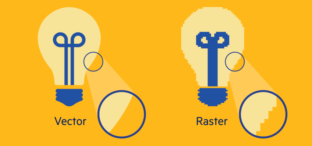
Raster graphics, also known as bitmap graphics, are made up of a grid of pixels. Each pixel contains specific color information, resulting in a detailed and realistic representation of an image. Raster graphics are resolution-dependent, meaning they can lose quality when scaled up. They are commonly used for photographs and complex illustrations.
2. Vector Graphics
Vector graphics, on the other hand, are created using mathematical equations and are composed of paths and curves instead of pixels. They are resolution-independent, meaning they can be scaled up or down without any loss of quality. Vector graphics are commonly used for logos, icons, and illustrations that require scalability.
Understanding the characteristics and applications of raster and vector graphics will help you choose the appropriate format for your design projects. Now, let’s explore some common graphic design software and their terms.
Common Graphic Design Software and Their Terms
Graphic design services rely on various software to bring their creative visions to life. Familiarizing yourself with the terminology associated with these software tools will enhance your ability to navigate through design projects. Here are some commonly used graphic design software and their terms:
Adobe Photoshop is a powerful image editing software widely used by graphic design services. Some key terms associated with Photoshop include layers, masks, brushes, and filters. Understanding these terms will enable you to manipulate images and create stunning visual effects.
Adobe Illustrator is a vector graphics editor used for creating illustrations, icons, and logos. Some essential terms associated with Illustrator include paths, anchor points, bezier curves, and pen tool. By mastering these terms, you can create precise and scalable vector designs.
Adobe InDesign is a desktop publishing software primarily used for creating print designs such as brochures, magazines, and books. Some important terms associated with InDesign include master pages, paragraph styles, character styles, and grids. By understanding these terms, you can efficiently layout and format your print designs.
Familiarizing yourself with the terminology of these graphic design software tools will enable you to work seamlessly and efficiently on your design projects. Now, let’s move on to graphic design file formats and their uses.
Graphic Design File Formats and Their Uses
Different design projects require different file formats to ensure optimal quality and compatibility. Understanding the various graphic design file formats and their uses will equip you with the knowledge to choose the right format for your specific needs. Here are some common graphic design file formats:
1. JPEG
JPEG (Joint Photographic Experts Group) is a widely used file format for digital images. It is suitable for photographs and complex images with many colors and gradients. However, JPEG is a lossy compression format, meaning it sacrifices some image quality to reduce file size.
2. PNG
PNG (Portable Network Graphics) is a popular file format for web graphics and images with transparency. It supports lossless compression, meaning it retains the original image quality without sacrificing file size. PNG is commonly used for logos, icons, and images that require a transparent background.
3. PDF
PDF (Portable Document Format) is a versatile file format that preserves the formatting of a document regardless of the software, hardware, or operating system used to view it. PDFs are commonly used for sharing print-ready designs, such as brochures, magazines, and posters.
By understanding the characteristics and uses of different graphic design file formats, you can ensure that your designs are delivered in the appropriate format for their intended purpose. Now, let’s delve into branding and identity design terms.
Branding and Identity Design Terms
Branding and identity design are essential components of graphic design that focus on creating a cohesive and recognizable visual identity for a brand or business. Familiarizing yourself with the terminology associated with branding and identity design will enable you to develop effective brand identities. Here are some key terms:
1. Logo
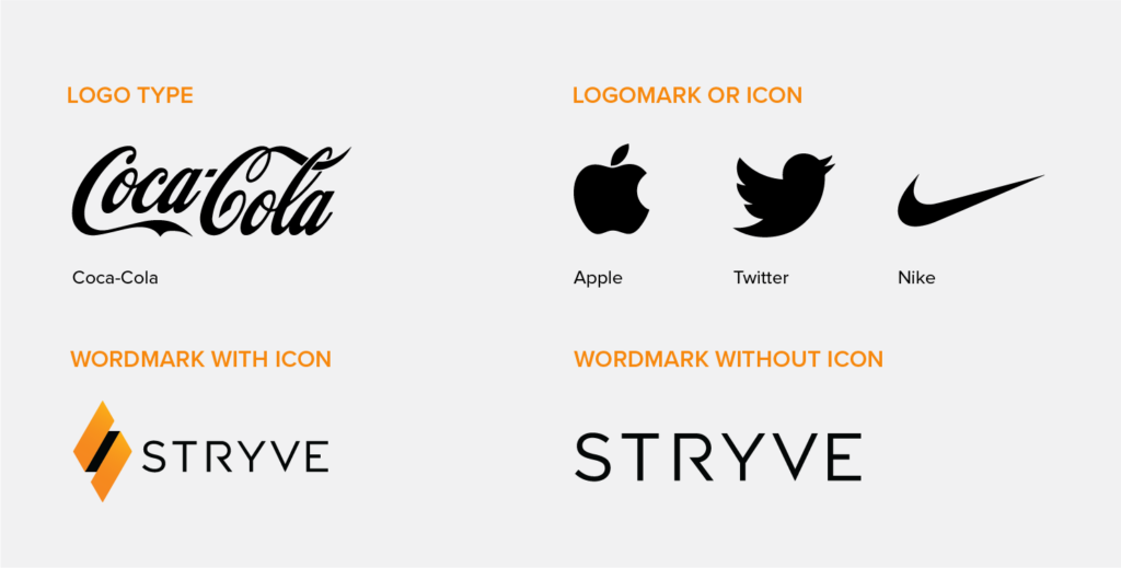
A logo is a visual symbol that represents a brand or business. It is typically a combination of text and imagery that serves as the foundation of a brand’s visual identity. Logos can be created using various design elements such as typography, icons, and colors.
2. Brand Guidelines
Brand guidelines, also known as brand style guides, are documents that outline the rules and specifications for using a brand’s visual elements. They provide guidance on logo usage, color palettes, typography, and other design elements to ensure consistency and cohesiveness across all brand communications.
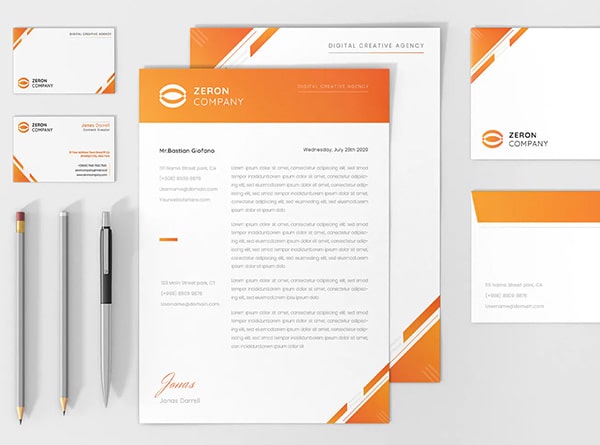
3. Brand Identity
Brand identity encompasses the visual and tangible elements that represent a brand, including its logo, colors, typography, imagery, and other design elements. It is the visual representation of a brand’s personality, values, and positioning in the market.
By understanding these branding and identity design terms, you will be able to create cohesive and impactful brand identities. Now, let’s move on to web design terms that every graphic designer should know.
Web Design Terms Every Graphic Design as a Service Should Know
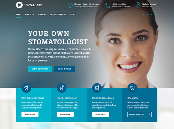
Web design is a specialized field within graphic design service that focuses on creating visually engaging and user-friendly websites. Familiarizing yourself with the terminology associated with web design will enable you to effectively collaborate with web developers and create visually stunning web designs. Here are some key web design terms:
1. Responsive Design
Mobile responsive design is an approach to web design that ensures websites adapt and display properly across various devices and screen sizes. It involves creating flexible layouts and using media queries to optimize the user experience on desktop computers, tablets, and mobile devices.
2. UX/UI Design
UX (User Experience) and UI (User Interface) design are crucial aspects of web design that focus on optimizing the user’s interaction and experience with a website. UX design involves creating intuitive and user-friendly interfaces, while UI design focuses on the visual elements and aesthetics of the interface.
3. Wireframe
A wireframe is a basic visual representation of a web page or interface that outlines the structure and layout of the content. It provides a blueprint for the design and helps visualize the placement of elements such as navigation menus, headers, and body content.
By familiarizing yourself with these web design terms, you will be able to collaborate effectively with web developers and create visually stunning and user-friendly websites. Now, let’s conclude our exploration of graphic design terms.
Conclusion: Expanding Your Graphic Design Vocabulary
Congratulations! You have now explored a wide range of graphic design terms that are essential for every business and graphic design company. From typography to color theory, layout and composition to branding and web design, you have gained valuable knowledge that will enhance your communication and design skills.
By familiarizing yourself with these terms and incorporating them into your design vocabulary, you will be able to confidently navigate through design projects, communicate effectively with clients and colleagues, and create visually appealing and impactful designs.
Remember, graphic design is a constantly evolving field, and it is essential to stay updated with the latest trends and terminology. Continue to expand your knowledge and skills, and let your passion for design shine through in every project you undertake.
Now, go forth and impress with your newfound graphic design vocabulary!
