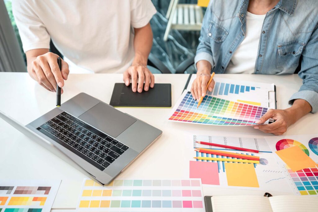

Hey there, design enthusiasts! Let’s talk poster design trends for 2024. As a graphic design aficionado, I’m always on the hunt for fresh ideas to spice up my print media game. Trust me, staying ahead in poster design isn’t just about looking cool – it has an impact on how effectively we communicate visually. From eye-catching info graphics to brand identity powerhouses, posters continue to be a go-to medium for design agencies and creatives alike.
In this article, I’ll walk you through the hottest poster design trends that are set to make waves in 2024. We’ll explore the magic of minimalist typography, dive into vibrant color palettes, and take a nostalgic trip with retro elements. Plus, I’ll share some insights on how sustainable designs are shaping the future of digital and print posters. Whether you’re a seasoned pro or just dipping your toes into the design world, these trends are sure to inspire your next masterpiece. So, let’s get creative and push the boundaries of poster design together!
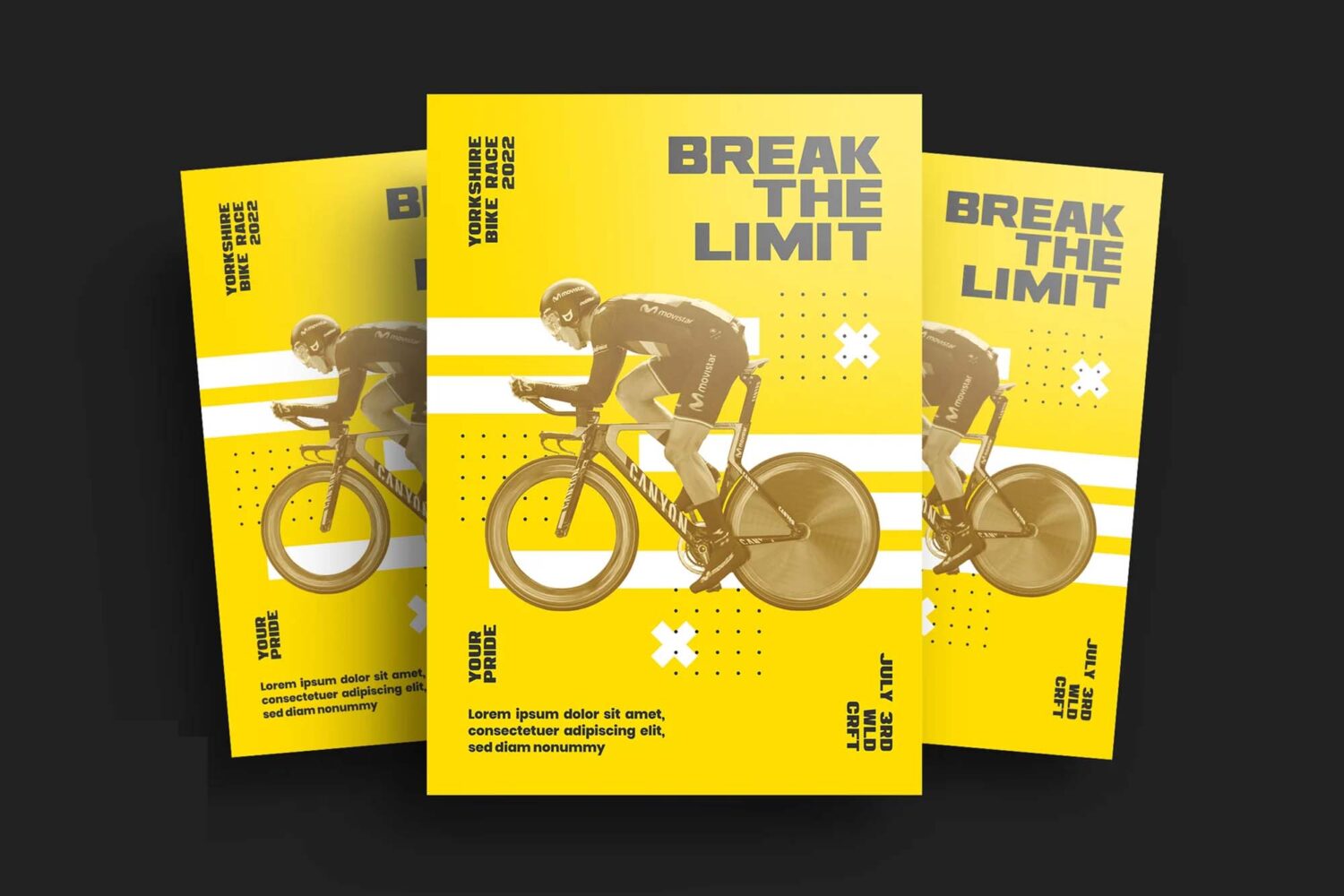
Minimalist and Bold Typography
I’ve got to say, the minimalist approach in poster design is really taking off! It’s all about stripping things down to the essentials and letting the message shine through. Let’s dive into how this trend is shaping up for 2024.
Simplicity in design
The ‘less is more’ philosophy is at the heart of minimalist poster design. We’re seeing a lot of clean lines, uncluttered layouts, and a focus on what really matters. This approach isn’t just about looking cool – it’s about communicating effectively. By removing the unnecessary, we’re able to get our point across with precision. It’s like whispering in a noisy room – sometimes, that’s what grabs people’s attention the most.
Impactful font choices
When it comes to typography in minimalist designs, bold is beautiful. We’re talking about large, eye-catching fonts that make a statement. Sans serif fonts are particularly popular for their clean, modern look. They’re easy to read, which is crucial for any poster. Fonts like Futura and Gilmer are great choices – they’ve got that geometric style that looks both retro and futuristic at the same time.
But don’t think you’re limited to sans serif. Sometimes, a more decorative font can add just the right touch of elegance or playfulness. It all depends on the message you’re trying to convey. The key is to choose a font that complements your design without overwhelming it.
Negative space utilization
Negative space, or white space as some call it, is a designer’s best friend, especially when it comes to brochure design or minimalist poster layouts. It adds balance and keeps the focus on the key elements. It’s not just empty space – it’s a powerful tool that helps define the limits of objects and creates bonds between them. Think of it as breathing room for your design elements.
Using negative space effectively can:
– Improve the flow of content
– Make text more readable
– Draw attention to important elements
– Add contrast and balance to your design
In minimalist poster design, negative space often becomes an active part of the visual presentation. It can create shapes or forms that aren’t explicitly drawn, adding an extra layer of creativity to your work.
Remember, the goal of minimalist design isn’t to cram as much as possible onto the page. It’s about finding that perfect balance where every element serves a purpose. By embracing simplicity, using impactful typography, and making smart use of negative space, we can create posters that not only look great but also communicate our message with clarity and style.
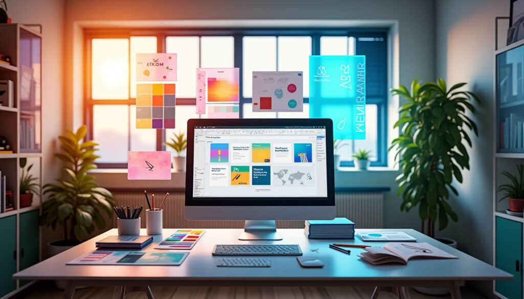
Vibrant Color Palettes
Let’s talk about color! In 2024, poster design is all about making a statement with bold, eye-catching hues. We’re seeing a shift from muted tones to vibrant palettes that grab attention and evoke emotions. This trend has an impact on how we communicate visually, adding depth and energy to our designs.
Neon accents
Neon is making a comeback, and it’s not just for retro-themed designs anymore. These electric hues are perfect for adding a pop of color that really stands out. I’m loving how designers are using neon accents to highlight key elements in their posters. It’s like adding a touch of urban nightlife to your design – think glowing city lights and vibrant street art.
One cool trick is to pair neon with darker backgrounds. This creates a stunning contrast that makes your design elements really pop. For example, a neon pink logo on a deep navy background can look absolutely stunning. Just remember, a little goes a long way – use neon as an accent, not the main event.
Color blocking techniques
Color blocking is a technique that’s been around for a while, but it’s getting a fresh twist in 2024. This approach involves using solid blocks of contrasting colors to create striking visual effects. It’s a great way to add structure and balance to your poster design.
The key to successful color blocking is choosing the right color combinations. Try pairing complementary colors for a bold look, or go for an ombre effect with shades of the same hue. Don’t be afraid to experiment with unexpected color pairings – sometimes the most unusual combinations create the most memorable designs.
Gradient applications
Gradients are having a moment in poster design, and for good reason. They add depth and dimension to flat designs, making them more dynamic and engaging. In 2024, we’re seeing gradients used in more subtle and sophisticated ways.
One trend I’m really excited about is using gradients to mimic natural phenomena. Think sunset-inspired color transitions or the deep blues and greens of ocean depths. These gradients can set the mood for your entire design and tell a visual story without any words.
Another cool application is using gradients as overlays on images or patterns. This technique can add texture and interest to your design, creating a unique visual effect that’s sure to catch the eye.
Remember, the goal with these vibrant color palettes is to create posters that not only look great but also communicate your message effectively. Whether you’re using neon accents, color blocking, or gradients, make sure your color choices support your overall design concept and brand identity.
So, go ahead and play with color! Experiment with different combinations and techniques. You might be surprised at how a bold color choice can transform your poster design from good to unforgettable. Just remember, in the world of poster design, sometimes more is more – don’t be afraid to go big and bold with your color choices!
Retro and Nostalgic Elements
As a digital design and poster design enthusiast, I’m thrilled to see the resurgence of retro and nostalgic elements in 2024. This trend has an influence on how we communicate visually, tapping into our collective memories and evoking powerful emotions. Let’s dive into some exciting ways designers are incorporating these blast-from-the-past vibes into their work.
70s-inspired motifs
The groovy 70s are making a comeback in a big way! We’re seeing a lot of simple, flat shapes arranged into recurring patterns that scream “”far out!”” These abstract designs are popping up in magazine layouts, marketing materials, and packaging. Think peace signs, paisley patterns, and funky florals – they’re all the rage again.
What I love about this trend is how it combines authenticity with a modern twist. Designers are taking inspiration from the hippie and disco movements but giving them a fresh, contemporary spin. It’s not about looking outdated; it’s about creating a cozy, nostalgic atmosphere that resonates with viewers across generations.
Vintage color schemes
When it comes to color palettes, 2024 is all about that warm, earthy 70s vibe. We’re seeing a lot of mustard yellows, burnt oranges, and teal blues. These nature-inspired tones create a relaxed, grounded feel that’s perfect for poster design.
One cool trick I’ve noticed is pairing these vintage hues with more modern, vibrant colors. This creates a unique contrast that catches the eye while still evoking that nostalgic feel. For example, you might see a poster with a predominantly earthy palette punctuated by a pop of neon – it’s a great way to blend old and new.
Throwback imagery
Imagery plays a huge role in creating that retro vibe. We’re seeing a lot of designers incorporate vintage photography, iconography, and illustrations into their poster designs. Think classic cars, old-school TVs, vinyl records – anything that transports viewers back in time.
One trend that’s really caught my eye is the resurgence of hand-painted film posters. This style has taken center stage in recent years, reflecting our love for stories with a nostalgic quality. It’s not just limited to alternative movie posters either – this illustrated approach is being used across various types of poster design.
The key to nailing this trend is to strike a balance between nostalgia and modernity. You want your poster to feel familiar and comforting, but also fresh and relevant. It’s a delicate dance, but when done right, it creates designs that really resonate with audiences.
So, whether you’re working on a brand identity project or creating info graphics for print media, don’t be afraid to sprinkle in some retro magic. Just remember, authenticity is key. Take the time to research the era you’re drawing inspiration from and strive to capture its essence accurately. With the right approach, you can create poster designs that not only look great but also tell a story and evoke powerful emotions.
Sustainable and Eco-friendly Designs
As a designer, I’m thrilled to see the growing trend of sustainable and eco-friendly poster design in 2024. It’s not just about looking good anymore; it’s about making a positive impact on our planet. Let’s dive into some exciting ways we’re making our designs greener.
Recycled materials
One of the coolest things happening in poster design is the use of recycled materials. We’re not just talking about regular recycled paper here – there’s a whole world of eco-friendly options out there. For instance, some designers are using paper made from agricultural byproducts like wheat straw or sugarcane bagasse. These materials give posters a unique texture and look while reducing waste [[1]].
But it doesn’t stop there. Bamboo-based paper is gaining popularity too. It’s a great alternative because bamboo grows quickly and needs fewer resources than traditional trees. And for those looking for something really different, there’s even hemp paper. It’s super durable and has a lower environmental impact [[1]].
The best part? These recycled materials don’t compromise on quality. You can still get high-quality, opaque paper that’s perfect for printing eye-catching colors [[2]]. So, we can create stunning posters while being kind to the environment.
Nature-inspired themes
In 2024, we’re seeing a lot of nature-inspired themes in poster design. It’s like bringing a bit of the outdoors into our visual communication. Think earthy color palettes, organic shapes, and elements that mimic natural patterns. This trend isn’t just about looking pretty – it’s a subtle way to reinforce the eco-friendly message of our designs [[3]].
I’m loving how designers are using these nature-inspired elements to create dynamic scenes. It’s not just about slapping a tree or a leaf on a poster. We’re talking about creating immersive visual experiences that transport viewers to natural settings. This approach can make learning spaces more inspirational and engaging [[4]].
Green messaging
Now, let’s talk about the message itself. In 2024, poster design isn’t just about looking green – it’s about spreading the word too. We’re using our designs to educate viewers about sustainability issues and promote eco-friendly practices [[5]].
One cool trend I’ve noticed is using posters to spread information about recycling. With the right communication and visuals, we can pique people’s interest and inspire them to take action. It’s amazing how a well-designed poster can make complex environmental concepts more accessible and engaging [[6]].
Conclusion
Poster design trends are shaping up to be an exciting mix of old and new, with a strong focus on sustainability and visual impact. From minimalist typography to vibrant color palettes, retro elements, and eco-friendly materials, designers have a wealth of options to create eye-catching and meaningful posters. These trends have an influence on how we communicate visually, pushing the boundaries of creativity while also considering our environmental footprint.
As we move forward, it’s clear that poster design is more than just about esthetics – it’s about making a statement and connecting with viewers on a deeper level. Whether you’re a design agency, seasoned designer or just starting out, these trends offer plenty of inspiration to create posters that stand out and resonate with audiences. So, dive in, experiment with these trends, and let your creativity shine. Get in touch with us today and schedule your complimentary 15-min consult to explore how we can bring your poster design ideas to life.
## References
[1] – https://www.adobe.com/express/learn/blog/design-trends-2024
[2] – https://medium.com/codeart-mk/graphic-design-trends-2024-52c4b55981df
[3] – https://venngage.com/blog/graphic-design-trends/
[4] – https://www.jukeboxprint.com/blog/24-of-the-biggest-graphic-design-trends-for-2024
[5] – https://looka.com/blog/graphic-design-trends/
[6] – https://www.vistaprint.com/hub/graphic-design-trends?srsltid=AfmBOooHcK0TG_P1q0Cl4rKsx_d0Ay9fdHRxtG0cWjhKCulY59iAJo0P
Related Posts