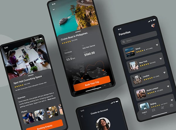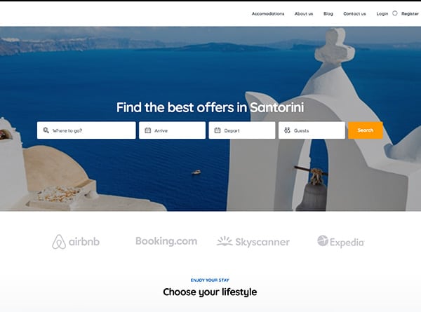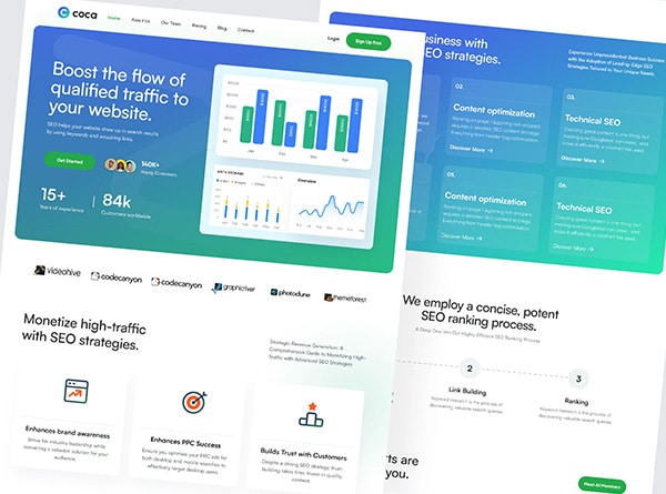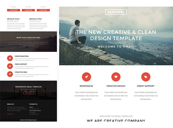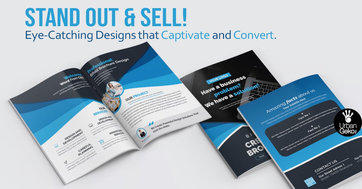
You might think brochures are a relic of the past—something companies handed out at trade shows decades ago. But think again! The humble brochure is making a major comeback, evolving from a simple paper handout into a powerful tool for driving conversions. As we move into 2024, savvy CEOs, directors, managers, and business owners are rediscovering the art of brochure design, now armed with cutting-edge design techniques and strategies to engage customers and boost business.
So, whether you’re looking to refresh your marketing strategy or introduce a new product, here’s your ultimate guide to creating high-converting brochures that resonate with your audience and make an impact.
Why Brochures Still Matter
In a world dominated by digital channels, why should any business still care about brochures? Simple—brochures combine the tangible with the visual, offering something that digital ads and emails often can’t: personal engagement. You can hand them out at events, mail them to potential clients, or use them as part of your direct sales strategy. Brochures provide a lasting impression, giving your brand something physical to leave behind.
And here’s the thing—modern brochures aren’t just pieces of paper. They’ve become sophisticated, high-quality marketing assets that integrate graphic design, infographics, and compelling storytelling to convert leads into customers. But like any marketing tool, the secret lies in crafting them thoughtfully.
The Anatomy of a High-Converting Brochure
What sets apart an ordinary brochure from one that generates leads and boosts your business? The answer lies in a few key elements that, when strategically combined, lead to high conversion rates.
1. Strong Headline and Clear Call to Action
You can’t convert anyone if they don’t know what you’re offering! A compelling headline captures attention, while a well-placed call to action (CTA) guides potential customers towards the next step. Think of the headline as your first impression—it needs to be sharp, clear, and impactful.
A great CTA? It’s specific, benefits-driven, and leaves no room for confusion. Don’t just say, “Learn more”; say, “Download our product guide now for exclusive insights.” That specificity is what leads to action.
2. Design That Aligns with Your Brand Identity
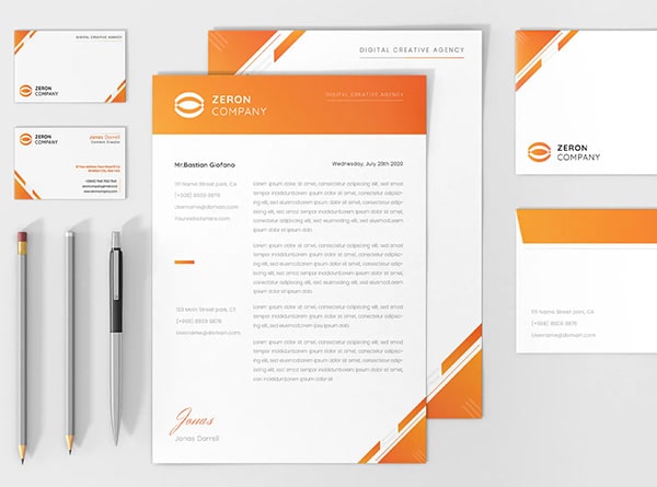
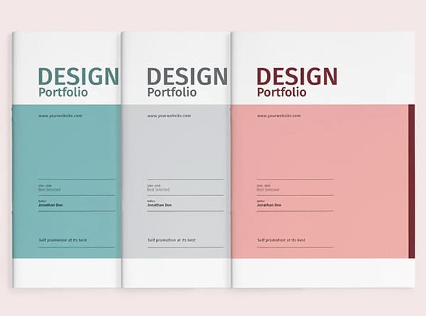
At the heart of any effective brochure is the design. In 2024, brochures need to be more than aesthetically pleasing—they must reflect your company’s brand identity. Consistency across all marketing materials builds trust, and a well-designed brochure that mirrors your website, social media, and other assets creates a cohesive brand experience.
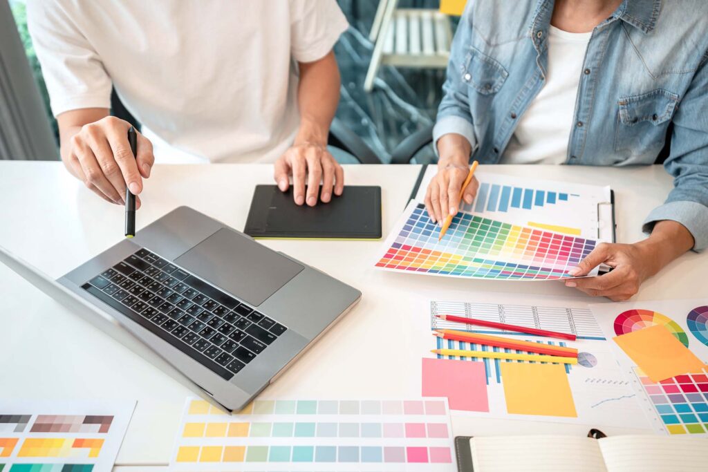
Here’s where working with a design agency really pays off. A professional design team understands how to blend colors, typography, and layout to represent your brand’s values while keeping things visually appealing and functional.
3. Compelling Content and Visual Hierarchy
It’s tempting to fill your brochure with every single detail about your product or service, but less is more. Your brochure should answer three basic questions: What are you offering? Why does it matter? What’s the next step? Keep the copy concise and easy to digest, and let your visuals do much of the talking.
A high-converting brochure also leverages visual hierarchy. People don’t read brochures like books; they scan. The most critical information should jump out immediately—think bold headings, bullets, and well-placed graphics to guide the eye.
4. The Power of Infographics
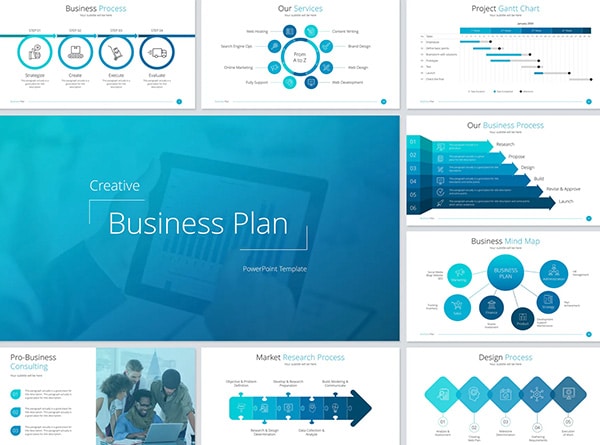
Visual storytelling is more effective than a wall of text, especially when you want to communicate complex ideas. That’s where infographics come in. Use infographics to present data, explain a process, or break down key benefits. Not only do they make your brochure more engaging, but they also help simplify your message, making it easier for potential customers to grasp the value of your offering quickly.
5. High-Quality Visuals and Photography
If you’re still using stock photos from 2010, it’s time for an upgrade! High-quality visuals are essential for any brochure design. People judge the professionalism of your company based on the quality of your marketing materials, and a pixelated image could hurt your credibility. Invest in custom photography or premium stock photos that align with your brand image. If your company works with products, showcasing those in action through high-resolution images can make a world of difference.
Digital Design Meets Print: The Hybrid Approach
One of the biggest trends in 2024 is the hybrid approach to brochures. While print brochures still have their place, many companies are also leveraging digital design. Digital brochures allow you to embed multimedia elements like video and interactive graphics, offering a richer experience than print. They’re also easier to distribute and update.
If you decide to go digital, make sure your brochure is mobile-friendly. A significant portion of your audience will likely view it on a smartphone or tablet, so the layout should be responsive, ensuring the design scales appropriately for different devices.
How to Tailor Your Brochure for Your Target Audience
One size does not fit all, especially in brochure marketing. CEOs, directors, and managers expect personalized messaging tailored to their specific needs. This means your brochure should speak directly to your audience’s pain points and offer solutions that resonate.
For example, a brochure aimed at other businesses (B2B) might focus more on ROI, efficiency, and scalability, while one targeting individual consumers might emphasize experience, quality, or innovation.
Your CTA, images, and even the tone of your content should reflect this tailored approach. Are you talking to a CEO or a tech-savvy entrepreneur? Your tone matters.
Mistakes to Avoid in Brochure Design
Let’s be real—creating high-converting brochures isn’t without its pitfalls. Here are a few common mistakes to avoid:
Overloading with Information: Don’t cram every piece of information into one brochure. Keep it focused on a single message or theme. The goal is to spark interest, not overwhelm.
Ignoring the Fold: Brochures, especially tri-folds, have natural sections created by the fold. Ignoring this layout can result in a messy, difficult-to-navigate design.
Using Low-Quality Printing: The tactile feel of a brochure is often overlooked. If it feels cheap, people will think your brand is cheap. Invest in quality paper and printing techniques.
Not Proofreading: Typos and grammatical errors undermine your credibility. Make sure to proofread and get a second pair of eyes on the content before you hit print or publish online.
Leveraging Brochures in a Multi-Channel Strategy
In 2024, brochures aren’t standalone marketing tools—they’re integrated into a larger multi-channel strategy. This means your brochure should connect seamlessly with your website, social media, and email campaigns. Including QR codes or URLs that link to landing pages with more in-depth content is a great way to drive traffic from your brochure to your website.
If your business offers website design and management services, for example, your brochure can highlight key services while directing potential clients to case studies or testimonials on your website. The goal is to create a smooth transition from print to digital so that your audience remains engaged beyond the brochure.
Tracking Brochure Success: Measuring Conversions
How do you know if your brochure is working? The ultimate goal of a high-converting brochure is to turn interest into action. Whether it’s signing up for a demo, calling your sales team, or visiting your website, you should track the performance of your brochure.
Here are a few ways to measure success:
Unique Codes or Offers: Include a promo code in your brochure to track redemptions.
Landing Page: Use a custom landing page URL to see how many visitors come directly from your brochure.
Phone Tracking: If your brochure includes a phone number, use call tracking software to see how many leads come from the brochure.
QR Codes: Add a QR code that leads to an exclusive offer or page, making it easy to track engagement.
The data you collect will help you refine your design and messaging for future iterations.
Partnering with the Right Design Agency
Here’s the truth: creating a high-converting brochure isn’t something you should do on a whim. It takes expertise in graphic design, branding, and marketing strategy to get it right. That’s why partnering with a professional design agency is often the best decision for businesses.
A good design agency can ensure that your brochure is not only visually stunning but also functional and aligned with your business goals. From brainstorming design concepts to crafting engaging copy, they can handle every detail while you focus on what matters most—running your business.
Conclusion: Brochures That Convert in 2024
In 2024, brochures are anything but old school. They’re essential marketing tools, offering businesses a unique way to connect with their audience in both print and digital formats. With the right blend of compelling content, stunning graphic design, and strategic planning, your brochure can convert leads into loyal customers.
Remember, the key to a high-converting brochure lies in its ability to communicate your message clearly, engage your audience visually, and drive them to take action. Keep it simple, keep it focused, and most importantly—keep it aligned with your brand.
So, what are you waiting for? It’s time to revamp your brochures and take your marketing to the next level. Whether you’re working with a design agency or doing it in-house, now is the time to create brochures that not only look great but also convert like never before.
