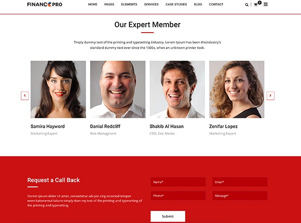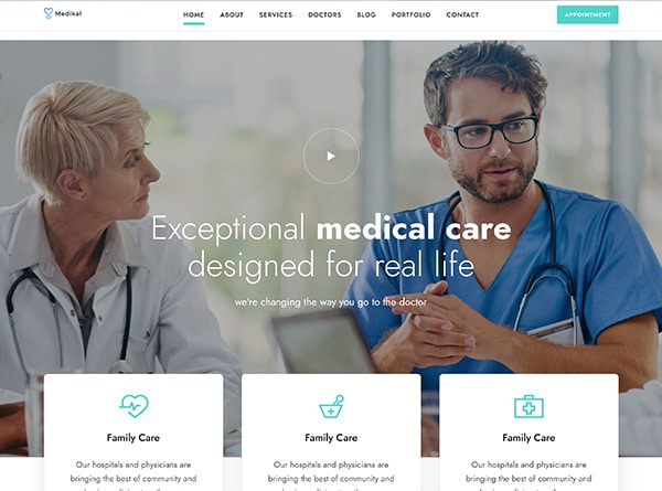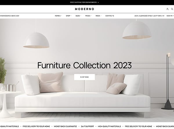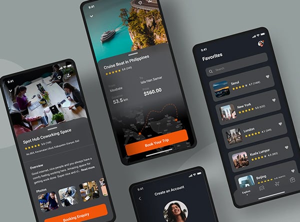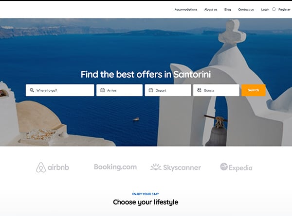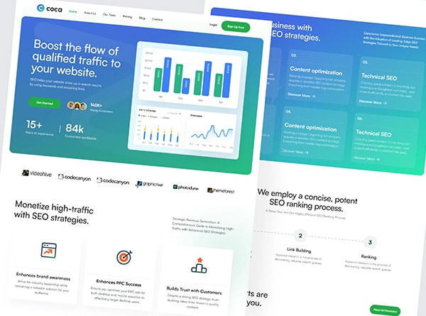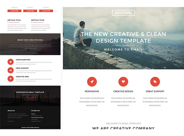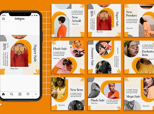
Hold onto your pixels, folks! The City of Angels is about to get a digital makeover that’ll knock your socks off. As we hurtle towards 2025, Los Angeles is gearing up to lead the charge in web design innovation. Gone are the days of static pages and clunky interfaces. We’re talking about a web design trends 2025 revolution that’s as bold and diverse as LA itself.
Picture this: you’re cruising down Sunset Boulevard, but instead of billboards, you’re scrolling through websites that adapt to your every whim. That’s the future of web design in LA, baby! It’s not just about looking pretty anymore (though let’s face it, in this town, looks always matter). It’s about creating digital experiences that are so intuitive, so engaging, that users forget they’re on a mobile-friendly website at all.
From the glitz of Hollywood to the tech hubs of Silicon Beach, LA’s web designers are cooking up a storm of creativity. They’re blending cutting-edge technology with that unmistakable LA flair to craft websites that don’t just catch the eye – they capture the imagination.
So, buckle up, digital dreamers and tech enthusiasts! We’re about to take a wild ride through the modern web design LA trends that are set to transform LA’s digital landscape in 2025. Trust me, by the time we’re done, you’ll be seeing the internet in a whole new light – and it’s looking brighter than a California sunset.
AI-Powered Personalization: Your Digital BFF
Remember when websites were one-size-fits-all? Well, those days are as outdated as flip phones in 2025 LA. Enter AI-powered personalization – the digital equivalent of having a personal stylist for your web experience.
Imagine landing on a website that knows you better than your best friend. Creepy? Maybe a little. Awesome? Absolutely! AI algorithms are working overtime to analyze your browsing habits, preferences, and even your mood (yep, they’re that good) to serve up a tailor-made experience just for you.
Here’s how it’s shaking things up:
- Dynamic Content Curation: Websites are becoming chameleons, shape-shifting their content based on who’s visiting. A fashionista from Beverly Hills? Here’s the latest runway trends. A tech geek from Culver City? Have some cutting-edge gadget reviews.
- Predictive Recommendations: AI is getting so smart it’s practically reading your mind. It’s suggesting products you didn’t even know you wanted, but suddenly can’t live without. It’s like having a psychic in your pocket, only more accurate and less likely to ask for your credit card number.
- Mood-Based Design: Feeling blue? The website’s color scheme softens. Pumped up? Get ready for some energetic visuals. AI is tapping into the psychology of color and interactive design to match your vibe.
- Personalized User Journeys: No more one-path-fits-all navigation. Websites are creating unique journeys for each user, guiding them through content and features based on their interests and behavior.
But here’s the kicker – all this personalization is happening in real-time, faster than you can say “Hollywood sign.” It’s not just about remembering your name anymore; it’s about understanding your digital DNA.
And for businesses? This level of personalization is gold. It’s boosting engagement, skyrocketing conversion rates, and creating brand loyalty that’s stickier than LA traffic.
So, the next time a website seems to read your mind, don’t freak out. Just know that AI is working its magic, turning your digital experience into a red-carpet event, tailored just for you. Welcome to the era of websites that don’t just respond to you – they anticipate your every move. It’s like having a digital crystal ball, only way cooler and infinitely more useful.
Augmented Reality (AR): Blurring the Lines Between Digital and Physical
Hold onto your VR headsets, folks, because Augmented Reality is about to make your screen come alive in ways you never imagined. In 2025 LA, the line between the digital and physical worlds isn’t just blurring – it’s doing a full-on disappearing act.
Picture this: you’re browsing a furniture website, and suddenly, that sleek mid-century modern couch you’ve been eyeing is right there in your living room. No, you haven’t been teleported to an IKEA showroom. It’s AR, baby, and it’s revolutionizing how we interact with websites.
Here’s how AR is turning LA’s modern web design scene upside down (in the best way possible):
- Virtual Try-Ons: Forget the hassle of dressing rooms. With AR, you can try on that designer outfit from Rodeo Drive without leaving your couch. Swipe, tap, and voila – you’re runway-ready!
- Interactive Product Demonstrations: Why read about how a product works when you can see it in action? AR is bringing products to life, letting you explore features and functions in 3D.
- Immersive Storytelling: Brands are using AR to create narrative experiences that transport users into their world. It’s like stepping into a movie, only you’re the star.
- Educational Experiences: Learning is getting a major upgrade. Imagine studying the solar system with planets orbiting around your coffee table, or dissecting a virtual frog without the smell (thank goodness).
But here’s where it gets really exciting – AR isn’t just for e-commerce or education. It’s seeping into every corner of responsive web design:
Real estate websites are offering virtual property tours that let you explore homes as if you’re actually there. No more surprise tiny bathrooms or weirdly shaped rooms!
- Travel sites are giving you a taste of destinations before you book. Stroll down the Champs-Élysées or hike Machu Picchu, all from your LA apartment.
- Even banking websites are getting in on the action, with AR visualizations of your financial data that make budgeting almost (we said almost) fun.
The best part? All this AR goodness is happening right in your browser. No need for clunky apps or special equipment. It’s seamless, it’s intuitive, and it’s changing the game for user engagement.
So, the next time you visit a website and find yourself reaching out to touch something that’s not really there, don’t worry – you’re not losing it. You’re just experiencing the magic of AR in web design. It’s like having a superpower that lets you bring the internet into the real world. Welcome to the future, where your screen is just a window to endless possibilities.
Micro-Animations: The Devil’s in the Details
Alright, let’s zoom in – way in. We’re talking microscopic level here, folks. In the world of 2025 LA web minimalist design, it’s the little things that are making a big splash. Enter micro-animations: the unsung heroes of user experience that are about to become the talk of the town.
Think of micro-animations as the digital equivalent of a perfectly timed wink or a subtle nod. They’re those tiny, almost imperceptible movements that guide you through a website, making your journey smoother than a fresh jar of skippy. And in LA, where every interaction is a performance, these little animations are stealing the show.
Here’s how these mini marvels are jazzing up the web:
- Feedback Fiesta: Click a button, and it ripples like a stone in water. Hover over a menu, and it unfolds like a blooming flower. These tiny reactions are like digital high-fives, letting you know, “Hey, I see you, and I’m listening!”
- Transition Tango: Pages don’t just load; they dance into view. Elements glide, fade, or zoom, turning navigation into a choreographed performance. It’s smoother than a Hollywood actor’s pick-up line.
- Storytelling in Seconds: Micro-animations are becoming the haiku of the digital world, telling stories in mere moments. A loading icon that mimics a coffee cup filling up for a café website? That’s not just loading, that’s branding in motion.
- Guided Attention: Like a subtle nudge from a friend, these animations gently guide your eyes to where they need to go. It’s like having a personal tour guide for every website.
But here’s where it gets really interesting:
- Emotional Design: These tiny animations are evoking big feelings. A heart that beats when you like something, or a character that waves goodbye when you leave a page – it’s turning websites into emotive experiences.
- Functional Flair: Micro-animations aren’t just pretty; they’re practical. They’re reducing cognitive load by visually explaining how things work without a single word.
- Performance Boosters: Despite their visual punch, these animations are lightweight, keeping websites speedy. It’s like adding racing stripes to a website without weighing it down.
The magic of micro-animations lies in their subtlety. They’re not screaming for attention; they’re whispering sweet nothings to your subconscious, making your web experience more intuitive, more engaging, and dare we say, more human.
So, the next time you find yourself smiling at a website without knowing why, or effortlessly navigating through pages like a digital ninja, tip your hat to the micro-animations. They’re the unsung heroes of 2025 LA web design, proving that sometimes, the biggest impacts come in the smallest packages. It’s a world where every pixel has a purpose, and every movement tells a story. Welcome to the era of web design where details don’t just matter – they dazzle.
Voice User Interfaces (VUI): Speak and You Shall Receive
Listen up, because the future of web design in LA is speaking your language – literally. Voice User Interfaces (VUI) are turning up the volume on how we interact with websites, and it’s music to our ears. In 2025, your voice is becoming the new mouse, and “Hey website” is the new click.
Imagine strolling down Venice Beach, craving some info on the best surf spots. Instead of fumbling with your phone, you simply ask your browser, and voila – you’re getting real-time updates on wave conditions faster than you can say “cowabunga.” That’s the power of VUI, and it’s changing the game in web design.
Here’s how VUI is giving LA’s digital landscape a voice:
- Hands-Free Browsing: Whether you’re whipping up a gourmet meal in your Downtown loft or cruising down the 405 (hands on the wheel, of course), VUI lets you navigate websites without lifting a finger.
- Accessibility Champion: VUI is breaking down barriers, making the web more accessible to everyone. It’s not just convenient; it’s inclusive.
- Natural Language Processing: Forget rigid commands. These VUIs understand context, accents, and even slang. It’s like talking to a local who really gets you.
Voice-Activated Searches: Looking for that perfect taco truck? Just ask. VUI is making search bars obsolete, replacing them with conversation.
But here’s where it gets really exciting:
- Multilingual Mastery: In a melting pot like LA, VUI is breaking language barriers. Websites can now cater to diverse audiences, switching languages on the fly.
- Emotional Intelligence: Advanced VUIs are picking up on tone and emotion. Feeling stressed? The website might suggest calming content. Excited? Get ready for high-energy recommendations.
- Interactive Storytelling: Brands are creating voice-activated narratives. It’s like choose-your-own-adventure books, but way cooler and infinitely more interactive.
- Voice Commerce: Shopping is getting a vocal upgrade. Browse, compare, and purchase products just by chatting with a website. It’s like having a personal shopper in your pocket.
The impact on web design is profound. Designers are now thinking in conversations, not just clicks. They’re creating audio interfaces that are as intuitive and engaging as visual ones. It’s a whole new dimension of user experience that’s as diverse and dynamic as LA itself.
And let’s not forget the SEO implications. Voice search is changing the game, with long-tail keywords and natural language queries taking center stage. It’s not just about what users type anymore; it’s about what they say and how they say it.
So, the next time you find yourself talking to a website like it’s an old friend, don’t worry – you’re not losing it. You’re just experiencing the future of web design, where your voice is your passport to the digital world. It’s a future where websites don’t just see and respond; they listen and understand. Welcome to the conversation – the web is all ears!
Dark Mode and Low Light UI: The Night Owl’s Delight
As the sun sets over the Pacific, LA’s digital landscape is embracing the dark side – and we’re not talking about joining the Empire. Dark mode and low light UI, user experience trends, are taking center stage in 2025’s web design trends, proving that sometimes, it’s hip to be square… and dark.
Picture this: you’re burning the midnight oil in your Silicon Beach startup, eyes glued to the screen. But instead of feeling like you’re staring into the sun, your website greets you with a soothing, dark interface that’s easier on the eyes than a warm cup of chamomile tea. Welcome to the world of dark mode, where websites are dressed to impress for after-hours browsing.
Here’s why dark mode is lighting up (or should we say, dimming down) LA’s web design scene:
- Eye Candy, Literally: Dark modes are reducing eye strain faster than you can say “optometrist.” It’s like sunglasses for your digital life.
- Battery Life Booster: OLED screens love dark mode. It’s saving battery life and making your devices last longer than a Hollywood marriage (well, some of them).
- Contrast is King: Dark backgrounds are making colors pop like fireworks on the 4th of July. It’s giving designers a whole new playground for visual hierarchy.
- Mood Setter: Dark mode is setting the tone for immersive experiences. It’s perfect for everything from streaming services to high-end fashion sites.
But here’s where it gets really interesting:
- Adaptive Interfaces: Websites are getting smart, automatically switching to dark mode based on your device settings or the time of day. It’s like having a digital butler who knows exactly when to dim the lights.
- Brand Reimagination: Companies are creating dark mode versions of their logos and branding. It’s not just a color swap; it’s a whole new identity for the night owls.
- Accessibility Ace: Dark mode is making the web more accessible for users with light sensitivity. It’s not just cool; it’s considerate.
- Focus Enhancer: By reducing visual clutter, dark mode is helping users focus on what really matters – the content. It’s like noise-cancelling headphones for your eyes.
The impact on web design is profound. Designers are now thinking in two color schemes, creating harmonious experiences that work in both light and dark. It’s doubling the creative challenge but also the opportunity for innovation.
And let’s not forget the technical side. Implementing dark mode isn’t just about inverting colors. It’s a delicate balance of contrast, readability, and aesthetics. It’s pushing developers to create more flexible, adaptable websites that look great no matter how you view them.
So, the next time you switch your favorite website to dark mode and feel that instant relief, remember – you’re not just saving your eyes. You’re experiencing a design revolution that’s as cool and refreshing as an LA night breeze. It’s a trend that’s proving sometimes, the best way to stand out is to blend in… with the dark. Welcome to the night shift of web design, where darkness reigns supreme, and every pixel shines brighter in the shadows.
Sustainable Web Design: Green Screens for a Blue Planet
Hold onto your reusable water bottles, eco-warriors, because LA’s web design scene is going green faster than you can say “climate crisis.” In 2025, sustainable web design isn’t just a trend; it’s a movement, and it’s proving that saving the planet can look pretty darn good.
Picture this: you’re surfing the web (probably while actually surfing, because, hey, it’s LA), and every click, every scroll, every interaction is as kind to Mother Earth as your organic, fair-trade, locally-sourced smoothie. Welcome to the world of sustainable web design, where websites are leaving a smaller carbon footprint than a barefoot walk on Venice Beach.
Here’s how LA’s digital landscape is getting an eco-friendly makeover:
- Energy-Efficient Coding: Developers are writing leaner, meaner code that uses less processing power. It’s like putting websites on a green juice cleanse.
- Optimized Images: High-res doesn’t have to mean high energy consumption. Designers are finding the sweet spot between stunning visuals and sustainability.
- Green Hosting: Websites are moving to servers powered by renewable energy. It’s like plugging the internet into a giant solar panel.
- Minimalist Design: Less is more, and more is less… energy-intensive. Streamlined designs are not just aesthetically pleasing; they’re planet-pleasing too.
But here’s where it gets really exciting:
- Carbon Calculators: Websites are displaying their carbon footprint in real-time. It’s like a fitbit for your digital presence, tracking every byte.
- Sustainable UX: Designers are creating user experiences that encourage eco-friendly behavior. It’s nudging users towards greener choices, one click at a time.
- Digital Clean-Up Reminders: Websites are prompting users to clean up their digital clutter. It’s like Marie Kondo for your inbox, but with an environmental twist.
- Eco-Friendly Animations: Even those cool micro-animations are getting a green makeover, using techniques that minimize power consumption.
The impact on web design is profound. It’s not just about looking good anymore; it’s about doing good. Designers are now balancing aesthetics with ethics, creating beautiful experiences that don’t cost the Earth.
And let’s not forget the business angle. Sustainable web design isn’t just good for the planet; it’s good for the bottom line. Faster, leaner websites mean lower hosting costs and happier users. It’s a win-win-win situation (the third win is for the polar bears, obviously).
So, the next time you visit a website and notice it loads faster than a Tesla on Ludicrous mode, or see a little green leaf icon proudly displayed in the footer, give a little cheer. You’re witnessing a digital eco-revolution, where every pixel is doing its part to save the world.
Welcome to the green side of the web, where sustainability is the new black, and websites are proving that you can look cool while staying cool (global temperatures, that is). It’s a trend that’s showing the world that in LA, we take our websites like we take our oceans – clean, beautiful, and teeming with life.
Data Visualization: Making Big Data Beautiful
Alright, data nerds and visual junkies, buckle up! LA’s web design scene is turning big data into big drama (the good kind) with jaw-dropping data visualization. In 2025, numbers aren’t just crunched; they’re choreographed into visual masterpieces that would make even the most hardcore statistician swoon.
Imagine landing on a website and being greeted not by a wall of text, but by a living, breathing infographic that tells a story more captivating than the latest Hollywood blockbuster. That’s the power of data visualization in web design, and it’s turning information overload into information overjoyed.
Here’s how LA is painting the town with data:
- Interactive Infographics: Static charts are so 2020. Now, infographics respond to your every move, revealing layers of information like a digital Russian doll.
- Real-Time Data Streams: Live data feeds are turning websites into dynamic dashboards. It’s like watching the pulse of the city in real-time.
- 3D Data Landscapes: Flat graphs? Please. Data is now presented in three-dimensional landscapes you can explore like a virtual explorer.
- Storytelling Through Numbers: Data isn’t just presented; it’s woven into narratives that captivate and educate. It’s turning spreadsheets into page-turners.
But here’s where it gets really juicy:
- Personalized Data Experiences: Websites are tailoring data visualizations to individual users. Your data, your story, your way.
- Augmented Reality Data: Imagine pointing your phone at a building and seeing its energy consumption data floating in mid-air. That’s not science fiction; that’s LA in 2025.
- Emotional Data Mapping: Visualizations are tapping into the emotional impact of data, using color, movement, and sound to convey sentiment and mood.
- Collaborative Data Exploration: Users can dive into data sets together, creating a social experience around information sharing.
The impact on web design is nothing short of revolutionary. Designers are now data storytellers, blending art and science to create experiences that inform and inspire. It’s pushing the boundaries of creativity and technical skill, demanding a new breed of designer who’s as comfortable with algorithms as they are with aesthetics.
And let’s not forget the user experience angle. Complex information is becoming accessible to everyone, not just the data scientists. It’s democratizing knowledge, making the abstract tangible, and the complicated comprehensible.
So, the next time you find yourself lost in a mesmerizing data visualization, exploring information like it’s a new world, remember – you’re not just looking at numbers. You’re experiencing the art of information, where data doesn’t just inform; it performs.
Welcome to the data-driven design revolution, where big data is getting a Hollywood makeover, and every dataset has a chance to be a star. It’s proving that in LA, we don’t just crunch numbers; we make them dance, sing, and tell stories that captivate the world. Lights, camera, data!
Conclusion: Embracing the Future of Web Design in LA
As we wrap up our whirlwind tour of LA’s digital design landscape, one thing is crystal clear: the future of web design is as bright and diverse as the city itself. From AI-powered personalization that knows you better than your therapist, to sustainable designs that are kinder to the planet than a vegan potluck in Echo Park, LA is setting the stage for a web that’s more intuitive, inclusive, and downright dazzling than ever before.
In 2025, websites aren’t just pages; they’re experiences. They’re conversations. They’re living, breathing entities that adapt, respond, and sometimes even predict what you need before you know you need it. It’s like having a digital concierge that’s part mind reader, part artist, and all awesome.
But here’s the real kicker – these trends aren’t just about looking cool (though, let’s face it, they do look pretty darn cool). They’re about creating meaningful connections in a digital world. They’re about making the web more accessible, more sustainable, and more human. In true LA fashion, it’s substance with style, purpose with pizzazz.
So, whether you’re a business owner looking to make your mark online, a designer ready to push the boundaries of what’s possible, or just someone who loves a good website (and really, who doesn’t?), the future of web design in LA is something to get excited about. It’s a future where technology and creativity collide in the most spectacular ways, creating digital experiences that are as unforgettable as a sunset over the Pacific.
As we look ahead to 2025 and beyond, one thing’s for sure – in the world of web design, LA isn’t just keeping up with the trends; it’s setting them. So, grab your virtual surfboard and ride this digital wave. The future of the web is here, it’s happening in LA, and trust me, you don’t want to miss it.
Welcome to the new era of web design, where every click is an adventure, every scroll is a journey, and every website has the potential to be a masterpiece. It’s bold, it’s beautiful, and it’s unmistakably LA. The digital revolution is here, and it’s wearing sunglasses.
Ready to make your mark online? Let’s find your perfect digital partner and build a website that stands out as much as the Hollywood sign. Reach out today to book your complimentary 15-minute consult and start your journey to digital success!


