Picture this: you’re standing in front of a room full of potential clients, armed with nothing but your voice and a PowerPoint. Sounds intimidating, right? Well, it doesn’t have to be. Business presentations are the secret sauce to winning deals and influencing decisions. I’ve seen firsthand how a well-crafted presentation can turn a skeptical audience into eager partners. It’s not just about the content; it’s about how you package and deliver it.
Here’s the scoop: we’re going to dive into why business presentations matter so much and how designers play a crucial role in making them pop. We’ll explore the key design principles that make presentations stick, and how to measure their impact. Whether you’re pitching to investors or giving a sales presentation, you’ll learn why teaming up with presentation designers (especially those PPT designers in Orange County) can be a game-changer. Trust me, by the end of this, you’ll be itching to give your next presentation a makeover.
The Critical Role of Presentation Design
I’ve seen firsthand how presentation design can make or break a business pitch. It’s not just about making things look pretty; it’s about communicating your message effectively. Let’s dive into why design is so crucial in business presentations.
Visual Communication
We humans are visual creatures. In fact, research shows that we retain 80% of what we see and do, compared to just 20% of what we read and 10% of what we hear [[1]]. This is why visual presentations stand out as one of the most impactful methods for conveying information in our fast-paced business world.
When I’m working on a presentation, I always keep in mind that my audience will process information in either a Z or F pattern. For slides with lots of graphs or images, people tend to scan in a Z pattern, starting from the top left and moving diagonally down. For text-heavy slides, viewers follow an F pattern, reading from left to right and then down [[2]]. Understanding these patterns helps me arrange information in a way that naturally guides the audience through my content.
Brand Consistency
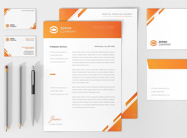
Maintaining brand consistency across all your presentation slides is crucial. It’s not just about slapping your logo on every page; it’s about creating a cohesive visual story that reflects your company’s identity. I’ve found that presentations with consistent branding see a 33% increase in client recognition [[3]]). That’s a significant boost!
To achieve this consistency, I make sure to use the same colors, fonts, and visual styles throughout my presentations. This doesn’t mean every slide looks identical, but there’s a clear visual thread tying everything together. It’s like creating a visual language that your audience can easily follow and understand.
Information Hierarchy
One of the most important aspects of presentation design is establishing a clear information hierarchy. This is all about guiding your audience’s attention to the most important elements first. I use techniques like varying font sizes, strategic use of color, and thoughtful placement of elements to create this hierarchy.
For example, I might use a larger font for key takeaways and a smaller font for supporting details. Or I’ll use contrasting colors to make certain elements pop. The goal is to make it easy for my audience to grasp the main points quickly, even if they’re just skimming the slides.
Remember, a well-designed presentation isn’t just about looking good; it’s about enhancing understanding and engagement. By focusing on visual communication, brand consistency, and information hierarchy, you can create presentations that not only look professional but also effectively convey your message and leave a lasting impression on your audience.
## How Designers Enhance Business Presentations
In the realm of business presentations, designers play a crucial role in transforming ordinary content into visually impactful experiences that leave a lasting impression. As a presentation designer, I’ve seen firsthand how our expertise can elevate the quality and effectiveness of business presentations.
Simplifying Complex Data
One of the most significant ways designers enhance business presentations is by simplifying complex data. In today’s information-rich environment, it’s easy to get overwhelmed by the sheer volume of data. That’s where we come in. We use our skills to present data in an organized and well-described format that doesn’t look overwhelming.
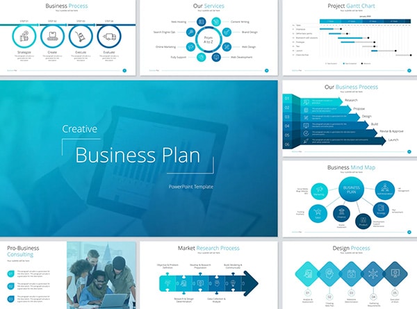
A good data visualization makes massive data digestible and simpler to grasp. We utilize charts, tables, graphs, and other simple ways to visualize information. For instance, we might use bright graphics to help convey key points or simplify big numbers by using ‘K’ or ‘M’ for thousands or millions.
Creating Engaging Visuals
Designers are experts in creating visually engaging materials that can result in better retention of information and increased interest. We cherry-pick high-quality images, graphics, charts, and videos that not only look good but also align with the message’s vibe.
Each visual in a presentation should have a purpose – they’re not just there for decoration. We employ design principles like contrast, alignment, and proximity to make key information stand out. By playing around with fonts, colors, and placement, we ensure that the audience can’t miss the important stuff.
Optimizing for Different Platforms
Optimizing content for distribution across multiple platforms is crucial. What works well on YouTube might not automatically translate to TikTok. Even within platforms, there are different format options, like YouTube shorts vs. regular videos, or Instagram posts vs. stories.
As designers, we consider how to transpose from one platform and format to another. We always keep in mind the types of screens on which the audience will watch the videos. For instance, if we’re creating a presentation for a website, we might stick to the typical 16×9 widescreen aspect ratio to ensure it’s indexed and visible in a Google search.
For platforms like TikTok or Instagram Stories, we adapt the content to fit the 9×16 vertical format, ensuring that the core message is still effectively conveyed. This might involve creative cropping or adding graphical elements to make the presentation work within platforms it wasn’t explicitly shot for.
By focusing on these areas, presentation designers can significantly enhance the impact of business presentations, making them more engaging, memorable, and effective across various platforms.
Key Design Principles for Effective Presentations
I’ve learned that effective presentation design isn’t just about making things look pretty. It’s about communicating your message in the most impactful way possible. Let’s dive into some key design principles that can take your business presentations to the next level.
Color Theory
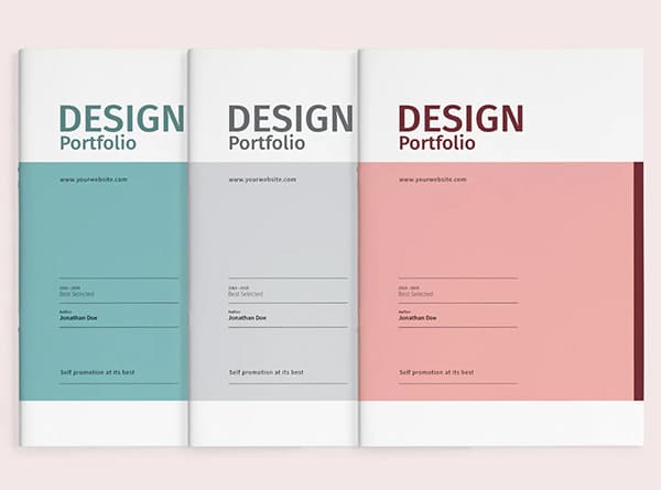
Color is a powerful tool in presentation design. It can evoke emotions, guide attention, and reinforce your brand identity. When I’m working on a presentation, I always consider the psychological impact of colors. For instance, blue often conveys trust and professionalism, making it a great choice for corporate presentations. Green, on the other hand, can represent growth and stability, which works well for presentations on business development.
I’ve found that using a monochromatic color scheme can be incredibly effective. It creates a cohesive look and allows me to highlight important information by using different shades and tints of the same color. However, if I want to create more visual interest, I might opt for a complementary color scheme, using colors opposite each other on the color wheel. This approach is particularly useful for sales presentations, where I want key points to stand out.
Typography
Typography is another crucial element in presentation design. The right font can make your message clear and engaging, while the wrong one can leave your audience struggling to read your slides. I always stick to sans-serif fonts for the main text in my presentations. They’re clean, modern, and easy to read on screens.
When it comes to font size, bigger is usually better. I make sure my titles are at least 28 to 48 points, and body text is no smaller than 24 points. This ensures that even people at the back of the room can read your slides comfortably.
Layout and White Space
One of the most common mistakes I see in presentations is cramming too much information onto each slide. Remember, white space (or negative space) is your friend. It helps guide the eye, creates visual hierarchy, and makes your content more digestible.
I always aim to keep my slides simple and uncluttered. A good rule of thumb is to stick to no more than 2-3 sentences per slide, or 6 bullet points maximum. This approach not only makes your slides look cleaner but also helps your audience focus on the key points you’re making.
By applying these design principles, you can create business presentations that not only look professional but also effectively communicate your message. Remember, the goal is to support and enhance your content, not overshadow it. With practice, you’ll find the right balance that works for you and your audience.
## Measuring the Impact of Well-Designed Presentations
As a presentation designer, I’ve learned that measuring the impact of business presentations is crucial to refine our approach and demonstrate value. Let’s dive into some key metrics that can help us gage the effectiveness of our presentations.
Audience Engagement Metrics
To understand how well our presentations resonate, we need to look at audience engagement. This goes beyond just counting heads in the room. We want to see how actively people are participating. For instance, response rates for live polls and Q&As can give us insights into how much the audience is contributing to the discussion [[1]].
Another important metric is session watch duration. This tells us how long people actually watched the presentation, measured in minutes and seconds. It’s a great indicator of how captivating our content is [[2]].
We can also track chat activity. The number of chats per session can show us which topics are sparking the most interest and discussion among attendees [[2]].
Information Retention
Now, let’s talk about how much information our audience actually retains. This is where the rubber meets the road in terms of presentation effectiveness.
Studies have shown that after just 10 minutes of a presentation ending, only 50% of the audience will remember what was said. A day later, that number drops to 25%, and by the end of the week, it’s hovering around 10% [[3]].
To combat this, we need to focus on creating memorable moments in our presentations. This could be a catchy headline, a powerful quote, or a striking image. The goal is to have at least one key piece of information stick with the audience long after the presentation ends [[3]].
Brand Perception
Finally, let’s consider how our presentations affect brand perception. A well-designed presentation can do wonders for how people view our brand.
One way to measure this is through post-presentation surveys. We can ask attendees about their perception of our brand before and after the presentation to see if there’s been a shift .
We can also look at social media engagement. If people are sharing quotes or images from our presentation on social channels, that’s a good sign that our message is resonating and potentially improving brand perception [[4]].
Remember, the ultimate goal of our business presentations is to move people to action. Whether that’s learning a new skill, adopting a new approach, or changing a behavior, we want to see tangible results from our efforts [[4]]
By focusing on these key areas – audience engagement, information retention, and brand perception – we can get a clearer picture of how our presentations are performing and where we can improve. It’s all about continuous refinement to create presentations that not only look good but also deliver real results.
Conclusion
The impact of well-designed business presentations, including design PowerPoint decks, extends far beyond the meeting room. They play a key role in shaping perceptions, driving decisions, and fostering engagement. From simplifying complex data to creating visually striking materials, designers have a significant influence on how information is received and remembered. By focusing on visual communication, brand consistency, and information hierarchy, presentations can become powerful tools to convey messages effectively.
As businesses continue to rely on presentations to communicate ideas and strategies, the role of designers becomes increasingly crucial. Their expertise in color theory, typography, and layout can transform ordinary content into compelling visual stories. To consider the effectiveness of these presentations, it’s essential to look at metrics such as audience engagement, information retention, and brand perception. Get in touch with us today and schedule your complimentary 15-min consult to explore how professional presentation design can enhance your business communication.
## References
[1] – https://blog.bit.ai/business-presentation/
[2] – https://smallbusiness.chron.com/benefits-presentations-business-professional-settings-72176.html
[3] – https://www.magicslides.app/blog/effective-presentation-importance
[4] – https://www.koad.com/post/what-is-presentation-designer-everything-you-need-to-know


