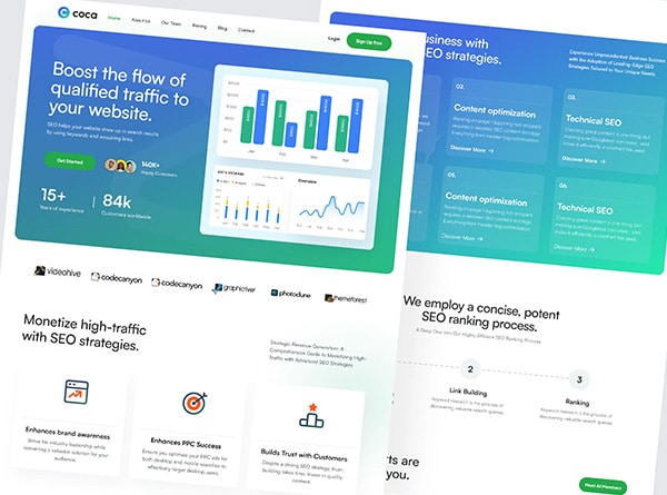
Web design is one of the most important things to work on in order to gain an audience. It is known that it only takes a few seconds for people to get a feel for your website/blog when they arrive at it.
Whether we like it or not, stay or go – that’s all that comes with the first impression. So bad design has a direct impact on lower search engine rankings. This is also the number one reason why promoting a website will not be enough. In this article, you will learn how to choose a theme by following web design trends.
The best tips on how to design a blog
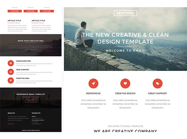
Nowadays, many internet users use ready-made templates to create any kind of website. On the web, you can find tons of Word Press templates for all tastes. The question is how to choose the right Word Press theme for your blog.
The solution to this problem must therefore be approached in a very responsible manner. To avoid mistakes, I suggest you follow these few tips that will follow.
As an example, I have provided beautiful blogs found on the Web design Inspiration site and Word Press themes that are ready to use.
Decide on the specifics of your site
Ignoring site specifics is one of the most common mistakes. But each site has its own specialties.
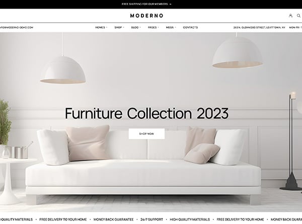
If it is an online store, the focus should be on the products and the general context should not detract from the choice.
The Buy or Order button should be in front of the visitor, and the quality of the images should always be the best. As for the blog, there are other requirements.
The design of the site should make a good impression, attract visitors and be useful with its articles and topics.
When choosing a template for your website, you should be aware of the specialization of the website. Therefore, models must be selected with care so that their use is appropriate.
No matter how good the template you choose, if it is not appropriate in that niche market, you should not use it for your site.
Don’t forget the parallax effect on your site
The parallax effect was previously hardly used in the design of web resources. But in the age of progressiveness, when VR technologies have already started to show their full potential, not using parallax on site is like a crime. It is not an absolute necessity, however!
This feature makes it possible to animate the background and the main elements at different speeds.
It will be a real plus for trendy website designs. Make sure every visitor pays attention and sees this effect as an integrated and dynamic part of your site
Geometric shapes and patterns
This trend is relatively recent. It was born in 2016, was developed in 2017, and will continue to gain popularity in 2020. Mixing various geometric shapes can give excellent results.
The right selection of patterns and shapes will help to create a holistic and attractive composition highly appreciated by the surfer. And, although 2D technology is gradually losing ground, giving way to 3D, these techniques can significantly refresh the concept of design, making it modern and very interesting.
Pay attention to reviews and support
I already mentioned that finding online templates to create a site is not a big deal today. However, it should be remembered that not all themes are technically advanced which means that they are not of high quality (premium themes).
There are a lot of shoddy products online. Therefore, pay attention to the developers if you want to have a functional site. Get feedback from other customers on product quality and technical support from creators. It will also help you choose the best theme.
And one more thing. Even the best themes can have one or the other downside, so developer support will be beneficial.
Full screen video in web design
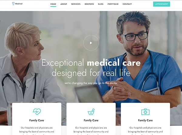
Background videos make the design of a website unusual, modern, which increases visitor engagement and blog traffic. Second, the video can show relevant information. In this case, the user will not need to scroll down the page to find the information of interest.
By the way, video can be a great addition to a Flat design. Use it as a screen saver and it will complement the design with a new image like the “National Geographic” site does.
A good web design is easy to use
Web design should structure the content of a page in a meaningful way and make it easier for visitors to navigate. You can usually find the logo at the top left corner of the page and the navigation menu at the top of the page. Think about the waterline, which is what the visitor sees before scrolling through the website.
