To stay ahead of the competition, it is imperative that you move your current website onto a mobile platform where online viewers can read your site easily.
The Need for Convenience
People today are pressed for time, and the easiest way to fill it is to use their mobile devices to do their online website searches while on the go. You will find people using their phones or tablets everywhere- in coffee shops, book stores, on the subway, and even while walking to work. People need convenience and as a result, they use their free time conducting business online, researching the latest trend, or connecting with friends and colleagues.
What is the Solution?
So what is the answer for this? How can people easily view websites on their various smartphones or tablets when they come in all shapes and sizes? How do you have a website that fits and reads nicely on these? And what about speed- the time it takes to load these websites onto these various platforms?
Your Website is Designed in “Capsules”
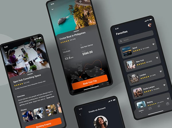
So what is the solution? It is called mobile responsive design. This is where your website is designed in ” capsules” so that all the content within your website floats around to adjust and fit onto your browsing screen size. So if you are on a mobile smartphone, you can easily view the images and words without scrolling left or right, the navigation menu will collapse into a nice and clean window, and you do not have to zoom in to read. If you are on a tablet, the whole website shows up on the screen and fits accordingly. Basically the capsules that hold the content scale themselves correctly depending on which device you use. This is brilliant, and allows for anyone anywhere to view your website correctly.
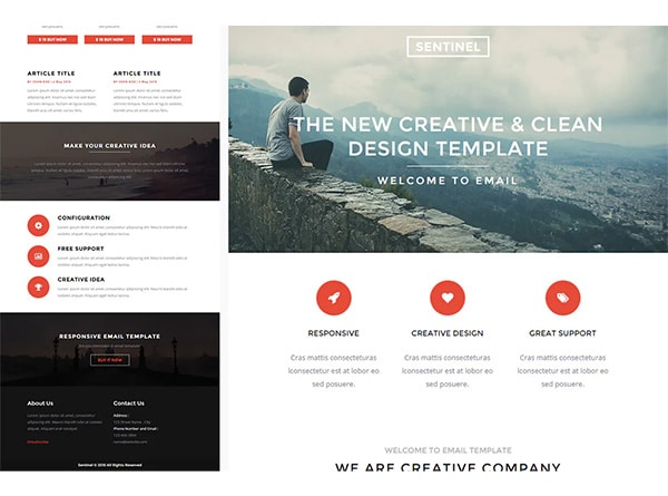
What Mobile Responsive Design Looks Like

Mobile Responsive Websites
If you company does not have a “mobile responsive” website, then you will lose potential viewers fast! Mobile responsive website design has been around for while, but just recently it has taken priority as the number on online mobile users is on the rise. Today almost everyone has a smartphone or tablet, so it is important that companies ensure their websites are mobile responsive. If you need to update your website onto this new platform, or would like a redesign on this platform, we can easily help. Contact us today.
How Do Search Engines Perceive Mobile Responsive Websites?
So how does mobile responsive design play into the search engines like Yahoo, Bing, MSN or Google? Well just recently Google has been “rewarding” Mobile Responsive Websites…but how? Google now places a “mobile-friendly” tag next to your company name on the mobile browsers, letting all users know they can count on your website to display correctly.
To Conclude
Today if your business or personal website is not mobile responsive, you will your viewers fast. No one likes to fiddle around with websites, and to stay ahead of the game, make the switch today.


