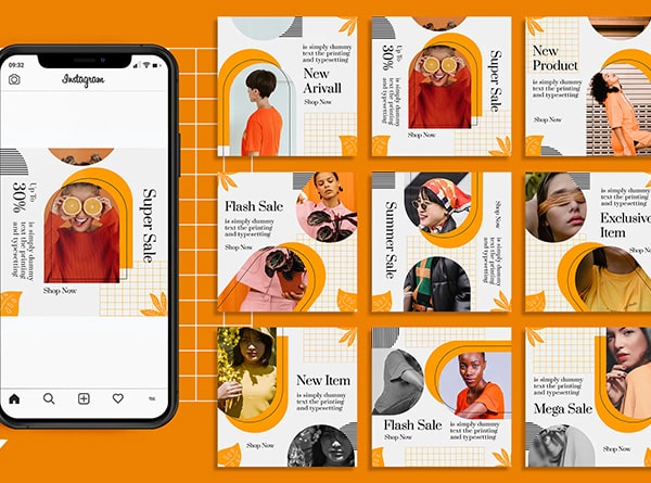
The age-old question of print versus digital continues to perplex entrepreneurs and marketing mavens alike. Picture this: you’re at the helm of a burgeoning startup, ready to make waves in your industry. But here’s the million-dollar question – should you invest in eye-catching brochures that potential clients can hold in their hands, or focus on creating scroll-stopping social media graphics that light up screens across the globe?
It’s not just about choosing between paper and pixels, folks. It’s about understanding the nuances of each medium and how they can amplify your brand’s voice in a crowded marketplace. So, grab your favorite beverage, settle into your comfiest chair, and let’s embark on a journey through the colorful world of graphic design services. By the end of this article, you’ll be armed with the knowledge to make an informed decision that aligns perfectly with your business goals and target audience. Ready to dive in? Let’s get this design party started!
The Fundamentals of Graphic Design
Ah, graphic design – the art of visual storytelling that can make or break a brand’s identity. It’s like the secret sauce in your grandmother’s legendary recipe; you might not always notice it, but boy, does it make a difference! At its core, graphic design is all about communication. It’s the clever use of visual elements, typography, and imagery to convey a message or idea that resonates with your audience.
Think of it as the visual voice of your brand. Just as you wouldn’t show up to a black-tie event in flip-flops (unless you’re a Silicon Valley mogul, perhaps), your brand’s visual elements need to be dressed appropriately for the occasion. This is where the magic of graphic design comes into play.
The Building Blocks of Visual Communication
Let’s break it down, shall we? Graphic design isn’t just about making things look pretty (though that’s certainly a perk). It’s a carefully orchestrated symphony of elements that work together to create a harmonious visual experience. Here are the key players in this visual orchestra:
- Color: The mood-setter of the design world. Colors can evoke emotions, create associations, and even influence purchasing decisions. Ever wondered why so many fast-food chains use red and yellow? It’s not just because they look good together!
- Typography: The unsung hero of graphic design. The right font can whisper elegance or shout excitement. It’s not just about what you say, but how you say it – visually.
- Layout: Think of this as the choreography of your design elements. A well-planned layout guides the viewer’s eye and ensures your message is delivered in the right order.
- Imagery: Whether it’s photographs, illustrations, or icons, visual elements can convey complex ideas in an instant. A picture is worth a thousand words, after all!
- White Space: Don’t underestimate the power of nothing! Strategic use of white space can create focus, balance, and a sense of sophistication.
The Role of Graphic Design in Business
Now, you might be thinking, “That’s all well and good, but how does this help my bottom line?” Excellent question, dear reader! Graphic design isn’t just about making things look pretty (though that’s certainly a bonus). It’s a powerful tool that can:
- Build brand recognition and loyalty
- Communicate complex information quickly and effectively
- Differentiate your business from competitors
- Increase perceived value of your products or services
- Enhance user experience across various touchpoints
In essence, good graphic design is like a well-tailored suit for your business – it makes you look good, feel confident, and stand out in a crowd. Whether you’re crafting a brochure design that tells your brand story or creating social media graphics that stop thumbs mid-scroll, graphic design is the silent salesperson working 24/7 to elevate your brand.
The Print Design Landscape
Ah, the tactile world of print design – where ink meets paper and magic happens. There’s something undeniably satisfying about holding a beautifully crafted piece of print marketing collateral in your hands. It’s like the difference between receiving a handwritten letter and an email; both convey information, but one just feels more special, doesn’t it?
Print design encompasses a wide array of materials, from business cards that make a lasting first impression to billboards that catch the eye of commuters. Let’s dive into the world of print and explore why it still holds a special place in the hearts of marketers and consumers alike.
The Enduring Appeal of Print
In an increasingly digital world, you might wonder if print still has a place. The answer is a resounding yes! Here’s why:
- Tangibility: There’s a psychological impact to physically holding something. It creates a connection that digital simply can’t replicate.
- Credibility: Studies have shown that people tend to trust print media more than digital. It’s perceived as more “real” and less ephemeral.
- Longevity: A well-designed brochure can sit on a coffee table for months, continuously reminding potential clients of your brand.
- Targeted Reach: Print allows for highly targeted distribution, ensuring your message reaches the right audience.
- Less Competition: With the digital space becoming increasingly crowded, print offers a way to stand out from the noise.
Types of Print Design Services
The world of marketing collateral is vast and varied. Here are some key players in the print design game:
- Brochure Design: The workhorse of print marketing. A well-designed brochure can tell your brand story, showcase products, and provide valuable information in a compact, portable format.
- Business Cards: Your pocket-sized brand ambassador. In a world of digital connections, a memorable business card can make a lasting impression.
- Packaging Design: The unboxing experience can be a powerful marketing tool. Think about the joy of opening an Apple product – that’s the power of great packaging design.
- Posters and Banners: From trade show displays to in-store promotions, large format printing can make a big impact.
- Direct Mail: Yes, it’s still a thing! A cleverly designed mailer can cut through the digital clutter and land right in your target audience’s hands.
The Technical Side of Print Design
Creating stunning print designs isn’t just about creativity – it’s also about understanding the technical aspects of the print process. Here are some key considerations:
- Color Modes: Print design uses the CMYK color mode, which can produce different results than what you see on screen (which uses RGB).
- Resolution: Print requires higher resolution images (typically 300 DPI) to ensure crisp, clear results.
- Bleed and Trim: Designers need to account for the edges of printed materials, extending designs beyond the final cut line to avoid white edges.
- Paper Stock: The choice of paper can significantly impact the final look and feel of your printed piece.
- Printing Techniques: From embossing to foil stamping, various printing techniques can add a touch of luxury to your materials.
Understanding these technical aspects is crucial for creating print designs that look as good in real life as they do on screen. It’s like baking – you need to understand the science to create something truly delicious!
The Digital Design Revolution
Welcome to the fast-paced, ever-evolving world of digital content creation! If print design is a carefully choreographed waltz, digital design is more like a freestyle dance battle – dynamic, responsive, and always ready to adapt to the latest trends. In this digital age, your online presence is often the first (and sometimes only) impression you make on potential customers. So, let’s dive into the pixels and explore the exciting realm of digital design services.
The Power of Digital Design
Digital design isn’t just about making things look good on screens (although that’s certainly part of it). It’s about creating immersive, interactive experiences that engage users and drive action. Here’s why digital design is such a game-changer:
- Interactivity: Digital designs can respond to user actions, creating a more engaging experience.
- Measurability: Analytics tools allow you to track user behavior and optimize your designs for better performance.
- Flexibility: Digital designs can be updated quickly and easily, allowing for real-time adjustments and A/B testing.
- Accessibility: Your digital designs can reach a global audience, 24/7.
- Cost-Effectiveness: While initial setup costs can be significant, digital distribution is often more cost-effective in the long run.
Types of Digital Design Services
The digital design landscape is vast and varied. Here are some key areas where digital design can make a big impact:
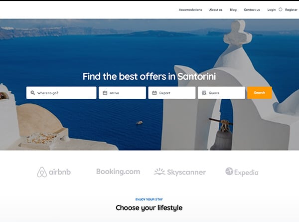
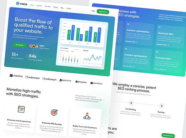
- Website Design: Your digital storefront. A well-designed website can attract, engage, and convert visitors into customers.
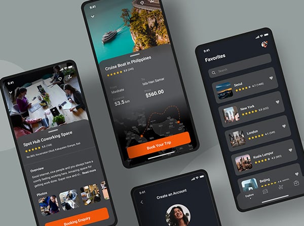
- User Interface (UI) Design: The art of making digital products intuitive and enjoyable to use. Good UI design can significantly improve user satisfaction and retention.
- Social Media Graphics: In the scrolling world of social media, eye-catching graphics are essential for stopping thumbs and capturing attention.
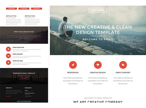
- Email Marketing Design: Despite rumors of its demise, email marketing is still going strong. Well-designed emails can boost open rates and drive conversions.
- Digital Advertising: From banner ads to interactive rich media, digital advertising offers endless creative possibilities.
- Logo Design Services: Simplistic to complex, the choices are endless.
The Technical Side of Digital Design
Creating effective digital designs requires a unique set of skills and considerations. Here are some key technical aspects to keep in mind:
- Responsive Design: With users accessing content on a variety of devices, designs need to adapt seamlessly to different screen sizes.
- File Formats: Different digital platforms require different file formats. Understanding when to use JPEGs, PNGs, SVGs, and other formats is crucial.
- Color Modes: Digital designs use the RGB color mode, which can produce vibrant colors not achievable in print.
- Loading Speed: In the digital world, speed is king. Designs need to be optimized for quick loading without sacrificing quality.
- Accessibility: Digital designs should be accessible to all users, including those with disabilities. This includes considerations like color contrast and text alternatives for images.
Understanding these technical aspects is crucial for creating digital designs that not only look great but also perform well across various platforms and devices. It’s like being a digital architect – you need to understand both the aesthetics and the engineering to create something truly remarkable.
Color Theory in Print vs Digital
Ah, color – the secret language of design that speaks directly to our emotions and subconscious. Whether you’re crafting a brochure design or creating social media graphics, understanding color theory is crucial. But here’s the kicker: colors behave differently in print and digital realms. It’s like twins with distinct personalities – same DNA, different vibes. Let’s dive into this colorful conundrum and explore how to master the art of color in both print and digital design.
The Color Conundrum: CMYK vs RGB
First things first, let’s talk about the technical stuff. In the world of color, we have two main players:
- CMYK (Cyan, Magenta, Yellow, Key/Black): This is the go-to color model for print design. It’s a subtractive color model, meaning it starts with white and gets darker as you add colors.
- RGB (Red, Green, Blue): This is the color model of the digital world. It’s an additive color model, starting with black and getting lighter as you add colors.
Here’s the catch: what you see on your screen (RGB) might not be exactly what you get in print (CMYK). It’s like ordering clothes online – sometimes the color looks different when it arrives!
Color Psychology: Print vs Digital
Colors can evoke emotions and influence behavior, but their impact can vary between print and digital mediums:
- Print: Colors in print tend to be more muted and have a softer impact. They’re often perceived as more trustworthy and professional.
- Digital: Colors on screen can be more vibrant and have a more immediate impact. They’re great for grabbing attention but can sometimes appear less sophisticated if not used carefully.
Practical Tips for Color Use
Now that we’ve covered the basics, let’s look at some practical tips for using color effectively in both print and digital design:
- For Print:
- Use a limited color palette to keep printing costs down
- Consider the paper stock – colors can look different on glossy vs matte finishes
- Always do a test print to check color accuracy
- For Digital:
- Use web-safe colors to ensure consistency across different devices
- Take advantage of the wider color gamut to create vibrant designs
- Consider how colors will look on both light and dark modes
Remember, whether you’re designing marketing collateral for print or creating digital content, color is your secret weapon. Use it wisely, and you’ll create designs that not only look great but also resonate with your audience on a deeper level.
Typography: From Paper to Pixels
Typography – the unsung hero of design that can make or break your visual communication. Whether you’re crafting a sleek brochure design or creating eye-catching social media graphics, the right typography can elevate your message from mundane to magnificent. But here’s the twist: typography behaves differently in print and digital realms. It’s like comparing a handwritten love letter to a text message – same sentiment, different delivery. Let’s dive into the world of fonts and explore how to master typography in both print and digital design.
The Font Fundamentals: Print vs Digital
First, let’s break down the key differences between print and digital typography:
- Print Typography:
- Higher resolution allows for more intricate font designs
- Serif fonts are often preferred for body text due to better readability
- Font size is measured in points (pt)
- Digital Typography:
- Lower screen resolution can affect the clarity of intricate fonts
- Sans-serif fonts are often preferred for better on-screen readability
- Font size is typically measured in pixels (px)
Choosing the Right Fonts
Selecting the perfect font is like choosing the right outfit for an occasion – it needs to fit the purpose and look good doing it. Here are some tips:
- For Print:
- Consider the texture and weight of the paper
- Use serif fonts for body text in longer documents
- Experiment with decorative fonts for headlines, but use sparingly
- For Digital:
- Stick to web-safe fonts or use web font services for consistency across devices
- Use sans-serif fonts for body text to improve readability on screens
- Consider how fonts will render on different screen sizes and resolutions
Typography Trends and Techniques
Typography isn’t just about legibility – it’s also about style and personality. Here are some current trends and techniques to keep your designs fresh:
- Variable Fonts: These adaptable fonts can change weight, width, or other attributes without switching font files – perfect for responsive digital design.
- Kinetic Typography: Bringing text to life with animation is a great way to grab attention in digital media.
- Layered Fonts: Creating depth and dimension by layering different font styles or colors can add visual interest to both print and digital designs.
- Custom Typography: Creating unique, brand-specific fonts can set your marketing collateral apart in both print and digital realms.
Remember, whether you’re designing a brochure or creating social media content, typography is your voice in visual form. Choose wisely, and your message will not only be heard but felt.
Layout and Composition: Structuring Your Design
Alright, design enthusiasts, let’s talk about the backbone of any great visual – layout and composition. It’s like the secret recipe that turns a jumble of ingredients into a mouth-watering dish. Whether you’re whipping up a brochure design or crafting social media graphics, mastering layout and composition is key to creating designs that not only look good but also effectively communicate your message. So, let’s roll up our sleeves and dive into the world of grids, white space, and visual hierarchy!
The Grid System: Your Design’s Best Friend
Think of the grid system as the invisible scaffolding that holds your design together. It’s like the lines on a sheet of music – you might not see them in the final performance, but they’re crucial for creating harmony. Here’s why grids are so important:
- Structure: Grids provide a framework for organizing content, ensuring your design feels cohesive and balanced.
- Consistency: Using a grid system helps maintain consistency across different pages or screens, creating a unified look for your marketing collateral.
- Flexibility: Grids can be adapted for both print and digital designs, making it easier to create responsive layouts for various screen sizes.
White Space: The Power of Nothing
Ah, white space – the unsung hero of design. Also known as negative space, it’s the empty area between and around elements in your design. Here’s why it’s so crucial:
- Readability: Proper use of white space improves readability by giving the eyes a place to rest.
- Focus: Strategic use of white space can draw attention to key elements in your design.
- Sophistication: Ample white space can create a sense of luxury and sophistication in your designs.
Remember, white space isn’t always white – it’s simply the empty space in your design, regardless of color.
Visual Hierarchy: Guiding the Eye
Visual hierarchy is all about guiding your audience’s eye through your design in a specific order. It’s like being a tour guide for your viewer’s attention. Here are some key techniques:
- Size and Scale: Larger elements naturally draw attention first.
- Color and Contrast: Bright colors and high contrast can make elements stand out.
- Positioning: Elements at the top or center of a design tend to get noticed first.
- Repetition: Repeating elements can create a sense of rhythm and guide the eye through the design.
Print vs Digital: Layout Considerations
While many principles of layout and composition apply to both print and digital design, there are some key differences to keep in mind:
- Print Layout:
- Fixed dimensions require careful planning of content placement
- Consider how the design will look when the brochure or document is folded
- Think about how the design will be viewed (e.g., held in hand, displayed on a wall)
- Digital Layout:
- Responsive design is crucial for adapting to different screen sizes
- Consider scrolling behavior and “above the fold” content
- Interactive elements can guide users through the content
Whether you’re creating a brochure design or social media graphics, mastering layout and composition is like conducting an orchestra – every element has its place, and when they all work together, the result is harmonious and impactful.
The Impact of Texture and Material
Let’s get tactile, folks! In the world of design, it’s not just about what meets the eye – it’s also about what meets the fingertips. Texture and material play a crucial role in both print and digital design, albeit in different ways. It’s like the difference between a velvet painting and a high-definition screen – both can be beautiful, but they engage our senses differently. So, let’s dive into the world of textures and materials and explore how they can elevate your design game!
The Tangible World of Print
In print design, texture and material are not just visual elements – they’re physical experiences. Here’s how they can make your marketing collateral stand out:
- Paper Stock: The choice of paper can dramatically affect the look and feel of your print materials. From glossy magazine-style paper to textured, handmade sheets, each type creates a unique impression.
- Embossing and Debossing: These techniques add a 3D element to your design, creating raised or recessed areas that beg to be touched.
- Foil Stamping: Adding metallic or pigmented foil can create a luxurious, eye-catching effect.
- Spot UV: This technique adds a glossy, raised effect to specific areas of your design, creating contrast and depth.
- Die Cutting: Custom-shaped materials can make your brochure design or business card truly unique and memorable.
The Virtual Texture of Digital Design
In the digital realm, we can’t physically touch the design, but we can create the illusion of texture. Here’s how:
- Visual Texture: Using images or patterns that mimic real-world textures can add depth and interest to your digital designs.
- Shadows and Highlights: Clever use of shadows and highlights can create the illusion of 3D elements on a flat screen.
- Parallax Scrolling: This technique creates a sense of depth by moving background images slower than foreground images.
- Micro-interactions: Small animations triggered by user actions can add a tactile feel to digital interfaces.
The Psychology of Texture
Texture isn’t just about aesthetics – it can also influence how people perceive your brand:
- Luxury and Quality: Smooth, glossy textures often convey a sense of luxury and high quality.
- Authenticity and Warmth: Rough, natural textures can create a sense of authenticity and warmth.
- Modernity and Tech: Sleek, minimalist textures are often associated with modern, tech-savvy brands.
- Playfulness and Creativity: Bold, unconventional textures can convey a sense of playfulness and creativity.
Bridging the Gap: Texture in Print and Digital
While print and digital designs have different texture capabilities, there are ways to create a cohesive brand experience across both mediums:
- Consistent Visual Language: Use similar visual textures in both print and digital designs to create a unified brand feel.
- Translating Physical to Digital: If you have a textured logo or design element in print, consider how it can be represented digitally through shadows, highlights, or animations.
- QR Codes and Augmented Reality: Use these technologies to bridge the gap between print and digital, allowing users to experience digital textures through their physical marketing materials.
Remember, whether you’re designing a brochure or creating social media graphics, texture and material can add that extra layer of sensory appeal that makes your design truly memorable. It’s like adding seasoning to a dish – when done right, it enhances the entire experience without overpowering the main ingredients.
Accessibility in Print and Digital Design
Alright, let’s talk about a topic that’s close to my heart – accessibility in design. It’s not just about making things look pretty; it’s about making sure everyone can engage with your content, regardless of their abilities. Whether you’re crafting a brochure design or creating social media graphics, accessibility should be at the forefront of your mind. It’s like building a house with ramps and elevators alongside the stairs – you’re making sure everyone can come in and enjoy the party!
The Importance of Accessible Design
Accessible design isn’t just a nice-to-have; it’s a must-have. Here’s why:
- Inclusivity: It ensures that your message reaches the widest possible audience, including people with disabilities.
- Legal Compliance: Many countries have laws requiring digital content to be accessible.
- SEO Benefits: Many accessibility practices also improve your search engine rankings.
- Better User Experience: Accessible design often leads to better usability for all users, not just those with disabilities.
Accessibility in Print Design
Print design has its own set of accessibility considerations. Here are some key points to keep in mind:
- Color Contrast: Ensure there’s sufficient contrast between text and background colors for readability.
- Font Size and Style: Use clear, legible fonts and appropriate font sizes.
- Alternative Formats: Consider providing your print materials in alternative formats like large print or braille.
- Paper Choice: Matte paper can reduce glare, making it easier for some people to read.
- Clear Layout: Use a logical, easy-to-follow layout with clear headings and subheadings.
Accessibility in Digital Design
Digital design offers unique opportunities and challenges for accessibility. Here’s what to consider:
- Screen Reader Compatibility: Ensure your digital content can be read by screen reading software.
- Keyboard Navigation: Make sure all interactive elements can be accessed using a keyboard alone.
- Alt Text for Images: Provide descriptive alternative text for images.
- Captions and Transcripts: Include captions for videos and transcripts for audio content.
- Responsive Design: Ensure your design works well on different devices and screen sizes.
Tools and Techniques for Accessible Design
Luckily, there are plenty of tools and techniques to help you create accessible designs:
- Color Contrast Checkers: Tools like WebAIM’s Contrast Checker can help ensure your color choices meet accessibility standards.
- Accessibility Plugins: Many design software packages offer accessibility plugins or built-in checkers.
- User Testing: Nothing beats testing your designs with actual users who have disabilities.
- WCAG Guidelines: The Web Content Accessibility Guidelines provide a comprehensive framework for digital accessibility.
The Future of Accessible Design
As technology evolves, so do the possibilities for accessible design:
- AI and Machine Learning: These technologies are making it easier to automatically generate alt text and captions.
- Voice Interfaces: The rise of voice-controlled devices is opening up new avenues for accessible interaction.
- Haptic Feedback: This technology could provide new ways for users to interact with digital content through touch.
Remember, accessible design isn’t about limiting your creativity – it’s about expanding your audience and improving the user experience for everyone. Whether you’re designing marketing collateral or creating digital content, accessibility should be an integral part of your design process. It’s like adding a secret ingredient that makes your design not just look good, but feel good for everyone who interacts with it.
Measuring Success: Analytics and Metrics
Alright, data enthusiasts, let’s dive into the world of numbers and insights! Measuring the success of your design efforts is crucial, whether you’re distributing a beautifully crafted brochure or launching a social media campaign. It’s like being a detective, but instead of solving crimes, you’re uncovering the mysteries of user engagement and conversion rates. So, grab your magnifying glass (or should I say, your analytics dashboard), and let’s explore how to measure success in both print and digital design!
The Importance of Measuring Design Success
Before we dive into the nitty-gritty, let’s talk about why measuring success is so crucial:
- ROI Justification: It helps you prove the value of your design efforts to stakeholders.
- Continuous Improvement: Data-driven insights allow you to refine and optimize your designs over time.
- Resource Allocation: Understanding what works helps you allocate your design resources more effectively.
- Customer Understanding: Analytics provide valuable insights into your audience’s preferences and behaviors.
Measuring Success in Print Design
Measuring the impact of print design can be tricky, but it’s not impossible. Here are some methods:
- QR Codes: Include unique QR codes in your print materials to track engagement.
- Unique URLs: Use specific landing pages or URLs for each print campaign.
- Coupon Codes: Include unique coupon codes in your print materials to track conversions.
- Surveys: Conduct customer surveys to gather feedback on your print materials.
- Sales Data: Track sales data before and after distributing print materials.
Metrics for Digital Design Success
Digital design offers a wealth of measurable data. Here are some key metrics to consider:
- Website Analytics:
- Page views and unique visitors
- Time on page and bounce rate
- Conversion rate
- Click-through rate (CTR)
- Social Media Metrics:
- Engagement rate (likes, comments, shares)
- Reach and impressions
- Follower growth
- Click-through rate on social media posts
- Email Marketing Metrics:
- Open rate
- Click-through rate
- Conversion rate
- Unsubscribe rate
Tools for Measuring Design Success
Fortunately, there are plenty of tools available to help you gather and analyze data:
- Google Analytics: The go-to tool for website analytics, offering a wealth of data on user behavior.
- Social Media Analytics: Most social media platforms offer built-in analytics tools.
- Heat Mapping Tools: Tools like Hotjar can show you exactly where users are clicking on your website.
- A/B Testing Tools: Platforms like Optimizely allow you to test different design variations.
- Email Marketing Platforms: Tools like Mailchimp offer comprehensive email analytics.
Interpreting and Acting on Data
Collecting data is only half the battle – the real value comes from interpreting and acting on it:
- Look for Patterns: Identify trends and patterns in your data over time.
- Compare Against Benchmarks: Use industry benchmarks to understand how your designs are performing relative to others.
- Test and Iterate: Use your insights to inform design changes, then test and measure the results.
- Tell a Story: Use data visualization techniques to present your findings in a compelling way.
Remember, measuring success isn’t about proving that every design is perfect – it’s about learning, improving, and creating designs that truly resonate with your audience. Whether you’re analyzing the performance of your brochure design or tracking engagement with your social media graphics, data is your friend. It’s like having a conversation with your audience, even when they’re not directly speaking to you. So, embrace the numbers, and let them guide you to design greatness!
Choosing the Right Design Service for Your Business
Alright, decision time! You’ve journeyed with me through the colorful worlds of print and digital design, and now it’s time to answer the burning question: which graphic design service is right for your business? It’s like standing at a crossroads, with brochure design beckoning from one path and social media graphics waving from another. But don’t worry, I’m here to be your trusty GPS, guiding you to the perfect design destination for your business needs.
Assessing Your Business Needs
Before we dive into the options, let’s take a moment to reflect on your business needs:
- Target Audience: Where does your audience hang out? Are they flipping through magazines or scrolling through Instagram?
- Business Goals: What are you trying to achieve? Brand awareness? Lead generation? Direct sales?
- Budget: What resources do you have available for design services?
- Timeline: How quickly do you need results?
- Brand Personality: Is your brand more traditional or cutting-edge?
When to Choose Print Design Services
Print design might be your best bet if:
- You’re targeting a local audience: Local businesses often benefit from tangible marketing materials.
- Your audience prefers physical media: Some industries and demographics still favor print.
- You’re attending trade shows or events: Nothing beats a well-designed brochure or business card for in-person networking.
- You want to create a premium feel: High-quality print materials can convey luxury and attention to detail.
- You need long-lasting marketing materials: A well-designed brochure can have a longer shelf life than a social media post.
When to Opt for Digital Design Services
Digital design might be the way to go if:
- You’re targeting a global audience: Digital content can reach people worldwide instantly.
- Your audience is tech-savvy: If your target market lives online, that’s where your design should be.
- You need real-time engagement: Digital designs allow for immediate interaction and feedback.
- You want to measure results quickly: Digital platforms offer robust analytics for tracking performance.
- You’re on a tight budget: Digital distribution can be more cost-effective than print runs.
The Power of Integrated Design Services
Here’s a secret: you don’t always have to choose between print and digital. Many businesses benefit from an integrated approach:
- Consistent Brand Identity: Use both print and digital design to create a cohesive brand experience across all touchpoints.
- Cross-Channel Campaigns: Launch campaigns that span both print and digital media for maximum reach.
- QR Codes and Augmented Reality: Bridge the gap between print and digital with interactive elements.
- Repurposing Content: Design assets that can be easily adapted for both print and digital use.
Choosing a Design Partner
Whether you’re leaning towards print, digital, or a mix of both, choosing the right design partner is crucial:
- Portfolio Review: Look for a designer or agency with experience in your preferred medium and industry.
- Communication Style: Choose a partner who understands your vision and communicates effectively.
- Technical Expertise: Ensure they have the skills to execute your chosen design approach.
- Scalability: Consider whether they can grow with your business as your needs evolve.
- Value-Added Services: Look for partners who offer strategy and consultation, not just design execution.
Remember, choosing the right design service isn’t about following trends – it’s about aligning with your business goals and connecting with your audience. Whether you end up with a stunning brochure design, eye-catching social media graphics, or a perfect blend of both, the key is to create designs that resonate with your audience and drive your business forward.
So, are you ready to make your choice? Whether you’re Team Print, Team Digital, or Team Both, remember that great design is about telling your brand’s story in the most compelling way possible. Now go forth and design your way to success!
Conclusion: Crafting Your Design Strategy
Well, folks, we’ve come to the end of our design adventure, but really, it’s just the beginning of yours! We’ve explored the vibrant worlds of print and digital design, from the tactile allure of brochure design to the instant gratification of social media graphics. We’ve delved into color theory, typography, layout, and even the nitty-gritty of analytics. But now comes the exciting part – crafting your own unique design strategy that will make your brand shine brighter than a disco ball at Studio 54!
The Power of Informed Decision-Making
Remember, there’s no one-size-fits-all solution in the world of design. Your perfect strategy might be all about print, all about digital, or a mix of both. The key is to make informed decisions based on:
- Your target audience’s preferences and behaviors
- Your business goals and objectives
- Your brand personality and values
- Your available resources and budget
Embracing Flexibility and Adaptability
In today’s fast-paced business world, flexibility is key.vv


