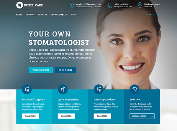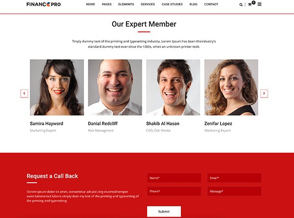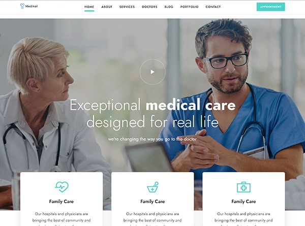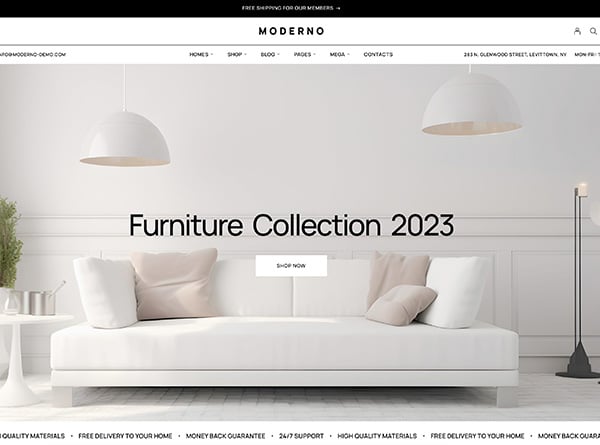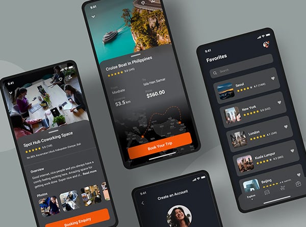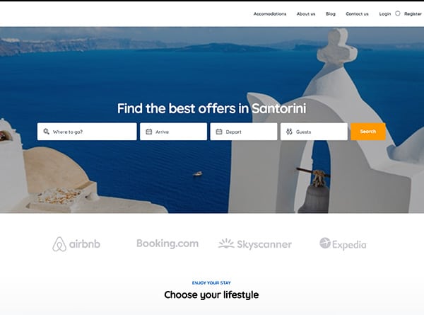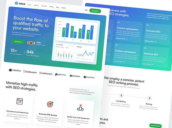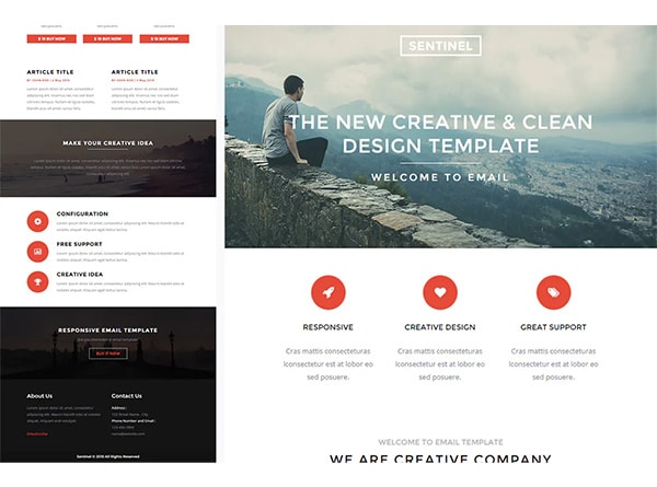
In a digital age, user experience is key. You only have a few seconds to capture your users before they move on, so it’s essential that you maximize your potential with a good website design. With the right tools and techniques, you can ensure that your website stands out from the competition and provides an unforgettable first impression for all of your viewers.
In this blog post, we will cover some tips and tricks for maximizing user experience in Orange County web design. From visuals to navigation, read on to learn how you can take advantage of the latest trends in web design and create an amazing user experience for every single one of your visitors.
1. Design a website layout that is organized and easy to use
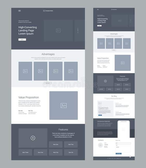
- First, it needs to be organized so that visitors can easily find the information they are looking for.
- Second, it needs to be easy to use so that visitors do not get frustrated and leave the site.
- Third, the layout should be visually appealing so that visitors will want to stay on the site.
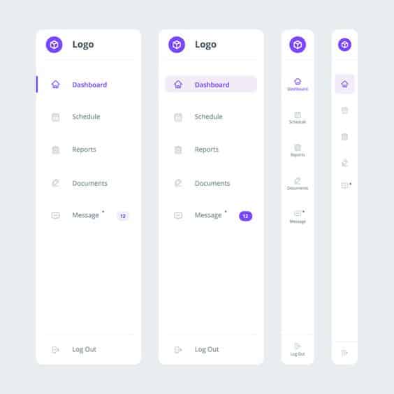
There are many ways to design a website layout that is organized and easy to use. One way is to use a simple layout with clearly defined sections. The home page should have a menu bar at the top that links to the different pages on the site. The content of each page should be laid out in an easily readable format with headlines and subheadings. Images and other visuals should be used sparingly so as not to clutter the page.
Another way to design a website layout is to use a grid system. This type of layout consists of rows and columns that contain content blocks. The grid system helps to organize the content on the page and makes it easy for visitors to find what they are looking for. It also allows for more complex layouts with multiple columns and sidebars.
No matter which method you choose, it is important to remember that simplicity is key when it comes to web design. Visitors should be able to understand your layout quickly and easily. If they have trouble navigating your site, they are likely to leave and never come back.
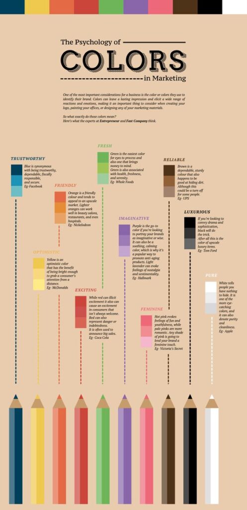
2. Choose colors, fonts, and images that are visually appealing.
3. Select an appropriate typography that is easy to read and comprehend.

- Use a sans-serif font. Sans-serif fonts are easier to read on screens, so they will be more user-friendly.
- Use a large font size. This will help users be able to read your content more easily.
- Use clear and concise text. Make sure your text is easy to read by using simple sentence structure and avoiding jargon.
By following these tips, you can ensure that your typography is user-friendly and easy to understand. This will create a better user experience for your visitors, leading to more conversions and higher satisfaction rates.
4. Ensure that navigation is intuitive and easy to use.
As a web design company in Orange County, we always make sure that our clients’ websites have intuitive and easy-to-use navigation. This is because we know that one of the most important aspects of a website is its ability to help users find what they are looking for quickly and easily.
There are a few key things that you can do to ensure that your website’s navigation is intuitive and easy to use.
- First, make sure that your menus are clear and organized.
- Second, use drop-down menus sparingly and only when absolutely necessary.
- Third, use breadcrumbs so that users can see where they are on your site at all times.
- Fourth, include a search box on every page of your website.
By following these simple tips, you can make sure that your website’s navigation is as user-friendly as possible. This will help to ensure that your visitors have a positive experience on your site and will want to come back again in the future.
5. Provide a seamless user journey from one page to the next.
It’s important to provide a seamless user journey from one page to the next when designing a website. This means creating a logical and easy-to-follow flow that takes the user from point A to point B in a way that makes sense.
There are a few things to keep in mind when doing this:
- Make sure the navigation is clear and easy to use. This is critical in helping users find their way around your site.
- Use consistent styling throughout the site. This will help create a cohesive look and feel, making it easier for users to move from one page to the next.
- Use calls to action (CTAs) wisely. CTAs should be used to guide users towards the next step in their journey, so make sure they’re placed logically and stand out enough to be noticed.
- Pay attention to loading times. Users won’t stay on a page if it takes too long to load, so make sure all your pages are optimized for fast loading times.
- Test your design before launch. Ask friends or family members to test out the design and journey flow before you go live with your site. This will help you catch any potential issues and make necessary changes before it’s too late.
- Add features such as breadcrumbs and search bars
Breadcrumbs and search bars are two essential features that can help improve the user experience on your website.
Breadcrumbs help users navigate your site by providing a trail of links to the pages they have visited.
Search bars allow users to quickly and easily find the information they are looking for on your site. Both of these features can be easily added to your website using Orange County web design services. - Test the website to ensure that it works correctly and meets user expectations.
When it comes to user experience, testing is essential to ensure that your website works correctly and meets user expectations.
There are a variety of ways to test your website, including using online tools, conducting user research, and monitoring web analytics.
To get started, you can use online tools like Google Page Speed Insights and Pingdom to test your website’s speed and performance.
You can also conduct user research by recruiting users to test your website and providing them with feedback forms. Finally, you can monitor web analytics to see how users are interacting with your website and identify any areas for improvement.
By testing your website regularly, you can ensure that it provides a positive experience for users and helps you achieve your business goals.
