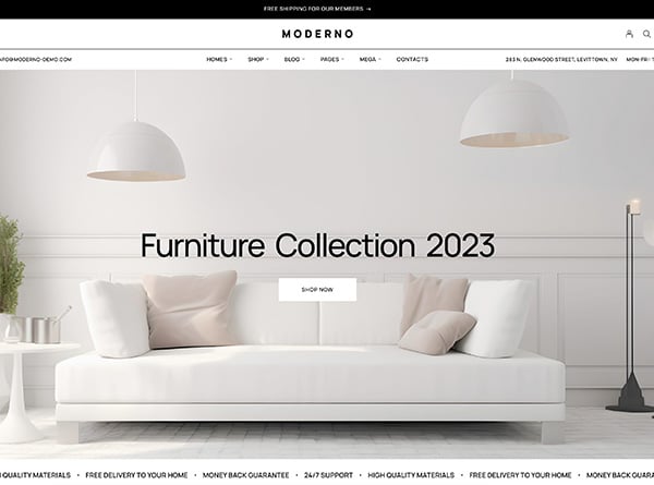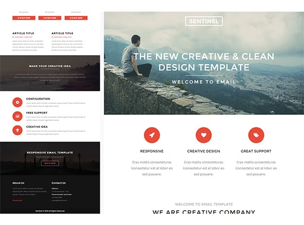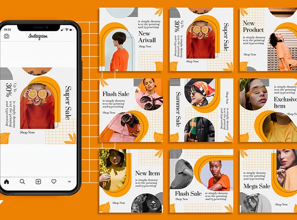
Have you ever heard someone say that there is something missing within your design? Your “design approach” whether print or web, is key to the final outcome. Some designs grab your attention in a positive way, while others tend to go unnoticed. Our Orange County graphic design team has put together a few tips on what you can do to give your design that extra “shine” that it is missing.
1. Images
Big beautiful images can help any design shine.
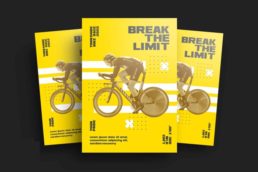
Providing the viewer with a striking image adds a visual element to your design that can be very intriguing. This technique is very common among graphic designers, but not every image will make your design effective. The image you choose has to say something about your product or service, and will grab the viewer’s attention to draw them in. Incorporating the right photo in the right place can make your design exciting and effective.
2. Type
You can say typeface is the mouthpiece of design.
Incorporating the right typeface on your design can really capture someone’s attention. Play around with different typefaces to see which one works best. Once you have chosen a type, play around with the size, color, thickness, and layout of your type until the type looks perfect. You will be surprised how much better your design will look once you have used the correct typeface.
3. Stroke
A striking design element is stroke.
A design can easily go from flat to finish by incorporating a stroke to some of the main shapes of the design. Play around with the colors and the weights of your strokes to give it more variety. This technique will add perspective to your design.
4. Shadow
Give your design elements depth.
Another great way to add depth and texture to your design is by using a shadow. This can add dimension to your design and make it more appealing. You want to make sure you are using shadows in natural areas. It is important to keep a balance between the darkness and lightness of the shadow or else it can look unnatural.
5. Gradient
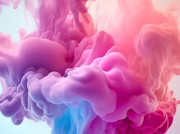
Used correctly, gradients can give life to your design.
While gradients can easily be overused, having the right gradient in the right place can add to the design. You can create unique color effects that can add dimension your design. A linear gradient, will give you a color change from top to bottom, or side to side. A radial gradient will give you a circular color change. Choosing the right color combinations and the right gradient pattern can make your design pop.
No matter what you add to your design, remember that everything you use must have a purpose. Do not add an element just because, use it because it will add value to your work. A simple clean design is the best design there is!
As a professional Orange County graphic design agency, our passion is to develop unique brands that stand out from the competition. We design across all platforms from Printed Media to KeyNote Presentations to Website Designs, and everything in-between. Call us today 949-200-6910 and let us help you make your business shine!
