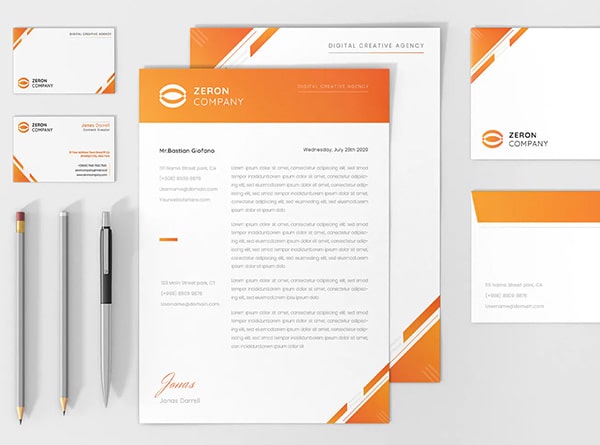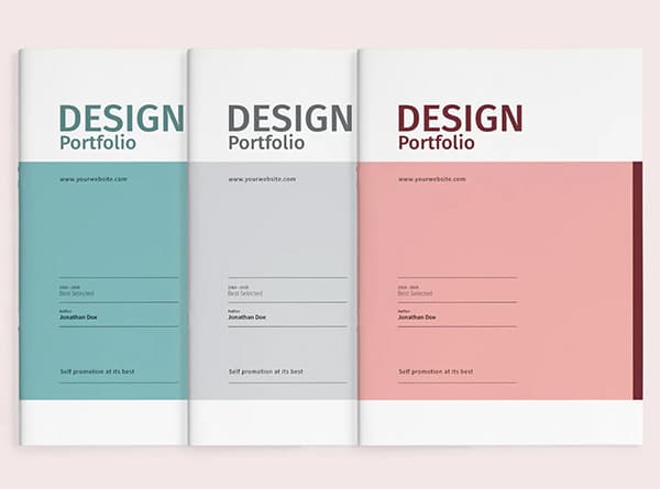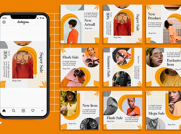
Let’s chat about social media graphics and how they can make your brand stand out from the crowd. As a digital design enthusiast, I’ve seen firsthand how the right visuals can have an influence on a company’s identity. Social media graphics aren’t just pretty pictures; they’re powerful tools that have an impact on how people perceive and connect with your brand.
In this article, I’ll walk you through the ins and outs of using social media graphics to build a rock-solid brand identity. We’ll explore how to define your visual style, create consistent graphics across platforms, and craft content that grabs attention. Plus, I’ll share some tips on measuring your success and fine-tuning your approach. Whether you’re a seasoned pro or just dipping your toes into the world of design, you’ll find something useful to take your brand to the next level.
Defining Your Brand’s Visual Identity
Alright, let’s chat about how to define your brand’s visual identity. This is where the fun begins! We’re going to dive into the nitty-gritty of choosing colors, picking fonts, and creating a logo that’ll make your brand stand out from the crowd.
Choosing Brand Colors
First up, let’s talk about color. It’s not just about picking your favorite shade; it’s about finding colors that tell your brand’s story. Colors have a huge influence on how people perceive your brand. In fact, color can have an impact on up to 85% of customers’ purchasing decisions. That’s pretty wild, right?
When you’re picking your brand colors, think about what you want your brand to say. Are you going for a calm and trustworthy vibe? Blue might be your go-to. Want to come across as energetic and bold? Red could be your best bet. And if you’re aiming for a youthful and friendly feel, yellow might do the trick.
Don’t forget to check out what your competitors are doing. You want to stand out, not blend in. And remember, it’s not just about one color. You’ll want to create a palette of about five to ten colors that work well together and represent your brand across all your marketing materials.
Selecting Brand Fonts
Next up, we’ve got fonts. Your brand’s typography is like its visual voice. It’s how you communicate your message when you’re not actually speaking. There are four main types of fonts to choose from:
1. Serif fonts: These are the ones with little “”feet”” at the end of the letters. They give off a classic, high-end vibe.
2. Sans serif fonts: These are clean and simple, perfect for a modern look.
3. Script fonts: These look like handwriting and can make your brand feel more personal.
4. Display fonts: These are the fancy, decorative ones that really catch the eye.
When you’re picking your fonts, make sure they’re easy to read and work well in different sizes and formats. You’ll want to use them consistently across all your brand materials to create a unified look.
Creating a Logo
Last but definitely not least, we’ve got the logo. This is the face of your brand, the thing people will remember you by. A great logo is simple, recognizable, and timeless. Think about the Nike swoosh or the McDonald’s arches – they’re simple, but they’ve stood the test of time.
When you’re creating your logo, start with the concept. What do you want it to say about your brand? Then, choose your colors and font. Remember, your logo needs to work in different sizes and formats, from a tiny favicon on a website to a big sign on a building.
So there you have it! That’s the basics of defining your brand’s visual identity. Remember, consistency is key. Use your colors, fonts, and logo consistently across all your SM graphics and other marketing materials. This will help build recognition and trust with your audience. Now go out there and create a brand identity that’ll knock their socks off!
## Creating Consistent Social Media Graphics
Hey there! Let’s chat about how to keep your SM graphics looking sharp and on-brand across all platforms. It’s not just about making pretty pictures; it’s about creating a visual story that people can recognize in a heartbeat.
Developing Templates
First things first, let’s talk templates. These bad boys are your secret weapon for keeping your brand recognizable and saving a ton of time. Think of them as your brand’s uniform – they keep everything looking neat and tidy.
Before you start designing, get to know what kind of content you’ll be putting out. Are you all about educational posts? Product features? Inspirational quotes? Knowing this helps you create templates that fit your needs like a glove.
I like to whip up about three to six different options for each type of content. This gives you some variety to play with, so your audience doesn’t get bored seeing the same old thing every day.
For text-heavy stories, leave plenty of space for your words to breathe. If you’re showcasing products, make sure there’s room for eye-catching photos and a bit of explanatory text.
And here’s a pro tip: when you’re making these templates in design tools, use color blocks instead of just pasting in images. This way, you can easily switch up the colors to match your brand palette whenever you want.
Using Brand Elements Consistently
Now, let’s talk about maintaining consistency in your brand elements—this is where the real magic happens. Consistent branding is how people start recognizing your brand even before they read a word, and it’s a powerful tool for community building and establishing a loyal audience.
Start with your color palette. Colors have a huge influence on how people see your brand. Pick a set of five to ten colors that work well together and use them across all your graphics. This creates a visual shorthand for your brand.
Next up, fonts. Your typography is like your brand’s voice in visual form. Stick to a couple of fonts that match your vibe – maybe a sleek sans-serif for headlines and a readable serif for body text. Use them consistently, and people will start to associate those fonts with your brand.
Don’t forget your logo! It should be front and center, or at least make an appearance, in all your graphics. This is your brand’s signature, after all.
Lastly, think about the overall feel of your graphics. Are you going for a clean, minimalist look? Or maybe something more playful and colorful? Whatever you choose, keep it consistent across all platforms. This doesn’t mean every post has to be identical – you can still mix things up – but they should all feel like they’re part of the same family.
Remember, consistency is essential for digital branding, and it’s especially important for a design agency looking to stand out. A consistent approach transforms scattered visuals into a strong, recognizable brand identity. Stick with your brand’s core elements, use templates, and watch as your social media graphics help build a connected, engaged community that recognizes and remembers your brand.
Using High-Quality Images
First things first, let’s talk about using high-quality images. In today’s visual-driven digital landscape, the quality of your images can make or break your brand’s online presence. High-quality images do more than just make your content look pretty; they’re crucial for boosting user engagement and establishing credibility [[1]].
When you use top-notch visuals, you’re showing your audience that you pay attention to detail. It’s like having a neat and tidy storefront that draws customers in. This is especially important if you’re in an industry where visual representation is directly tied to product or service quality, like fashion, food, or lifestyle [[1]].
Remember, consistency is key. Using high-quality images across all your social media graphics helps build a strong brand identity. It grabs your audience’s attention and helps them remember your message [[2]].
Creating Infographics
Now, let’s chat about infographics. These visual storytellers are fantastic for breaking down complex information into bite-sized, easy-to-understand chunks. They’re like the superheroes of visual content, swooping in to save your audience from information overload!
Infographics are great for turning data into stories. They can help you showcase your brand’s journey, highlight customer testimonials, or even educate your audience about topics related to your industry [[3]].
When creating infographics, keep it simple and focused. Start with a clear goal in mind. Are you trying to educate your audience? Share data findings? Explain a complex process? Once you know your purpose, you can craft an infographic that delivers your message effectively [[3]].
Designing Eye-Catching Videos
Last but definitely not least, let’s talk about videos. They’re taking over as the most engaging content marketing type out there. In fact, 92% of marketers said that video was a crucial part of their digital marketing approach [[4]].
When creating videos, remember that you only have about 8 seconds to capture your audience’s attention. So make those first few moments count! Keep your videos short, sweet, and packed with motion to keep viewers engaged [[4]].
Don’t forget to customize your videos for each platform you’re sharing them on. Each platform has its own ideal size and format, so tailoring your videos accordingly can help improve user experience and appeal to each platform’s algorithm [[4]].
Crafting engaging visual content is all about telling your brand’s story in a way that resonates with your audience. Whether it’s through high-quality images, informative infographics, or eye-catching videos, the key is to keep it authentic, consistent, and aligned with your brand identity. So go ahead, get creative, and let your brand shine through your SM graphics!
Measuring and Optimizing Your Visual Branding
Hey there! Let’s chat about how to measure and optimize your visual branding using SM graphics. As a digital design enthusiast, I know how crucial it is to track your progress and make data-driven decisions. So, let’s dive in!
Tracking Engagement Metrics
When it comes to measuring the success of your social media graphics, engagement metrics are your best friends. These little nuggets of information tell you how well your audience is connecting with your visual content. Here’s what you should keep an eye on:
First up, we’ve got likes, comments, saves, and shares. These are the bread and butter of engagement metrics. They show you how many people are interacting with your posts and in what ways. But here’s a cool trick: pay attention to your applause rate. This measures only positive engagements, like heart reactions and saves. It’s a great way to gage how much your audience truly loves your content.
Don’t forget to do a deep dive into your comments every month. This qualitative analysis gives you a better idea of how people feel about your brand identity. Are they excited? Confused? Inspired? These insights can help you tweak your social media graphics to better resonate with your community.
A/B Testing Different Visuals
Now, let’s talk about A/B testing. This is where the magic happens in digital design. A/B testing lets you compare two versions of your social media graphics to see which one performs better. It’s like a friendly competition between your design ideas!
When you’re running an A/B test, you’re essentially creating two slightly different versions of your visual content. Maybe you change the color of a button, tweak the layout, or use a different font. Then, you show these versions to different segments of your audience and see which one gets more engagement.
The key to successful A/B testing is to change only one element at a time. This way, you can pinpoint exactly what’s having an impact on your audience’s behavior. It’s all about making small, incremental improvements to your SM graphics over time.
Remember, A/B testing isn’t just about numbers. It’s about understanding why people interact with your visuals in certain ways. This insight can help you create social media graphics that not only look great but also effectively communicate your brand identity and build a strong community around your brand.
So there you have it! By tracking engagement metrics and running A/B tests, you can continuously improve your SM graphics and build a stronger brand identity. Keep experimenting, stay curious, and watch your digital design skills soar!
Conclusion
SM graphics are a powerful tool to build a strong brand identity. They help create a visual language that speaks to your audience and sets you apart from competitors. By defining your visual identity, creating consistent graphics, and crafting engaging content, you can make a lasting impression on your audience and strengthen your brand’s presence across social media platforms.
Measuring and optimizing your visual branding efforts is key to long-term success. By tracking engagement metrics and conducting A/B tests, you can refine your approach and create social media graphics that truly resonate with your audience. Get in touch with us today and schedule your complimentary 15-min consult to take your brand’s visual identity to the next level.
## References
[1] – https://gorevity.com/heres-why-high-quality-images-are-everything/
[2] – https://boldist.co/social-media-marketing/importance-of-high-quality-assets-for-social-media-campaigns/
[3] – https://marketing.sfgate.com/blog/infographic-marketing-ways-to-effective-visual-storytelling
[4] – https://swarmify.com/blog/20-tips-for-creating-eye-catching-marketing-videos/


