Websites are no longer an option – they are a necessity. However, merely having a website isn’t enough. To truly make an impact and stand out from the competition, you need to focus on improving your user experience (UX). A great UX can be the deciding factor for whether or not someone stays on your site or bounces right off it.
So, in this blog post, we’re going to explore some tried-and-true methods for improving your web design and creating a seamless experience that will keep users coming back time and time again. Let’s dive in!
1. Define Your Target Audience
When it comes to your website, one size does NOT fit all. To create an optimal experience for your users, you need to take the time to define your target audience and cater your content accordingly.
Who are you trying to reach with your website? What are their needs and how can your website help them achieve their goals? Once you have a clear understanding of your target audience, you can start making design and content decisions that will appeal to them specifically.
2. Use Simple Navigation
The navigation of your website should be easy to understand and use. All the pages on your site should be easily accessible from the homepage, and there should be a clear hierarchy to the navigation so that users can always find their way back to where they started.
In addition, the navigation should be consistent throughout the site. That means using the same menu items and layout on every page. This will help users feel comfortable as they move around your site, and it will make it easier for them to find what they’re looking for.
Finally, don’t forget about mobile users! Make sure your navigation is just as easy to use on a small screen as it is on a desktop computer.
3. Ensure Responsive Design
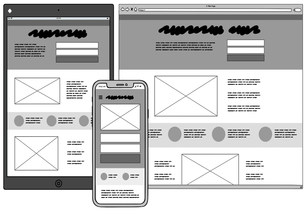
When thinking about how to improve UX in web design, it’s important to consider the various ways that users interact with your site. In addition to traditional desktop and laptop computers, more and more people are accessing the internet via mobile devices like smartphones and tablets. This means that your website must be designed to work well on all types of devices, not just traditional computers.
One way to ensure the responsive design is to use a responsive framework such as Bootstrap or Foundation. These frameworks provide pre-built CSS and JavaScript code that makes it easy to create websites that look great on all devices. Alternatively, you can use a CSS media query to specifically target different device sizes and make sure your website looks good on all screen sizes.
Ultimately, responsive design is essential for ensuring a good user experience on your website. By taking the time to make sure your site looks great on all devices, you’ll ensure that everyone has a positive experience when they visit your site.
4. Use Visual Hierarchy
When it comes to web design, the adage “a picture is worth a thousand words” rings true. People are visual creatures, and we tend to process information more quickly when it is presented to us in a visually appealing way.
This is where visual hierarchy comes into play. In short, visual hierarchy is the order in which we perceive and process visual information. When used effectively, it can help guide users through your website or app in a way that is both efficient and enjoyable.
There are a few key things to keep in mind when utilizing visual hierarchy in your web design:
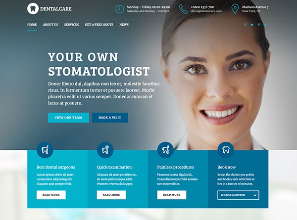
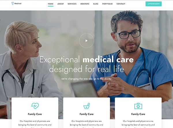
Size – Larger elements will naturally grab our attention first, so use this to your advantage. Think about what you want users to focus on and make those elements larger and more prominent.
Color – It can also be used to draw attention to certain elements. Use contrasting colors to make important details stand out, but be wary of using too many colors as this can be overwhelming for users.
Placement – The placement of elements on a page can also affect how they are perceived by users. Group related items together so they are easy to find, and place the most important element “above the fold” so users don’t have to scroll down to see it.
Typeface – The typefaces you use can also help create a hierarchy of information. Heavier fonts tend to be seen as more important than lighter fonts, so use the fonts carefully.
5. Optimize Page Load Times
It’s no secret that people are impatient. Research shows that the average person only spends about 10 seconds on a web page before losing interest. So, if your website takes longer than 10 seconds to load, you’re likely losing visitors.
There are several ways to optimize your page load times, including:
1. Use a content delivery network (CDN).
2. Optimize your images.
3. Minimize HTTP requests.
4. Put CSS at the top and JavaScript at the bottom.
5. Use caching.
6. Use White Space Effectively
White space is an important element of web design and can be used to improve the user experience. When used effectively, white space can help to create a more visually appealing and easy-to-navigate website. Here are some tips for using white space effectively:
-Use white space to break up content into manageable chunks. This will make your content easier to read and digest.
– Use white space to highlight important elements on your page. This will help users to quickly identify the most important information on your site.
– Use white space to create a sense of balance on your page. Too much or too little white space can make your page look cluttered or unorganized. Finding a good balance will help create a more pleasant user experience.
7. Prioritize Accessibility
Assuming you want a content section for the blog article “How to Improve User Experience (UX) in Web Design”:
One of the most important aspects of good UX design is making sure that your website is accessible to as many people as possible. This includes people with disabilities, people using mobile devices, and people with slow internet connections.
There are a few ways you can make sure your website is accessible:
1. Use clear and concise language. Avoid jargon and technical terms that not everyone will understand.
2. Use alternative text for images. This way, people who are blind or have low vision can still understand what your website is about.
3. Optimize your website for different screen sizes. More and more people are using mobile devices to browse the web, so your website must look good on all screens.
4. Use captions for videos. People who are deaf or hard of hearing can still enjoy your content if you provide captions for videos.
5. Test your website with different browsers and devices. Make sure everything works as it should on all platforms.”
8. Use Consistent Design
When it comes to web design, the user experience is everything. If your website is difficult to use or doesn’t look good, users will likely leave and never come back. That’s why it’s important to focus on improving the UX in your web design.
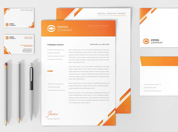
There are several ways to improve UX, but one of the most important is to use consistent design. This means using the same fonts, colors, and layout throughout your website. By doing this, users will be able to easily navigate your site and find what they’re looking for.
So if you’re looking to improve the UX of your website, be sure to use consistent design throughout. This will make it easier for users to use your site and find what they’re looking for.
9. Test and Iterate
Once you have a basic understanding of what UX is and how it can be improved, it’s time to put your knowledge into practice. The best way to improve your UX skills is to test and iterate on your designs.
Start by testing your design on yourself. Take a look at your website or app and ask yourself if it is easy to use and understand. If not, make some changes and then test again.
Once you’re happy with your design, it’s time to test it with real users. This can be done through user testing sessions or surveys. Ask your users for feedback on your design and then make changes based on their feedback.
Iterate on your design until you get the results you want. Remember, the goal is to create a design that is easy for users to use and enjoy. With some practice, you’ll be able to create amazing designs that provide a great user experience.


