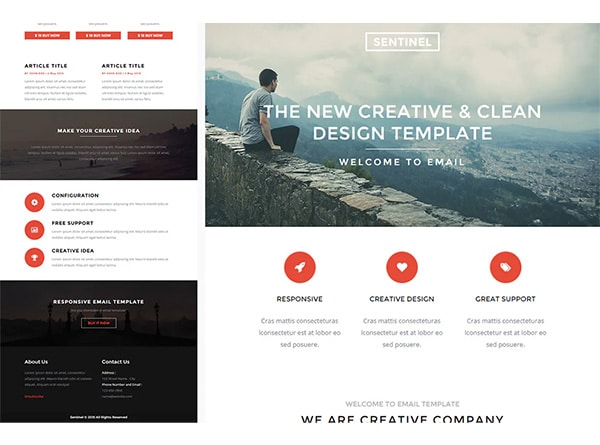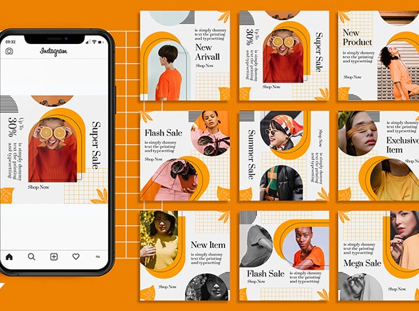
Tired of seeing the same old dry PowerPoint Presentation Deck at your company/sales meetings? Imagine how much more pleasant the experience would be if you had a powerful and engaging presentation? Think of how much more could be accomplished if the information was translated correctly on screen? Your audience would be more attentive and better able to comprehend the subject presented. The result is beneficial for all parties involved.
How do you create a powerful PowerPoint Presentation Deck you say? If you have the skills, creative ability and know-how then you could possibly pull this off. View our tips below to help inspire you to create outstanding Powerpoint presentations.
1. Start with the Purpose
You need to ask yourself what is the purpose behind the PowerPoint presentation? What are you trying to accomplish with the viewing audience? Answering these two questions will be the foundation of your presentation. You want to ensure that the final product upholds the intended purpose. For example, if you are looking to motivate your internal staff to join the company Walk-A-Thon, then you will need to create a presentation that gets them excited to join.
2. Choose a Theme
Understanding your purpose, develop a theme that holds this value. Don’t forget to remember that any theme must comply with the company branding guidelines. Usually these guidelines already set out fonts families, color themes, and other information that must be complied with. The theme can be anything really, from high-energy presentations that sell to more thought provoking Powerpoint presentations. Based on the theme of choice, tailor the design style to support the theme. For example, with the Walk-A-Thon using lots of imagery, dynamic movements, and team spirit will help motivate the employees.
3. Create Header/Divider Slides First
I think this is a good starting point for any presentation. Information can be broken up into sections ahead of time, and laid out in the PowerPoint as sections. Just think of run-on sentences…if these break the readers thought process, then how much more is a deck without section slides? Divider slides organize content to easy digestible thoughts. Creating the divider slides first will help spark creativity and set the tone for the overall deck.
4. Next Information Slides
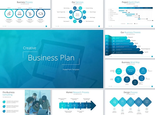
Since the information presented is the bulk of any PowerPoint presentations, much care and thought should be given on how to lay it out. Rather than just writing the copy in a paragraph or bullet style, think outside the box. Is there another way visually that the information can be displayed? Could icons, photos, colored graphic elements be added to help break up the copy? Our California presentation design team believes adding imagery to each slide helps reinforce the information and makes it more understandable to the audience. The more understanding given, the more information is retained.
5. Data Slides
We usually recommend leaving the data slides toward the end. Since these are time consuming, trying to design them first will only get you aggravated, tired, and depleted. Think about what kind of data you would like to show and how it could be illustrated. Can icons, graphs, charts, or tables be used? What about a completely different way of illustrating the information? PowerPoint offers various table, chart and graph style templates that can be used to start. This makes it easy to change the colors/fonts to match your corporate branding and add in the information.
6. Cover Slide
The cover slide, our Orange County PowerPoint presentation designers favorite slide of all! Let your creatively loose here on this one. Think outside the box but remember to ensure that it stays with the overall theme and brand of the company.
7. Slide Transitions
Next we suggest setting up the transitions between the slides. For corporate decks we recommend using one style of transition for all slides. This helps keep cohesiveness to the overall deck, and keeps the focus on the actual slide itself.
8. Object Animation
The final step is to decide which objects would “greatly benefit” from animating. When we say “greatly benefit”, we mean if the object was animated it reinforces the idea behind what the object stands for. Unfortunately alot of times designers go crazy with too many animations on each page, and/or animations that don’t make any sense at all. While it may offer the “cool factor” on the page, if it doesn’t make sense to do so, don’t. A rule of thumb is animate only when BENEFICIAL.
Too time consuming to develop your presentation deck? We understand! This is where our professional PowerPoint presentation design specialists can help. We offer our services as an extension of your in-house team, or on a per-project basis. Each of our presentation decks are simple, affordable and flexible. We are based out of Newport Beach, California since 2005. Give us a call us today at 949-200-6910 to discuss further.


