It is crucial to create a seamless user flow on your website to enhance user experience (UX). A user flow refers to the path that a user takes while navigating your website. When users are able to move smoothly from one page to another, they are more likely to stay longer and engage with your content. In this article, we will discuss how to create a seamless user flow in web design.
1. Understand your target audience
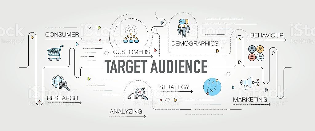
One of the most important steps in creating a seamless user flow on your website is understanding your target audience. This means identifying their demographic information, including age, gender, geographic location, and interests.
By understanding who your target audience is, you can tailor your website design to meet their specific needs and preferences. For example, if you’re targeting a younger audience, you may want to incorporate more interactive elements such as videos or animations.
It’s also important to consider why users are visiting your website in the first place. Are they looking for specific products or services? Do they need answers to questions about a certain topic? By answering these questions and providing relevant content, you can keep users engaged and encourage them to explore more of what your site has to offer.
In addition to understanding who your target audience is and what they’re looking for on your site, it’s also important to consider how users interact with different devices. With mobile usage increasing every year, it’s crucial that websites are designed with mobile responsiveness in mind so that users can easily access content from any device.
Taking the time to understand your target audience will help ensure that your website design effectively meets their needs and enhances their overall user experience.
2. Map out the user flow
Mapping out the user flow is a crucial step in creating a seamless web design. It’s important to understand how users will interact with your website, where they will go, and what actions they’ll take. To do this, start by identifying the key pages of your site and outlining how users will get from one page to another.
Consider the user’s journey and create clear paths for them to follow. This can be done through intuitive navigation menus or clickable buttons that lead them from one section of the site to another. Make sure to label each link clearly so users know exactly where they’re headed.
Another way to map out the user flow is by creating wireframes or mock-ups of each page on your site. This allows you to see how all elements fit together visually and ensures that everything flows smoothly from one section of the site to another.
Incorporating feedback from real users during this process can also help enhance user experience, ensuring that it truly meets their needs and expectations. By taking these steps, you’ll be able to create a well-structured website that guides users effortlessly through their journey.
3. Simplify navigation
A website with complex navigation can be frustrating for users, leading to a negative user experience. Simplifying navigation is key to creating a seamless user flow in web design and ultimately enhancing the overall user experience.
Firstly, reducing the number of menu items can make navigation less overwhelming for users. Aim for 5-7 main categories that are easy to understand and relevant to your target audience.
Secondly, consistency is important when it comes to navigation. Ensure that the placement of menus and links remains consistent throughout the entire website. This will help users familiarize themselves with how the site works and navigate more easily.
Thirdly, including a search bar on every page can provide an alternative way for users to find what they’re looking for quickly without having to click through multiple pages.
Simplifying navigation is crucial in providing an effortless browsing experience that enhance user experience and keeps visitors coming back again and again.
4. Use clear and concise language

Firstly, avoid using technical jargon or industry-specific terms unless you’re sure your audience will understand them. Instead, use plain English that everyone can understand.
Secondly, keep sentences short and straightforward. Long-winded explanations can be confusing and overwhelming for users.
Thirdly, make good use of headings and subheadings to break up the content into manageable chunks. This helps users scan the page quickly to find the information they need.
Fourthly, focus on active voice rather than passive voice when writing content for your website. Active voice is more direct and engaging than passive voice which can come across as vague or uncertain.
Always proofread your content before publishing it online to ensure there are no errors or typos that may confuse readers. Clear language goes a long way in enhancing the user experience on your site!
5. Optimize page load speed
Optimizing page load speed is crucial in creating a seamless user flow on your website. A slow-loading website can lead to frustration and impatience among users, causing them to leave the site altogether.
One way to optimize page load speed is by compressing images and videos without sacrificing their quality. Large files can significantly slow down a web page’s loading time, so it’s essential to reduce their size as much as possible.
Another method is by minimizing HTTP requests by combining CSS and JavaScript files. This technique reduces the number of requests made between the server and browser, ultimately resulting in faster loading times.
It’s also important to leverage browser caching so that previously loaded resources don’t need to be reloaded again each time someone visits your site. By enabling caching, browsers will store static content like images and scripts for future use, allowing pages to load quickly upon subsequent visits.
Avoid using too many plugins or third-party integrations on your website as they can increase its load time substantially. Only include what’s necessary for functionality purposes while keeping an eye on their performance impact.
Optimizing page load speed should be at the forefront of every web designer’s mind when building a website with a seamless user flow in mind.
6. Incorporate a call to action
By following the above tips, you can create a seamless user flow in web design to enhance user experience. However, it’s important to incorporate a call to action (CTA) at the end of each page or section. A CTA encourages users to take action and engage with your website further.
An effective CTA should be clear and concise, using action-oriented language such as “Sign up now” or “Learn more”. It should also stand out visually on the page through color contrast and placement.
Incorporating a well-designed CTA not only enhances the user experience by guiding them toward their desired actions but also improves conversion rates for your business goals.
Remember that creating a seamless user flow is an ongoing process that requires consistent testing, analysis, and tweaking. By prioritizing user needs and preferences through every stage of web design, you’ll create an enjoyable online experience that keeps users coming back for more.
In conclusion, creating a seamless user flow is crucial to enhancing the user experience of your website. By understanding your target audience, mapping out the user flow, simplifying navigation, using clear and concise language, optimizing page load speed, and incorporating a call to action, you can create a website that meets the needs of your users and provides a seamless user experience. If you need assistance with creating a seamless user flow, contact Orange County Web Design experts to guide you.


