Ever wondered how the best PowerPoint designers work their magic? I’ve spent years watching these wizards turn mundane concepts into jaw-dropping presentations. It’s not just about fancy graphics or slick animations – it’s an art form that blends creativity, strategy, and technical know-how. The top PowerPoint creators have a knack for visual storytelling that can make even the driest data come alive on screen.
In this article, I’ll pull back the curtain on the secrets of elite presentation deck masters. We’ll explore how they craft compelling narratives, design with laser-like focus, and leverage PowerPoint’s hidden features. I’ll also share tips on perfecting your final product, whether you’re working on pitch deck creation or sprucing up your next big presentation. By the end, you’ll have insights to elevate your own PowerPoint game to new heights.
Mastering Visual Storytelling
As one of the best presentation designers, I’ve learned that visual storytelling is the secret sauce that turns ordinary presentations into captivating experiences. It’s not just about putting pretty pictures on slides; it’s about crafting a narrative that resonates with your audience and keeps them engaged from start to finish.
Crafting a Compelling Narrative
The heart of visual storytelling lies in creating a narrative that guides your audience through a journey. I always start by identifying the key message I want to convey and then build a story around it. This approach helps me organize my thoughts and ensures that every element in my presentation serves a purpose.
One effective technique I use is the “”hero’s journey”” structure. This involves presenting a problem, showing the challenges faced, and then revealing the solution. For example, when working on pitch deck creation, I might start by highlighting a common industry pain point, then showcase how our product or service addresses this issue, leading to a triumphant conclusion.
Using Imagery Effectively
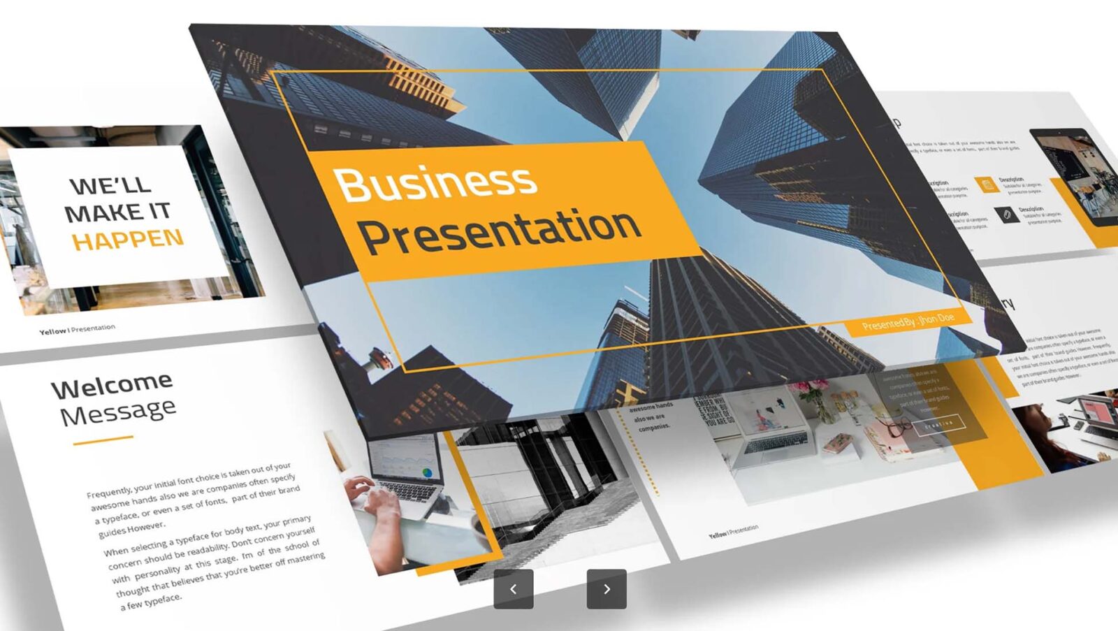
Images are powerful tools in a presentation designer’s arsenal. They can convey complex ideas quickly and leave a lasting impression on the audience. When selecting images, I focus on high-quality, relevant visuals that support my narrative.
I’ve found that using full-screen images can create a cinematic effect, making the presentation more immersive. However, it’s crucial to ensure that any text overlaid on these images is readable. I often use the “”rule of thirds”” when placing text, which helps create a balanced and visually appealing composition.
Infographics are another fantastic way to present data visually. They can take complex information and make it digestible and engaging. When creating infographics, I aim for simplicity and clarity, using color coding and icons to highlight key points.
Creating Visual Hierarchy
Visual hierarchy is essential in guiding the audience’s attention to the most important elements of your presentation. As a PowerPoint creator, I use various techniques to establish this hierarchy:
1. Size: Larger elements naturally draw more attention. I use this principle to emphasize key points or headlines.
2. Color: Contrasting colors can make certain elements pop. I often use a muted color palette for the background and reserve bright colors for important information.
3. Typography: Different font sizes and styles help distinguish between headings, subheadings, and body text. This creates a clear structure for the audience to follow.
4. White space: I’m not afraid to leave empty space on slides. This helps reduce clutter and allows important elements to stand out.
By mastering these visual storytelling techniques, you can elevate your presentations from mere information delivery to compelling narratives that captivate and inspire your audience. Remember, the goal is not just to present data, but to tell a story that resonates and leaves a lasting impact.
Designing with Purpose
As one of the best PowerPoint designers, I know that creating stunning presentations goes beyond just making things look pretty. It’s about aligning design with content and maintaining brand consistency to create a powerful visual impact.
Aligning Design with Content
When I’m working on presentation decks, I always start by considering the purpose of each slide. Every visual element should serve a specific function and support the message I’m trying to convey. This approach helps me avoid the common pitfall of adding unnecessary design elements that can distract from the main point.
One technique I use is the Auto Fix feature in PowerPoint for the web. This nifty tool automatically aligns, resizes, and distributes elements on a slide, saving time and ensuring a clean, professional look. However, I’ve found that it’s best to use Auto Fix on smaller groups of elements first, then gradually refine the entire visualization.
To further enhance alignment, I rely on PowerPoint’s built-in guides and gridlines. These tools are invaluable for ensuring that objects are perfectly aligned both vertically and horizontally. I often use smart guides, which appear as red dashed lines when moving objects, to help space out elements evenly across the slide.
Maintaining Brand Consistency
Brand consistency is crucial in presentation design. It’s not just about slapping a logo on every slide; it’s about creating a cohesive visual language that reflects the brand’s personality and values across all communications.
To achieve this, I always start with a comprehensive style guide. This document serves as the foundation for brand consistency, providing clear guidelines for anyone creating presentations within the company. It typically includes specifics on color palettes, typography, imagery style, and logo usage.
When it comes to colors, I set up a custom color palette in PowerPoint that matches the brand’s official colors. This ensures that every element in the presentation aligns with the brand’s visual identity. For typography, I stick to 2-3 fonts that are specified in the brand guidelines, maintaining consistent font sizes across similar elements in all presentations.
Imagery is another crucial aspect of brand consistency. Whether using photos, illustrations, or icons, I maintain a consistent style throughout the presentation. This might involve applying consistent filters to photos or using a specific illustration style that aligns with the brand’s visual language.
For charts and graphs, I use the brand’s color scheme to represent different data points. This not only maintains visual consistency but also helps in creating a clear and coherent message.
By focusing on aligning design with content and maintaining brand consistency, PowerPoint creators can elevate their presentations from good to great. Remember, the goal is not just to make slides look pretty, but to create a cohesive visual story that effectively communicates your message while reinforcing your brand identity.
Leveraging Advanced PowerPoint Features
From the best PowerPoint design company, I know that mastering advanced features can take your presentations from good to great. Let’s dive into some powerful tools that can help you create stunning slides and captivate your audience.
Custom Animations
Custom animations are a game-changer when it comes to pitch deck creation. They allow you to bring your ideas to life and guide your audience’s attention. To create custom animations, start by selecting an object on your slide. Then, head to the Animations tab and choose from a variety of effects.
One cool trick is to use motion paths. These allow you to define a specific route for your object to follow. You can even combine multiple motion paths to create complex movements. For example, you could have a logo fly in from the side, then bounce slightly before settling into place.
To take your animations to the next level, try using the Animation Pane. This tool gives you precise control over timing and sequencing. You can set animations to start on click, with the previous animation, or after a specific delay. This is particularly useful when you’re creating presentation decks with multiple moving parts.
Smart Art and Diagrams
Smart Art is a powerhouse feature for PowerPoint creators. It allows you to quickly create professional-looking diagrams and visual representations of your ideas. To use Smart Art, go to the Insert tab and click on the Smart Art button. You’ll find a wide range of options, from simple lists to complex hierarchies.
One of my favorite things about Smart Art is how easy it is to customize. You can change colors, styles, and even the overall layout with just a few clicks. This is incredibly helpful when you’re working on pitch deck creation and need to match your company’s branding.
For more complex ideas, try combining multiple Smart Art graphics. For instance, you could use a process diagram to show your company’s workflow, then add a hierarchy diagram to illustrate your team structure.
Embedding Multimedia
Incorporating multimedia elements can really make your presentations pop. PowerPoint designers often use videos and audio to add depth and interest to their slides. To embed a video, go to the Insert tab and click on the Video button. You can choose to insert a video from your computer or from online sources like YouTube.
When using videos, it’s important to consider file size. Large video files can make your presentation slow and unwieldy. One trick I use is to compress videos before adding them to my slides. This helps keep the file size manageable without sacrificing quality.
Audio can also be a powerful tool in presentation decks. You might use background music to set the mood or include voice-over narration for a more guided experience. To add audio, go to the Insert tab and click on the Audio button.
By mastering these advanced PowerPoint features, you’ll be well on your way to creating presentations that truly stand out. Remember, the key is to use these tools thoughtfully and in service of your overall message. Happy designing!
## Perfecting the Final Product
As one of the best PowerPoint designers, I know that refining your presentation is crucial to creating a stunning final product. Let’s dive into some key techniques that can elevate your slides from good to great.
Refining Transitions
Transitions play a vital role in enhancing the visual appeal of your presentations. They help guide your audience smoothly from one slide to the next, maintaining their attention and interest. When it comes to transitions, less is often more. I recommend using only one transition type throughout your presentation to maintain consistency and avoid distractions [[1]].
One of my favorite transitions is the Drape effect. It adds an elegant touch to your slides without being overly flashy. To apply this transition, simply navigate to the Transitions tab, find the Drape effect in the gallery, and click to apply it to your selected slide. You can even adjust the duration and timing to suit your presentation style [[2]].
Remember, the goal is to enhance your content, not overshadow it. Avoid using complex animations that might slow down your presentation, especially if you’re presenting online. Instead, opt for subtle effects that complement your message and keep your audience focused on what matters most.
Optimizing for Different Devices
It’s important to ensure your presentation looks great on all devices. With mobile internet traffic surpassing desktop traffic for the first time in 2020, we need to adopt a mobile-first approach when designing our slides [[3]].
To make your presentation mobile-friendly, start by using larger text sizes. I recommend using at least a 60-point size for headlines and a 30-32 point size for body content. This ensures your text is readable even on smaller screens .
When it comes to images, go big or go home. Large, high-quality images that occupy the whole slide work best as backgrounds. This approach not only looks great on mobile devices but also adds a professional touch to your presentation [[4]].
Another tip is to keep your slides simple and uncluttered. Follow the “one idea per slide” rule, or even take it a step further with “one sub-idea per slide”. This approach helps your audience digest information more easily, regardless of the device they’re using [[5]].
Lastly, pay attention to contrast. On smaller screens, contrast becomes even more critical. Ensure your slide content, whether it’s text, graphics, or charts, has enough contrast between its different parts. This not only improves readability but also adds visual interest to your slides [[6]].
By refining your transitions and optimizing for different devices, you’ll create a polished, professional presentation that looks great on any screen. Remember, the key is to keep it simple, focus on your content, and use design elements to enhance, not distract from, your message.
Conclusion
To wrap up, mastering the art of PowerPoint design goes beyond creating visually appealing slides. It’s about crafting a compelling narrative, aligning design with content, and leveraging advanced features to bring your ideas to life. By focusing on visual storytelling, maintaining brand consistency, and optimizing for different devices, you can create presentations that captivate your audience and effectively communicate your message.
Remember, the best PowerPoint designers are those who understand the power of simplicity and purpose in their designs. They use transitions wisely, optimize for various devices, and always keep the audience’s needs in mind. Whether you’re working on pitch deck creation or a business presentation, these principles can help you elevate your PowerPoint game. Get in touch with us today and schedule your complimentary 15-min consult to take your presentation skills to the next level.
## References
[1] – https://create.microsoft.com/en-us/learn/articles/5-golden-rules-powerpoint-design
[2] – https://libguides.hccfl.edu/powerpoint/tips
[3] – https://alum.mit.edu/sites/default/files/2018-06/POWERPOINT%20BEST%20PRACTICES_1.pdf
[4] – https://hbr.org/2013/06/how-to-give-a-killer-presentation
[5] – https://mtss.tcnj.edu/other-services/teaching-with-technology/7-tips-for-designing-and-delivering-powerpoint-presentations/
[6] – https://blog.hubspot.com/marketing/easy-powerpoint-design-tricks-ht
Related Posts