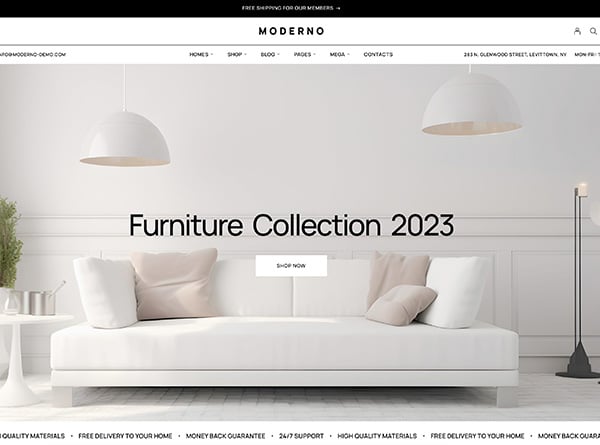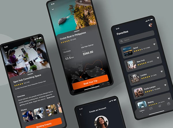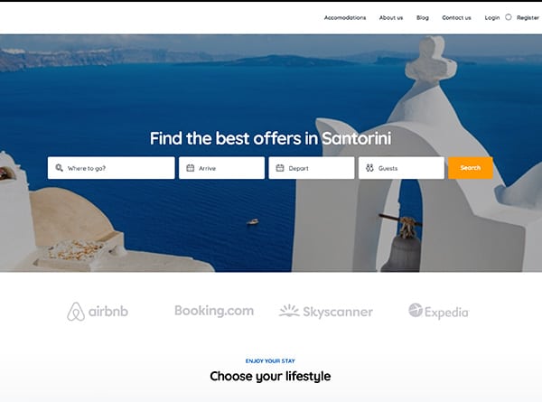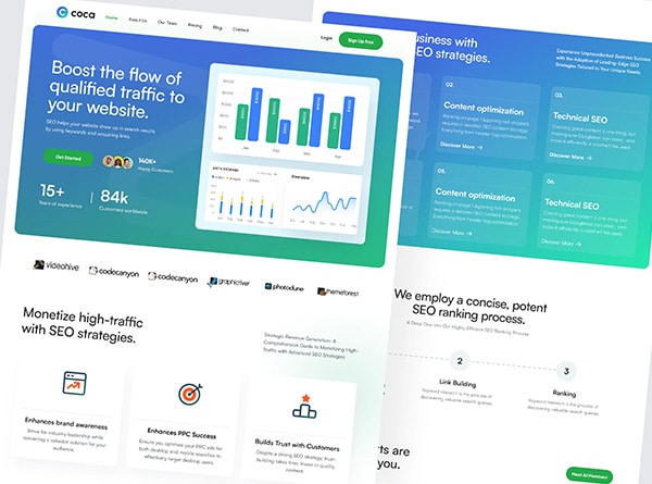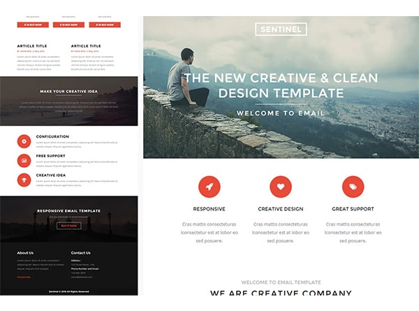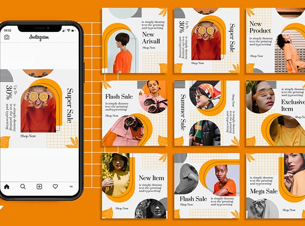
The easiest way to find inspiration is to review the work of other designers. After all, inventing something from scratch is simply impossible.
It’s not about stealing an idea, it’s about getting inspired, understanding what is now relevant, filling up with creative ideas, positive or even negative experiences in order to avoid any mistakes.
And designers often look for inspiration in simple things. After all, inspiration doesn’t necessarily mean something new.
Sometimes it’s the most ordinary web designs that surround us on a daily basis that you suddenly look at with fresh eyes.
What trends do you think will follow to reconstruct the unused Web designs?
First of all, we can distinguish a very relevant trend for several years – the Mobile First approach. A web page should be readable and visually appealing on any screen size. Therefore, adaptability is one of the key requirements of web design.
In addition, trends such as “white space” and minimalism will retain their position. In fact, the trends can be listed endlessly: colours, gradients, chat bots, virtual reality, but professionalism has remained the most important trend of all time for many years.
And the team often looks for inspiration in simple things. After all, inspiration doesn’t necessarily mean something new. Sometimes it’s the most ordinary things that surround us on a daily basis that you suddenly look at with fresh eyes.
There is only one problem with trends – there is always too much information about them on the net. I read almost 70 articles, which took me almost 3 days to get to the heart of the matter.
However, you will be able to get the whole collection of web design trends without any tedious research.
I think it won’t take you more than half an hour to read, or even less. Also, you can ignore the trends you are not interested in at the moment and view the crucial information.
I created some sort of article outline for this purpose. Each article is an anchor that brings you to relevant information. We want to be a one stop shop for you, hope this will work out.
What steps a designer should follow to Reused their unused web designs
Build the tree structure of website
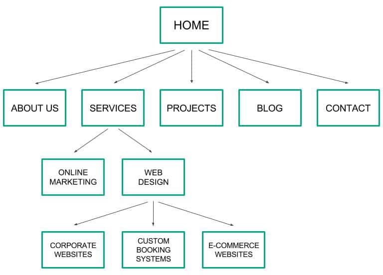
Carrying out a plan for your website is often a very difficult exercise. It’s never easy to organize content, which is often more heterogeneous than you might initially imagine.
Above all, making a plan is about prioritizing, making choices, which can take time and create discussions in a team. It is a difficult exercise, but oh so important.
Without well thought-out navigation, a website, no matter how pretty, is unlikely to achieve its goals.
This sheet should give you all the keys to understand the issues and concretely carry out the tree structure of your website. The tree structure of a website, a fundamental step in the creation of your website design.
From the tree to the storyboard
The tree structure, or site map, generally takes the form of a diagram that organizes the pages of the site into sections and defines the different levels of navigation.
This is usually the first step in designing a website. Once the tree structure of the website has been validated, the whole team has an overview of the site, and you can go down a level to look at the pages for the realization of the models.
The next step is to carry out the zonings of the pages, that is to say cut the main pages into zones, for example, a horizontal rectangle for the logo and the main menu, a vertical rectangle on the left for the secondary menu, etc.
Then, we go from zonings to wireframes where we add the main texts and graphic components, then finally wireframes to the graphic models of the website.
Why is it important to keep up with web design trends?

Need an example? Just think about what attracts you on Instagram? It’s a stunning layout and well thought out organization of brand profiles that encourage you to stay on a webpage longer.
The success and the growing number of sales on the network confirm this trend.
What’s the trick? A customer thinks he’s paying for a product, but he’s actually focusing on the image behind it. While perceiving an attractive presentation of a product or service in a specific environment, a customer imagines how well that product will suit them.The same techniques are applied to web design.
An attractive and memorable web page can capture a user’s eye and encourage them to learn more about your brand or order your services.
Final Comments
For each scenario that you define, imagine the path that the visitor will take on your website.
Does your tree structure allow you to quickly get to the target page each time? Once you have focused your reasoning on visitors, the next step is to think about robots! As we have seen above, the tree structure is very important for the natural referencing of your website.
You have to make sure that you have followed the ground rules. Are your key pages in the first or second level of the hierarchy? Do your categories form coherent semantic fields? You can read this fairly comprehensive article on internal meshing for more information on the subject.
During this phase, don’t hesitate to start all over again. The tree structure is the backbone of your website design, you really have to take the time to create a successful website plan, whether it is to bring visitors from a landing page to a target page, or to enable search engines easily understand all the content of your website.
Design processes are constantly evolving and design thinking is ideal for developing components focused on user needs.
The steps of this concept can be adapted and customized according to your project. Do not hesitate to share your suggestions in comments.


