Ever wondered how to make your business pitches stand out? Well, I’ve got a secret weapon for you: a presentation deck designer. These wizards of PowerPoint are the unsung heroes behind those slick slides that leave your audience in awe. As a presentation deck designer myself, I’ve seen firsthand how the right visuals can make or break a pitch.
In this article, I’ll walk you through the magic that happens when you bring a pro on board for your pitch deck creation. We’ll explore how these PowerPoint creators enhance your brand’s visual appeal, improve your content flow, and amp up the persuasiveness of your message. By the end, you’ll see why working with presentation deck designers is a game-changer for your business pitches. Trust me, it’s like having a visual storyteller in your corner!
The Role of a Presentation Deck Designer
As a presentation deck designer, I wear many hats. My job goes beyond just making slides look pretty. I’m a visual storyteller, a brand guardian, and a communication expert all rolled into one. Let me break down what this role entails and why it’s so crucial for your business pitches.
Understanding the designer’s expertise
Presentation deck designers are specialists in visualizing content. We take complex ideas and turn them into easy-to-digest visuals that capture your audience’s attention. Our expertise lies in understanding design principles, branding, and how to effectively communicate through visual mediums.
We’re not just PowerPoint wizards (though we’re pretty good at that too). We have a deep understanding of various presentation software like Google Slides, Keynote, and Prezi. This knowledge allows us to choose the best tool for your specific needs and make the most of its features.
Key responsibilities
So, what do we actually do? Well, our main job is to manage the presentation design process from start to finish. This includes:
1. Collaborating with you to craft a compelling narrative
2. Creating visually appealing slides that align with your brand
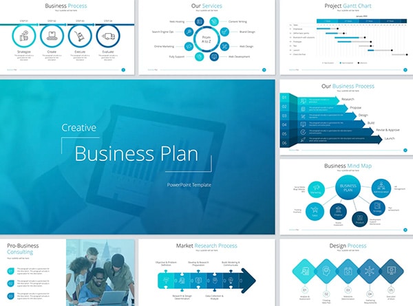
3. Developing data visualizations and infographics to support your key messages
4. Working through revisions to ensure the final product meets your objectives
We’re also responsible for establishing and maintaining your presentation design system. This includes setting up fonts, colors, styles, and logos that are approved for use. We create processes that make it easy for you to quickly modify slides while staying within your brand guidelines.
Another crucial part of our role is to serve as the final checkpoint. We review all slides before they’re approved for sharing, ensuring everything is polished and professional.
Tools and software used
To bring your presentations to life, we use a variety of tools. Of course, we’re experts in presentation software like PowerPoint, Google Slides, and Keynote. But our toolkit doesn’t stop there.
We also work with design software like Adobe Creative Suite, Figma, or Sketch. These tools allow us to create custom graphics, edit images, and design complex layouts that we can then incorporate into your presentation.
Some of us even use AI-powered tools to streamline the design process. For example, Beautiful.ai uses artificial intelligence to help with layout and design, allowing us to focus more on content and storytelling.
In essence, a presentation deck designer is your secret weapon for creating impactful business pitches. We combine design skills, storytelling abilities, and technical know-how to elevate your presentations from good to great. By bringing one of us on board, you’re not just getting pretty slides – you’re getting a partner who can help you communicate your ideas more effectively and persuasively.
Enhancing Visual Appeal and Branding
As a presentation deck designer, I know that visual appeal and branding are crucial for making your business pitches stand out. Let’s dive into how we can elevate your presentations to the next level.
Creating a cohesive visual style
When it comes to designing impactful slides, consistency is key. I always stick to a limited color palette that aligns with the brand’s visual identity. This approach ensures that your presentation looks cohesive and professional. It’s not just about the big things like colors and fonts; it’s also about the little details like titles, headlines, and sentence capitalization.
To create a unified look, I use a consistent template for headers, footers, and content areas. This guides the audience’s attention and improves the overall readability of the slides. Remember, less is more when it comes to visuals. I focus on one idea or concept per slide to ensure your message is clear and easily digestible.
Incorporating brand elements effectively
Incorporating your brand elements into the slides is crucial for reinforcing your brand identity and creating a professional look. I make sure to include your logo, color scheme, and visual characteristics like photography style and customized typography throughout the presentation.
When showcasing your logo, I don’t just display it—I explain it. I highlight the concepts and ideas behind your design choices, sharing the meanings of specific shapes or elements. This approach helps to create a stronger connection between your audience and your brand.
Designing impactful slides
To design slides that truly make an impact, I focus on using high-quality visuals. Low-quality, pixelated images or outdated clipart can make a presentation look unprofessional. That’s why I ensure all images are high-resolution and in a similar style and color palette.
I also leverage the power of icons and symbols to simplify complex ideas, making them quick to understand. These graphic elements are great for summarizing information or drawing attention to key points. When using charts or graphs, I make sure they’re well-designed, easy to understand, and accurately labeled.
Lastly, I use animation strategically to reveal content gradually, emphasize key points, or visualize data. This adds an extra layer of engagement to your presentation, helping to keep your audience focused on your message.
By focusing on these aspects of visual appeal and branding, I can create a presentation deck that not only looks professional but also effectively communicates your brand’s unique value proposition. This approach helps to captivate your audience’s attention and leave a lasting impression, ultimately enhancing the effectiveness of your business pitches.
Improving Content Structure and Flow
As a presentation deck designer, I know that organizing information logically is crucial to creating a compelling pitch. Research shows that audiences retain structured information 40% more accurately than unstructured information [[1]]. So, I always start by developing an outline for the key points. I think about three or four main ideas I want to share and organize them into a concise structure. This approach helps me ensure I remember my talking points, keeping me on track and avoiding awkward pauses.
When it comes to creating smooth transitions, I focus on using words and phrases that allow me to move seamlessly from one point to another. This helps the audience understand how everything links together and why it’s all relevant. For example, I might use phrases like “”Now that you’re aware of the overview, let’s begin with…”” or “”First, let’s look at…”” These transitions act as signposts, guiding the audience through the presentation.
To emphasize key points, I use a technique called internal summarizing. Before moving on to the next point, I briefly recap what I’ve just covered. I might say something like, “”In the first part of this speech, we’ve covered… Now, I’d like to move on to the second part, which looks at…”” This approach reinforces the main ideas and helps the audience follow along more easily.
I also pay attention to my body language and movement during transitions. I might start my introduction in the center of the stage, move to the left for my first point, return to the center for the second point, and then to the right for the third point. This physical movement helps keep the audience engaged and makes it easier for them to follow the flow of ideas.
When it comes to slides, I use them as a tool to assist in delivering my message, not as the focal point. I follow some golden rules: I don’t overfill slides with information, I use high-quality images to supplement what I’m saying, and I make sure everything is readable, even from the back of the room.
By focusing on these aspects of content structure and flow, I can create a presentation deck that not only looks professional but also effectively communicates the main message. This approach helps to captivate the audience’s attention and leave a lasting impression, ultimately enhancing the effectiveness of business pitches.
## Maximizing Impact and Persuasiveness
As a presentation deck designer, I know that creating a powerful pitch goes beyond just making slides look pretty. It’s about crafting a story that resonates with your audience and leaves a lasting impression. Let’s dive into some key strategies to maximize the impact and persuasiveness of your business pitches.
Crafting compelling narratives
One of the most effective ways to elevate your pitch is through storytelling. Stories have the power to build connections, foster trust, and make information memorable. When I’m working on a presentation, I always start by identifying the core message we want the audience to take away. Then, I weave that message into a narrative structure with a clear beginning, middle, and end.
To make your story more compelling, it’s crucial to use vivid language that engages the audience’s senses. I often encourage my clients to share personal anecdotes or experiences that relate to their business idea. This approach helps humanize the presentation and makes it more relatable.
Remember, authenticity is key. Your story should be genuine and align with your brand’s voice. By sharing real experiences and emotions, you’ll create a stronger connection with your audience.
Using data visualization techniques
While stories are powerful, data is often unavoidable in business pitches. However, slides crammed with numbers can quickly put an audience to sleep. That’s where data visualization comes in handy.
As a presentation deck designer, I love transforming complex data sets into visually appealing and easy-to-understand graphics. Line graphs are great for showing trends over time, while bar graphs work well for comparing data between different groups. For massive amounts of numeric data, I often turn to bubble charts, which can convey information at a glance.
When creating data visualizations, I always keep a few key principles in mind:
– Use consistent colors throughout your charts
– Ensure there’s enough contrast for easy interpretation
– Focus the slide title on what you want the audience to know, not just what the chart is about
– Use simple text labels instead of legends to save the audience’s attention
Incorporating interactive elements
To truly make your pitch stand out, consider incorporating multimedia elements. Videos, animations, and interactive features can create a more engaging and memorable experience for your audience.
For example, if you’re pitching a new app, why not include a short video demonstrating its functionality? Or if you’re presenting a complex business model, an animated explainer video could simplify the concept and make it more digestible.
Audio narration can also be a powerful tool. A confident voiceover can enhance your storytelling and create a cohesive narrative throughout your presentation.
When using multimedia elements, it’s important to strike a balance. They should enhance your message, not distract from it. Each element should serve a purpose and align with your overall presentation style.
By focusing on these aspects – crafting compelling narratives, using effective data visualization techniques, and incorporating multimedia elements – you can create a presentation that not only looks professional but also effectively communicates your message. As a presentation deck designer, my goal is always to help you create a pitch that captivates your audience and leaves a lasting impression.
Conclusion
A presentation deck designer can have a significant impact on your business pitches. By enhancing visual appeal, improving content structure, and maximizing persuasiveness, these professionals help create presentations that captivate audiences and leave lasting impressions. Their expertise in crafting compelling narratives, utilizing effective data visualization techniques, and incorporating multimedia elements elevates your pitch from ordinary to extraordinary.
In the end, partnering with a presentation deck designer is an investment in your business’s success. Their skills can help you communicate your ideas more effectively, making your pitches more memorable and persuasive. Get in touch with us today and schedule your complimentary 15-min consult to see how a presentation deck designer can take your business pitches to the next level.
## References
[1] – https://huglondon.com/insights/perfect-pitch-why-presentation-design-is-important


