Revolutionize Your Brochure Design for 2024: From Forgotten to Fabulous
Hey there, fellow design enthusiasts! Let’s talk brochure design. You know, those foldy paper things we used to grab at tourist spots? Well, they’re making a comeback, and it’s time to give them a serious makeover. Brochure design isn’t just about cramming info onto a page anymore. It’s about creating high-converting brochures that tell a story and make people want to keep reading.
In this article, I’m going to show you how to turn your brochures from snooze-fests to showstoppers. We’ll dive into the latest design trends that’ll make your brochures pop, explore how to weave in storytelling that grabs attention, and look at ways to make your brochures work both in print and digital formats. By the end, you’ll have all the tricks up your sleeve to create professional brochures that sell. Trust me, your local design agency will be jealous of your skills!
Embrace Modern Design Trends
Let’s dive into the exciting world of brochure design trends that’ll make your marketing materials pop! We’re talking about designs that’ll have people saying, “Wow, I actually want to read this!” So, let’s get started and give your brochures a serious glow-up.
Minimalist Layouts
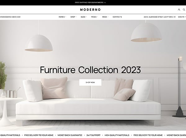
First up, we’ve got minimalist layouts. Think clean, crisp, and clutter-free. It’s all about making a big impact with less stuff. Imagine a brochure that’s so sleek, it could slip into a supermodel’s portfolio without breaking a sweat.
Here’s the deal: minimalist brochures are like the Marie Kondo of the design world. They keep only what sparks joy (and sells your product). We’re talking about designs that use white space like it’s going out of style (spoiler alert: it’s not).
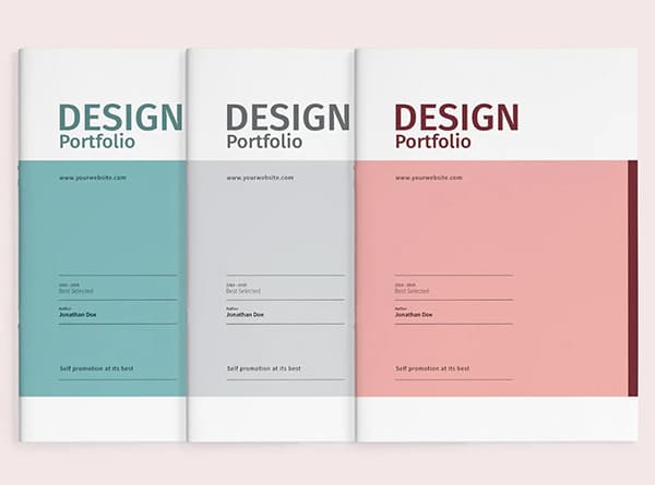
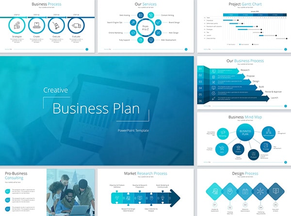
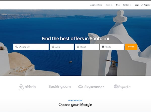
Picture this: a clean, modern trifold brochure with just a splash of color, or a bi-fold design that’s so simple, it’s practically zen. These designs aren’t just pretty to look at; they’re easy to read and understand. And that, my friends, is the secret sauce to creating high-converting brochures.
Bold Typography
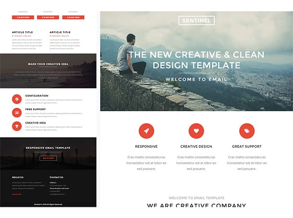
Now, let’s chat about typography. We’re not talking about your grandma’s cursive here. We’re talking big, bold, and beautiful fonts that grab attention faster than a cat video on the internet.
Typography in brochure design is like the voice of your brand. It’s not just about picking a font; it’s about creating a visual hierarchy that guides your readers through your content like a pro tour guide.
Here’s a pro tip: mix it up! Use different font sizes and weights to make your important info stand out. But remember, we’re not trying to recreate a ransom note here. Stick to two or three fonts max to keep things looking sharp.
And here’s the kicker: readability is key. Sure, that super funky font might look cool, but if people need a decoder ring to read it, you’re doing it wrong. Stick to fonts that are easy on the eyes, even when they’re scaled down. Your readers (and their eyeballs) will thank you.
Interactive Elements
Last but definitely not least, let’s talk about interactive elements. We’re living in a digital world, baby, and your brochures need to keep up!
Interactive brochures are like the Swiss Army knives of marketing materials. They’re versatile, engaging, and packed with features that’ll make your audience go “Ooh” and “Aah.”
Here are some cool tricks to try:
1. Clickable hotspots: Turn your brochure into a treasure map of information.
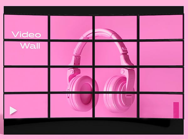
2. Embedded videos: Because sometimes, a picture is worth a thousand words, but a video is worth a million.
3. 360-degree product views: Let your audience spin your product around like they’re on a virtual shopping spree.
4. Interactive quizzes: Who doesn’t love a good quiz? Make your brochure fun and informative.
These interactive elements don’t just look cool; they’re also super effective. For example, adding 360-degree views to your product pages can increase conversion rates by up to 250% [[1]]. Now that’s what I call a brochure that sells!
Remember, the goal here is to create professional brochures that don’t just sit pretty on a coffee table. We want brochures that engage, inform, and ultimately, convert. So go ahead, embrace these modern design trends, and watch your brochures transform from forgotten flyers to fabulous marketing powerhouses!
Incorporate Storytelling Elements
Let’s dive into the heart of brochure design that truly connects with your audience. It’s not just about pretty pictures and fancy fonts; it’s about weaving a story that grabs attention and doesn’t let go. We’re talking about brochures that sell, folks!
Compelling Narratives
First things first, let’s chat about compelling narratives. Your brochure isn’t just a list of features; it’s a story waiting to be told. Think about it like this: you’re not just selling a product; you’re selling a solution to a problem. Your brochure should take the reader on a journey from their current situation to a better future with your product or service.
Here’s a pro tip: start with a problem your target audience faces. Then, introduce your brand as the hero that swoops in to save the day. For example, if you’re designing a brochure for a fitness app, don’t just list its features. Instead, tell the story of Sarah, who struggled to find time for the gym until she discovered your app. Now she’s fitter, happier, and has more time for her family. See how that’s more engaging than a bullet point list of app features?
Remember, people connect with stories, not facts and figures. So, make your brochure a page-turner!
Customer Testimonials
Now, let’s talk about the power of customer testimonials. These are like gold dust for your brochures that sell. Why? Because people trust other people more than they trust brands. It’s just human nature.
When you’re including testimonials in your brochure design, don’t just slap a quote on there and call it a day. Tell a mini-story with each testimonial. Include a photo of the customer, their name, and a bit about their situation. For instance:
“Meet John, a small business owner who doubled his sales in six months using our marketing software. ‘I was skeptical at first, but now I can’t imagine running my business without it,’ says John with a smile.”
See how that’s more powerful than just a generic quote? It gives context and makes the testimonial more relatable and believable.
Visual Storytelling Techniques
Last but definitely not least, let’s chat about visual storytelling techniques. Remember, we’re designing professional brochures here, not writing novels. Your visuals should do as much storytelling as your words.
One powerful technique is to use before-and-after images. This works great for products or services that create a visible change. For a home renovation company, show a dingy kitchen transformed into a modern masterpiece. For a skincare brand, show the progression of someone’s skin over time using your products.
Another technique is to use infographics to tell a story with data. Don’t just throw numbers at your reader; show them what those numbers mean. For example, if you’re designing a brochure for a charity, don’t just say you’ve helped 10,000 people. Show a map with little figures representing the people you’ve helped in different areas.
And here’s a cool trick: use color to guide your reader through the story. Start with cool, muted colors when describing the problem, then transition to warm, vibrant colors as you introduce your solution. It’s a subtle way to reinforce the positive change your brand brings.
Remember, your brochure design should be a seamless blend of words and visuals, all working together to tell your brand’s story. When done right, this storytelling approach creates high-converting brochures that don’t just inform, but inspire action.
So there you have it, folks! With these storytelling elements in your toolkit, you’re well on your way to creating brochures that sell. Your local design agency might start asking you for tips!
Optimize for Digital and Print
Let’s talk about making your brochures work double duty – both online and in print. It’s like giving your brochure design superpowers!
Responsive Digital Designs
First up, we’ve got responsive digital designs. Think of it as making your brochure do yoga – flexible and adaptable to any screen size. Whether your audience is checking out your brochure on their phone, tablet, or computer, it should look awesome.
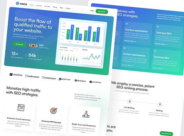
Here’s the cool part: digital brochures aren’t just pretty to look at. They’re interactive powerhouses. You can add videos, animations, and even 360-degree product views. It’s like turning your brochure into a mini-website!
But here’s the real kicker: digital brochures give you superpowers when it comes to tracking. You can see who’s opening your brochure, which pages they’re spending time on, and even where they’re clicking. It’s like having x-ray vision into your customers’ minds!
And let’s not forget about updates. With digital brochures, you can make changes on the fly. No more outdated info sitting on someone’s coffee table. Your brochure can always be fresh and up-to-date.
High-Quality Print Materials
Now, let’s chat about high-quality print materials. Because let’s face it, there’s something special about holding a physical brochure in your hands.
When it comes to print, paper choice is key. It’s not just about how it looks, but how it feels. A good brochure should feel as good as it looks. Think about using paper that’s between 70 lb (105 gsm) and 100 lb (150 gsm) for that perfect balance of quality and cost.
And don’t forget about finishes! Gloss coating can make your images pop, while a soft touch finish gives a luxurious feel. If you’re going for a more natural look, matte lamination might be your best bet.
Remember, your brochure is like a silent salesperson. It needs to make a great first impression. So don’t skimp on the print quality!
QR Codes
Now, here’s where things get really exciting. QR codes are like magic portals that connect your print brochure to your digital world.
Slap a QR code on your brochure, and suddenly, it’s not just a piece of paper anymore. It’s a gateway to your website, your social media, or even a special offer. It’s like giving your brochure superpowers!
Here are some cool ways to use QR codes:
1. Link to your social media pages. Let people follow you with just a scan.
2. Show off your product videos. Because sometimes, a picture isn’t enough.
3. Offer exclusive discounts. Who doesn’t love a good deal?
4. Share your contact info. Make it easy for people to get in touch.
But here’s a pro tip: always include a call-to-action with your QR code. Tell people why they should scan it. Maybe it’s to “Discover More” or “Get Your Exclusive Offer”. Give them a reason to whip out their phone!
By combining the best of both digital and print, you’re creating professional brochures that really pack a punch. You’re not just designing a brochure; you’re creating a marketing powerhouse that works hard for your business.
Remember, the goal is to create high-converting brochures that sell. So don’t be afraid to get creative and think outside the box. Your local design agency might even start asking you for tips!
Conclusion
As we wrap up our journey through the world of brochure design, it’s clear that creating eye-catching and effective marketing materials is both an art and a science. By embracing modern design trends, weaving in compelling storytelling elements, and optimizing for both digital and print formats, you’re well on your way to crafting brochures that truly stand out. These techniques have a significant impact on how your brand communicates with its audience, turning simple folded paper into powerful marketing tools.
Remember, the key to successful brochure design lies in striking a balance between visual appeal and informative content. By applying the strategies we’ve discussed, you’re not just making pretty pamphlets – you’re creating valuable assets that work hard for your business. Get in touch with us today and schedule your complimentary 15-min consult. With these tips in your toolkit, you’re all set to create brochures that don’t just inform, but inspire action and drive results.
## References
[1] – https://designshack.net/articles/trends/brochure-design-ideas-inspiration-ideas/


