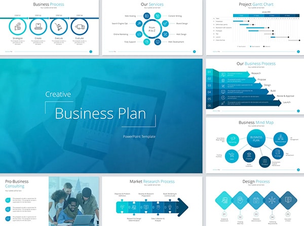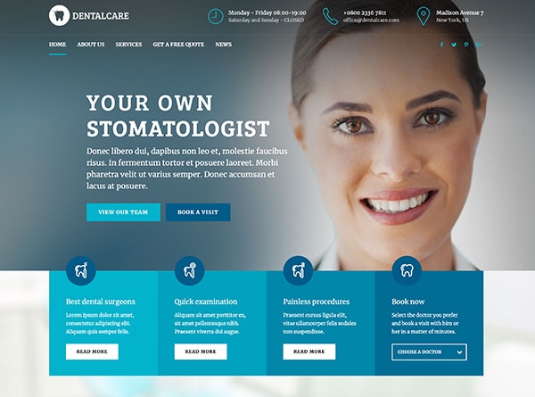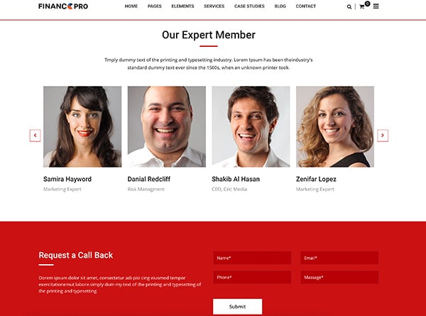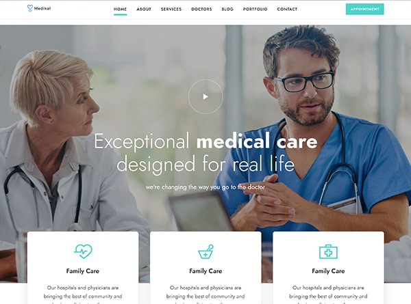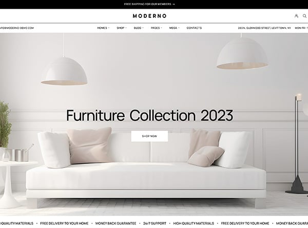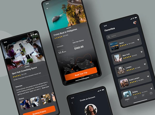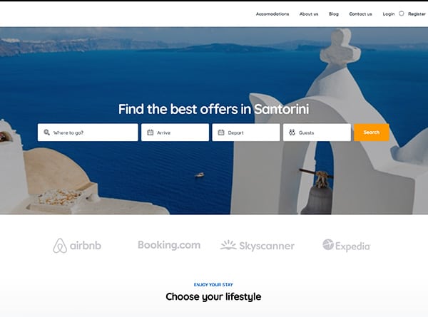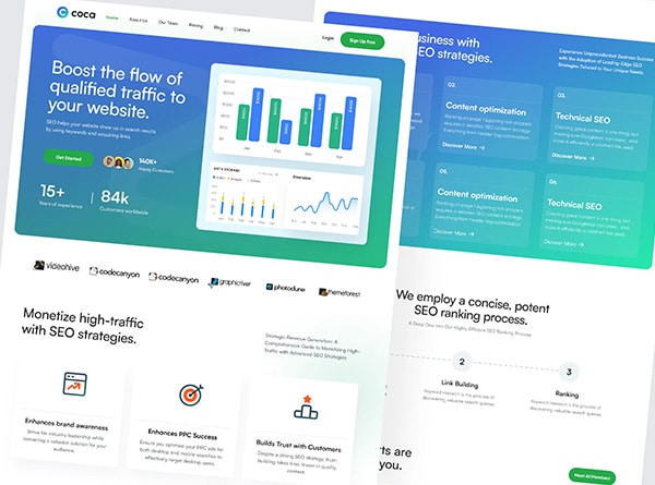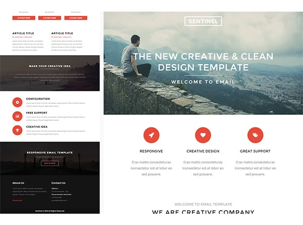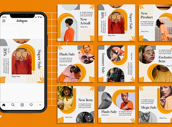
A layout is the placement of content, graphics, and images on a page. No matter if you are working on a print publication, presentation, or website, the layout is one of the most important elements as an effective design will grab a readers attention. If the layout does not showcase the important elements first, you are more likely to confuse the reader.
Before you begin your design, determine what the purpose or primary message you are trying to get across. Ask yourself what you are trying to achieve, whom you are trying to reach, and is your design accomplishing these criteria. Remember to keep the purpose at the forefront of your design.
There should be a hierarchy of information, with most important information being dominant that is positioned accordingly. If your purpose is to get readers to call you, your phone number should be clear. If your purpose is to inform people about a sale, the sale itself (50% off) should be clear. This dominant information is used to draw the user in. If you do not draw the user in you are not able to communicate your message to them.
Your layout should be easy to follow by creating a visual path where readers can easily find information they are looking for. It needs to be attractive, clear, and appropriate. If readers have a hard time following or understanding what they are reading, they are more likely to get frustrated and not even read it. A good diagram to follow is the “Z” pattern. This idea behind the Z pattern is that your eye will naturally follow the path of a Z when viewing information. Your eyes will first focus on the upper left corner and follow the shape of the Z until they end up in the bottom right. Although this does not work for every project, it is a great technique to keep in mind.
Choose the typeface you want to use. Determine if you are going to use the same type for the titles as the body or a different type for body and titles. One thing your Orange County graphic design team cannot stress enough, is to make sure you keep your formatting consistent. All titles should be formatted the same, your sub-titles should be formatted the same, and all of your body should be formatted the same. Your layout can become very cluttered if you have seven different typefaces all for different purposes and there is no consistency. Not only can this look bad, your readers are more likely to not read it because it is hard to understand and follow.
Incorporating whitespace is another important element within your layout. White space is the area between elements in your design. You do not want readers to skip over cluttered areas, so make sure you incorporate plenty of white space where it is necessary. It can be used to highlight a specific element as well as allowing your eye to rest on the page. The amount of whitespace you use should be balanced among the rest of your layout.
All images and graphics should be used, as elements to enhance your messaging, not take away from it. You have to be careful when using graphics and images as they can easily distract your reader away from the important information. Remember that the most important information should be clear and focused on first. The graphics and images should be used as a secondary supplement that compliments your message. Every item that you place into your layout should have a purpose.


