The design of your website has a huge impact on the credibility of your store, making it essential to leave a good first impression in less than a second. This means that how customers perceive you is of utmost importance and will form their reality.
Constructing an ecommerce website requires the development and establishment of an online store to advertise products. This is distinct from simply listing merchandise on a marketplace such as eBay. With your own store, you possess full artistic freedom.
By combining website design with social media marketing, digital campaigns, and search engine optimization (SEO), customers will be provided with an enriched user experience that will boost visitors to your store. Though website design is not the only factor customers consider, it is an important part of providing a pleasant user experience.
9 Tips for Designing an Ecommerce Website
No matter the business, certain elements are necessary when it comes to developing an ecommerce store that will appeal to customers. The following are all needed for an effective ecommerce website design:
1. Creating an interface with the user in mind.
Your ecommerce business should strive to create an atmosphere that not only looks appealing, but also makes customers feel something. You want to give them an experience that binds them to your products emotionally. It should be simple for people to visualize how your product would fit into their lives and make their purchase seem reasonable.
Pretty pictures and vivid colors are certainly agreeable, but concentrating on the customer experience is what makes the greatest difference. Once a person has enjoyed an enjoyable user experience, they are more likely to finish their purchases at a 400% higher conversion rate and return as a repeat customer.
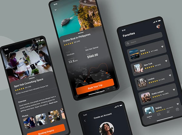
An organic layout and course of action that is standardized and straightforward to utilize for customers of all types should be the focus for design. Make the site’s navigation easier to use and include a clever search function to aid customers in locating the product they are looking for swiftly.
From a customer’s view, navigate your website to understand its usability. Can customers quickly locate items they need? Are the steps they must take to buy an item explicit and simple?
2. Brand identity should be in harmony.
Designing a website that puts your brand first is the key to success. By creating a website that reflects your value proposition, you can make connections with leads, gain customer loyalty, and stand out from the competition.
Your brand is a representation of your online business, a reflection of your company’s culture, and an indication of the quality of your product.
Your brand story can be effectively expressed through a unified combination of visuals, messaging, product images, typefaces, icons, and colors that your customers can relate to.
Maintain a unified aesthetic throughout your design. Variations in page layouts, features, or navigation may be necessary to accommodate new products or information. However, the color palette, logo location, patterns, and fonts should remain the same to create a cohesive story.
3. Be aware of what’s happening in the world.
Two decades ago, ecommerce stores acted as a link between customers and a sales team. Today, ecommerce web designs have been progressing alongside the development of technology. Some of the newest trends include interactive designs, dynamic webpages and product recommendations based on data.
Consequently, customers anticipate a customized digital experience. They desire a smooth navigation that lets them search for products, purchase items, and monitor orders on the web.
Marketing ecommerce stores is increasingly utilizing social commerce as a means of connecting with consumers across a variety of channels.
4. Design for mobile devices.
When customers shop online, it is usual for them to move between gadgets. Establishing an easy-to-follow format across desktop computers, tablets, and cell phones creates an unforgettable experience that encourages customers to come back to your store.
By not having a mobile-friendly website design, you may be alienating customers. Studies have shown that more than half of users will not interact with a brand after a negative experience on a mobile device. Additionally, 67% of people are more likely to shop with a store that has a site that is optimized for mobile devices.
It is beneficial for a store with a large selection of items to have a navigation system that corresponds to the mobile design. For example, a product search that can be filtered and a hierarchical product menu should be incorporated.
Prior to release, check your mobile design to guarantee the screen size modifications and the transfer of the functions are successful.
5. Include consumer feedback.
Include glowing feedback and customer-created material as evidence of your reliability. Potential customers tend to rely on the experiences of other shoppers. If people have had a pleasing purchasing experience, it confirms the value of your business, eliminates any doubts, and encourages new buyers to purchase your item.
6. Make the checkout process easier.
Making the journey to purchase for your customers should be easily seen and uncomplicated. Utilizing a single page process can diminish difficulty and make checkout quicker. Test out colors to help guide customers through the purchase process. Draw attention with red buttons and dynamic fonts that focus the eye on the key information.
Providing customers with a cart view and an unmistakable CTA can help to guide them through the completion of their purchase.
Customers have access to accelerated methods of payment like PayPal, Stripe and Amazon Pay, in addition to Visa, to aid in the conversion process. These additional options lessen the amount of cognitive decision-making required.
When introducing new design components, make sure that they fit with what your clients want and do not obstruct the buying process.
7. Include Assurances of Trustworthiness.
Initially, people who haven’t dealt with your business before can be cautious. They may not be familiar with your offerings and might not be confident in your ability to meet expectations.
Providing trust indications in the website layout is beneficial for startups and small businesses, as it can reduce uncertainties.
It is essential to create confidence in your offering with expertly taken pictures and premium quality visuals. These images should enable potential customers to get a sense of the product prior to making a purchase. When displaying the images, make sure to provide plenty of white space to draw attention to the finer details. Furthermore, think about utilizing lifestyle shots to show how the product can be used.
8. Reaching You.
Make sure to include an email address, phone number, and/or mailing address in case customers have inquiries about their order or need to return something. Provide a straightforward way for consumers to access your customer service department. Incorporate a chat feature to quickly answer questions and set up appointments in real-time.
Provide customers with information about your store’s protocols. Make sure customers are aware of the terms and policies that apply to your store. Having a clear return policy on your website can help to reduce the potential for shoppers to leave their carts before completing their purchase, and also helps to alleviate any worries about ending up with a product they don’t need.
9. Proof of Security & Compliance.
Showcase badges and visuals to evidence technical certifications and industry standards.
The Last Word
Developing an effective ecommerce website design is key in order to elevate your digital brand and raise product awareness. Optimized design can result in greater visibility of products, higher store traffic, and create a more personalized user experience.
You now have the capability to construct an ecommerce website that incorporates essential components of content, commerce, and ease of access without necessitating technical knowledge.


