Design for the Web: Looking at Design as a Creative Process
When you think of design, you probably think of beautiful visuals, intricate layouts, and colourful palettes. However, there’s a lot more to web design than just aesthetics. Design for the web is a creative process that requires an understanding of user experience (UX) and user interface (UI).
In this blog post, we will examine the role of web design in creating effective online experiences. We will look at how designers approach this process and how it can be used to create engaging, functional websites. We will also consider some key considerations when starting out on your own web design projects.
1. Doing a thorough Market Research
As a web designer, it’s important to have a strong understanding of the market you’re designing for. That means doing thorough market research to identify the needs and wants of your target audience.
This can be done through a variety of methods, including surveys, interviews, focus groups, and analytics. Once you have a good understanding of your target market, you can start to design for their specific needs.
2. Brainstorming different ideas from a different point of view
From a designer’s perspective, the brainstorming process is all about coming up with creative ideas that can be used to improve the overall design of a website. However, it’s important to consider different points of view when brainstorming, as this can help to ensure that all sides are considered and that the best possible ideas are generated.
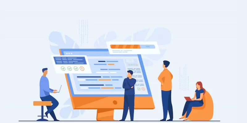
When brainstorming from different points of view, it can be helpful to start by identifying the main users or groups of users for a website. Once these users have been identified, it’s important to consider their needs and wants in relation to the design of the site.
For example, if a site is being designed for older users, it’s important to consider how they will interact with the site and what type of content they will be looking for. Similarly, if a site is being designed for children, it’s important to consider how easy it will be for them to navigate and understand the content.
Once the needs of the main user groups have been considered, it’s then important to think about other stakeholders who may be involved in the design process. This could include the client or business commissioning the project, as well as any third-party providers who may need to be involved in order to make the project a success. It’s important to ensure that all stakeholders are considered during the brainstorming process so that their needs can be considered.
Finally, once all relevant stakeholders have been considered, it’s then time to start generating ideas
3. Designing the concept
When it comes to web design, the creative process is just as important as the end result. To create a truly successful website, you need to start with a strong concept. This means thinking about what you want your website to achieve and how you can make it stand out from the competition.
Once you have a clear concept in mind, you can start to think about the design of your site. This includes everything from the overall layout and navigation to the individual elements on each page. The key is to create a design that is both user-friendly and visually appealing.
Of course, the best way to ensure your concept and design are successful is to test them out on real users. This feedback will help you fine-tune your ideas and make sure they are actually achievable. With a little hard work and some creativity, you can design a website that is sure to impress your visitors.
4. Putting Ideas from words into Visuals
Designing for the web is all about putting your ideas into visuals that can be easily understood by your audience. This can be a challenge, but it’s important to remember that you’re not limited to traditional design methods. In fact, many web designers use a variety of techniques to create their designs, including both digital and analog methods.
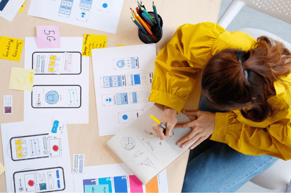
Some designers start by sketching their ideas out by hand. This can be helpful if you’re having trouble visualizing your design or if you want to experiment with different layouts and concepts. Once you have a general idea of what you want your design to look like, you can begin creating digital mock-ups using software like Photoshop or Sketch.
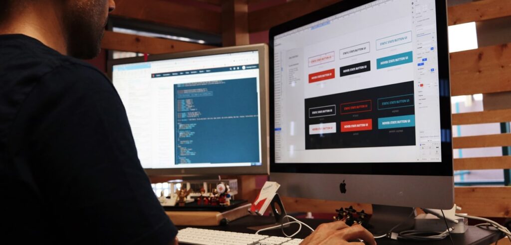
Other designers prefer to jump straight into code, building prototypes of their designs in HTML and CSS. This approach can be especially helpful if trying to achieve a specific interaction or animation effect. And, because you’re working directly in code, it’s easy to make changes and iterate on your design as needed.
No matter which approach you take, the important thing is to experiment and find what works best for you. There is no one right way to design for the web, so don’t be afraid to try new things and explore different possibilities.
5. Using Figma or another tool to create a Visual look and feel of the design
When it comes to creating a visual look and feel for your web design, there are a few different approaches you can take. One option is to use Figma, which is a vector drawing and animation tool that can be used to create high-quality visuals for your website. Another option is to use a tool like Photoshop or Illustrator to create your own custom graphics. Either way, the important thing is to put some thought into the overall look and feel of your site so that it reflects your brand and personality.
Once you’ve decided on the general aesthetic of your site, it’s time to start thinking about individual elements like colours, fonts, and images. These elements should all work together to create a cohesive and visually appealing design.
When choosing colours, keep in mind the psychological effects that different hues can have on users. For example, warmer colours tend to be more energizing while cooler colours can be calming. As you select fonts, consider both readability and style – you want something that looks good and is easy to read. And finally, when selecting images, make sure they are high-quality and fit with the overall tone of your site.
By taking the time to carefully consider the visual look and feel of your web design, you’ll create a site that is not only visually appealing but also reflects your brand identity in a positive way.
6. Discussing the design with the client and taking his feedback
Before starting to design a website, it is essential to have a discussion with the client about what they are looking for. This can be done through a phone call, video call, or in-person meeting. During this discussion, the designer should take note of the client’s goals, target audience, and any other important information. After taking the client’s feedback into consideration, the designer can begin creating a mock-up of the website.
7. Working on the client’s feedback
Assuming you have already completed the design and development phases of your project, it’s now time to collect feedback from the client. This can be done through a variety of methods, such as user testing, surveys, or simply asking the client directly for their thoughts.
Once you have collected this feedback, it’s important to take some time to digest it all and figure out what, if any, changes need to be made to the design. This is where your creative skills will really come into play, as you’ll need to find ways to incorporate the feedback without compromising your original vision for the project.
If possible, it’s always best to get feedback early on in the process so that changes can be made before too much work has been done. However, even if you only receive feedback at the very end, it’s still important to listen to what the client has to say and make whatever changes are necessary. After all, they are the ones who will be using the final product!

