In today’s competitive world, most companies have a website for users to go to. However, not all of them there are quality sites. In order to grab a users attention AND have them return to your site, it is critical that your it be attractive and functional. Our team has put together a list of few common mistakes to avoid when designing a website.
The purpose of your website is not clear
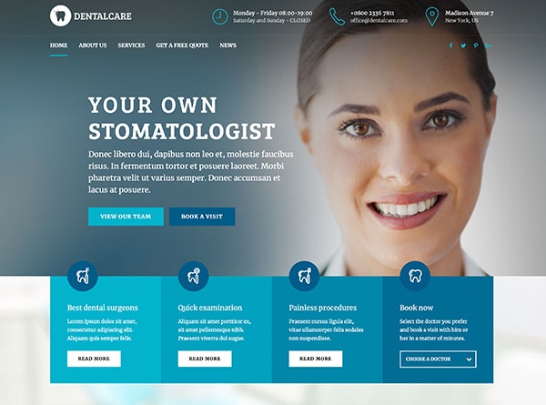
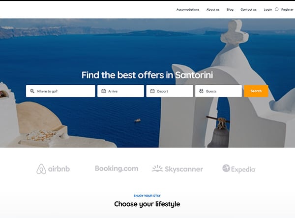
You only have a few seconds to grab a users attention. If they do not know what your website design about in a matter of seconds, they are more likely to leave your site and never return. Right away your site should tell someone the nature of your business. This information needs to be clear and obvious.
Going overboard with images
Overcrowding your site with a lot of images can slow down the speed of your site and drive visitors away. Use images where necessary and as a way to enhance the messaging. Stay away from blinking images, as they tend to make the site look cluttered.
Making your contact information hard to find
One of the top reasons users will visit a website is to find out how to contact the company. If your contact information is not listed or is in a place that is difficult to find, the user is more likely to get frustrated and leave your site. It is best to have your contact information on a several areas of your site so it is easy for users to find it.
Leaving outdated information up
Users visit websites to find information about your company. If you keep outdated information up on your website, users can become confused and annoyed. Make sure to review and update the information on your website on a regular basis.
Having unclear navigation
If users go from one page to another and don’t know how to return to the homepage, they are more likely to exit out and not return. Make sure to have clear navigation that is consistent on every page. If your menu bar is at the top on the home page, it should stay on the top on every other page as well.
Not fixing broken links
If you have broken links on your site this can frustrate and confuse a user. You should check your links on a regular basis to see if there are any problems or if any changes have been made. If you notice that a link is broken, fix it right away.
Avoiding these few common website design mistakes are important, but are often overlooked. All it takes is a couple mistake to make your site fall short of a users expectations and make them never return again. Our Orange County Web Site Design team encourages you to pay close attention to the details while building your next website.


