10 Hints to Make an Awesome Brochure
If you want to take your brochures to the next level, it’s important to know how to create eye-catching designs that sell. If you know enough about design to create a basic brochure layout, you’re off to a great start. Take a look at these additional tips to get inspired by the timeless Orange County graphic design firm Urban Geko.
1. Begin With Clear Goals
The fastest way to create an ineffective brochure is to start without a clear direction. Communicate closely with the client and ask them questions regarding their company, brand and target audience. Make sure to sketch out a detailed outline to draw inspiration from. This outline should be based on what the client wants the final design to look like.
Don’t be afraid to ask for very specific information from the client. After all, you want them to be completely satisfied so it’s okay to get detailed input from them. Once you have established clear, defined goals for the end product, it’s much easier to proceed to the next steps of the design process.
2. Create Great Content
It’s not enough to create a brochure design that looks great. It’s got to have solid content as well. If you’re copying isn’t as captivating as your graphics, your brochure won’t achieve its true potential. If you feel that your copy is lacking, take the time to revise it and make any necessary edits. Consider what your clients are trying to say with their message and make sure that comes through in the copy.
The best way to make a great brochure is to find a way to combine the message of the copy with the style of the brochure. When those two factors work together, the result is an outstanding product.
3. Make Focused Font Choices
Many new designers want to impress their clients with their knowledge of font design. This is a good idea but some people get carried away. It’s not necessary to use the latest font on every project and using ten different fonts is a quick way to create an unorganized look. Instead of going for many different fonts, focus your font choices on two or three solid designs.
Choose a strong, clean font for the body text and eye-catching but elegant fonts for the heading and subheading. Don’t worry too much about dazzling the clients at this stage. They’re far more likely to be impressed by simple, clean fonts that don’t distract too much from the message of the brochure. In fact, many clients will provide you with a font to use. Clients usually have a branded look that they want to maintain so be sure to work within that style.
4. Choose The Right Paper
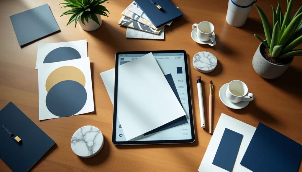
Before you begin working on a design, find out the type of paper stock your clients prefer. There’s nothing more frustrating than to have a brand-new design rejected because the clients use a different paper stock. Take some time in the initial meetings with the client to make a firm decision regarding paper choice. Spending a bit of time on this choice, in the beginning, can save you lots of time and frustration in the long run.
5. Keep It Clear
“The key to any great design is simplicity” adds Orange County graphic design guru, Lisa. Think about the way that brochures are typically viewed: they’re not meant to belong, drawn-out blocks of text. The most effective brochures are straightforward and get right to the point. It’s critical to deliver the message to the reader as quickly as possible.
For this reason, look over any copy that the client has provided and see if it can be reworked to be more efficient and clear. Avoid overused cliches and ineffective descriptions. Focus on making each word contribute to the overall point of the brochure. If a word distracts from the message, strike it out and keep the message on track.
6. Consider Your Audience
Before you begin designing a brochure, think carefully about who is going to read it. Is it going to be used in a digital format on the web? Is it going to be handed out in mass at conventions? Whatever its intended use, make sure to consider how that will affect the final product.
When you think carefully about how a brochure is going to be distributed, you can gain a lot of insight into appropriate color choices, font designs, and overall layout techniques. Design the brochure for the intended audience and you’ll increase your chances of creating a truly effective design.
7. Generate Multiple Ideas
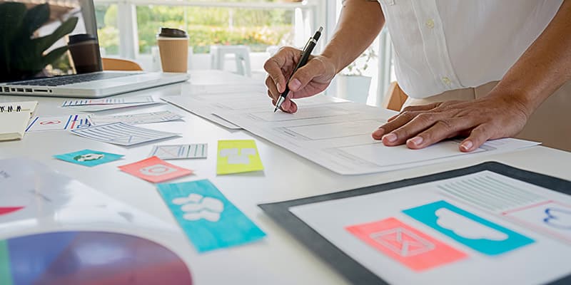
Brainstorming is a critical part of the brochure design process. It’s better to have several designs to choose from instead of reworking one design over and over. Break out your sketch pad and pen and start drafting ideas. If you’ve already explored one angle, try to approach from a different direction for the next idea. You never know when inspiration will strike so be open to new ideas and keep your pen nearby to jot down ideas as they come.
8. Focus On Impact
How is your brochure design going to impact the reader? This should be a primary focus for your design. Make sure to stick to what is going to be the most effective design for the intended message. Don’t try out ideas simply for the sake of novelty. After all, there is a good reason that many brochure designs use the same fonts in multiple formats. This is because when something works, it tends to be reused. There’s nothing wrong with using a tried and true idea if it’s appropriate for the message. The question to ask is: does this design choice make a better impact on the audience?
If so, keep it and move on to the next task.
9. Match Clients To Designs
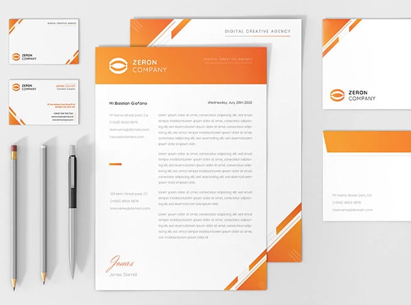
The greatest design in the world can fall flat if it isn’t appropriate for the client. Pay attention to the client’s public image. Are they projecting an image that is in line with your design? If not, it’s time to change some things around. If your client is a tech company, don’t go for a gaudy, flashy look that would be more appropriate elsewhere. On the other hand, if your client projects an energetic image, don’t deliver a muted, understated design. Make sure that your design fits with the image that the company presents. Chances are that your clients have spent a lot of time and money on creating a brand image. Your design choices should reflect the image of the client.
10. Use Quality Images
If there’s one area of brochure design that should never be approached half-heartedly, it’s images. The images that you use in your design should be the soul of your project. Of course, it’s not always feasible to hire a professional photographer for an exclusive photoshoot. Sometimes the budget only allows for stock images. When this happens, spend the time to seek out images that don’t have a generic, stock feel to them. Your images should convey a sense of energy and purpose. If you put extra time and effort into finding the perfect image, your project will stand out and your clients will thank you for it.
