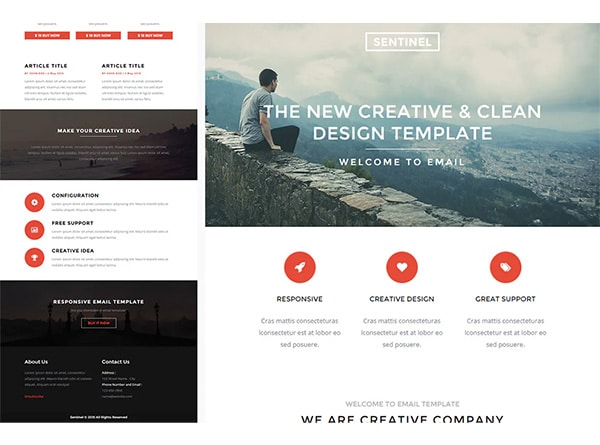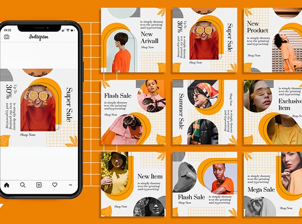
It’s all about planning for the future when it comes to web design. The digital space may be a
showcase for new developments in animation, interaction, and total immersion every year
because of its relationship with technology. And, as we’ll see in the web design trends that
follow, 2022 has a lot to offer.
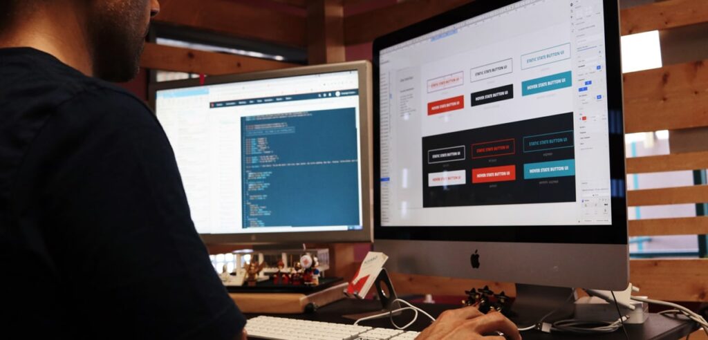
Web design is also moving forward with cutting-edge techniques like complex interactivity and
animations, as well as visual effects such as glass morphism. Designers are using no-code
technologies to make it all happen more quickly and simply than ever before.
● Interactive Text
Interactive text on websites can be a game-changer. Some designers have come up with
ingenious ways to have it move and interact with the user’s mouse. Making text
interactive is as simple as using a hover-state change, which is analogous to a button. It
also helps that using new no-code platforms, it’s now easier to build more intricate
effects than it was to try to implement these interactions by hand. It’s crucial to keep
legibility in mind when incorporating interactivity into fonts, as some people are easily
distracted by moving characters.
Several websites allow users to customize the formats and make the interactive design
more than just scrolling up and down.
For Example, Daesk is a parallax scrolling web page with bright colors and beautiful
blended backdrop graphics. The mouse-activated Call to Action button and the floating
reviews capture your attention as you navigate.
● Dark Mode
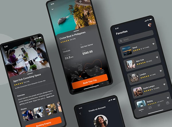
Web designs in dark mode serve various purposes. On the practical side, they help to
reduce eye strain, which is a growing worry as we spend more time staring at screens.
The dark mode gives your website a sleek, contemporary appearance while also
allowing you to showcase other design elements by darkening the objects surrounding it.
This trend deviates from the previous few years’ usual white and bright designs.
According to a recent study, 81.9% of people use dark mode on their phones. Dark
mode settings were added to several mobile and desktop operating systems, allowing
users to adapt their screens for viewing in low-light situations. The trend is spreading to
website designs, particularly for web-based products such as streaming services, which
are most likely to be viewed in low-light settings. For example, Youtube, Netflix use a
black background since a white and bright interface in a dark room would be blinding.
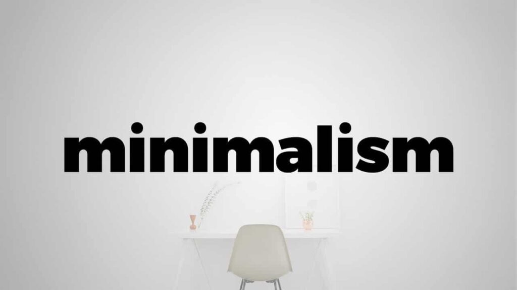
● Minimalism
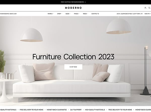
Minimalism (Also known as flat design) is a prominent web design style that is both
timeless and modern.
The minimalist design aesthetic is a combination of aesthetics and functionality. Every
design element, such as photos and typography, has a purpose. The idea is to eliminate
any unnecessary design flourishes until only the essentials remain.
Nonetheless, it’s been connected with a lot of white space in the past. People will likely
be experimenting with colorful minimalism in 2022, according to our predictions. To be
minimalist, you don’t have to go entirely white.
Shopify is a perfect example of a site that executes colorful minimalism successfully. To
produce an attention-grabbing and easy-on-the-eyes layout, their website uses a vibrant
backdrop color with clean typography and minimum design components on each page.
They demonstrate that minimalism does not have to be cold or boring.
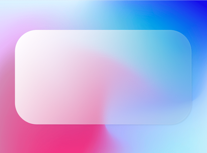
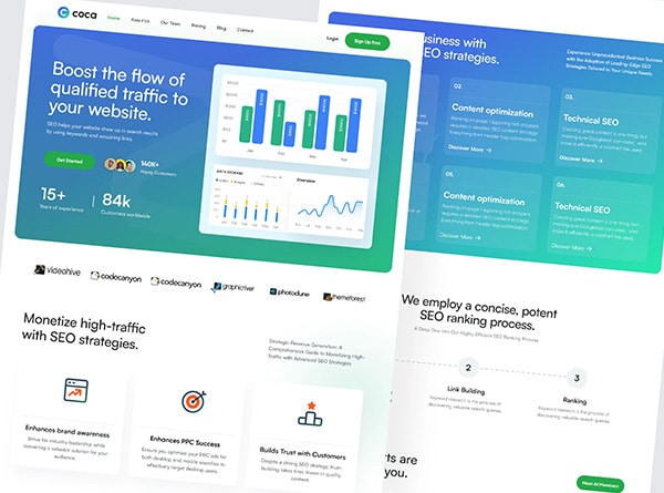
● Glass Morphism
Due to recent advancements in web technology, the frosted glass effect may now be
easily applied to websites. The foggy appearance of components behind the frosted
glass overlay adds color to an area while allowing text or objects to appear over the
image while being readable.
The effect has become a popular weapon in a designer’s arsenal, and it’s increasingly
being employed as a background instead of gradients.
Transparency, blur, and movement can be used to make elements of pages appear to be
made of glass. This method can be used in logos, images, or even entire sections.
The optical illusion is created through diffusion, reflection, and shadow, which are the
fundamental elements of this style. It allows you to emphasize what you want to highlight
and blur other elements by keeping them vague. The glass effect, when combined with
modest movement, can give a website a 3D feel. The “frosted glass” within the image
diffuses the image, allowing you to include transparency into your design without it
becoming too cluttered.
Some of the world’s most well-known companies use glass morphism, like Apple,
Microsoft, and Dripple.
Conclusion
Today’s online world is large and crowded with websites. You must first stand out from the crowd
to be successful. As a result, professional site design is no longer a luxury but a necessity.
Keeping it simple is the most critical of our web design advice. The site design trends for 2022
mark a stride ahead, but that’s nothing new on the internet. In today’s world, the future moves
swiftly, and digital designers frequently pave the way. But it’s the emphasis on happiness that
makes these trends feel new.

