- Remove clutter, keep the design clean:
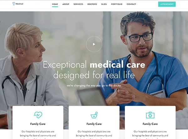
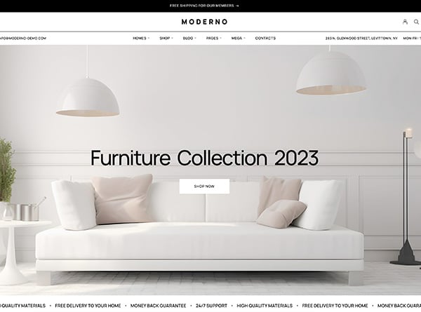
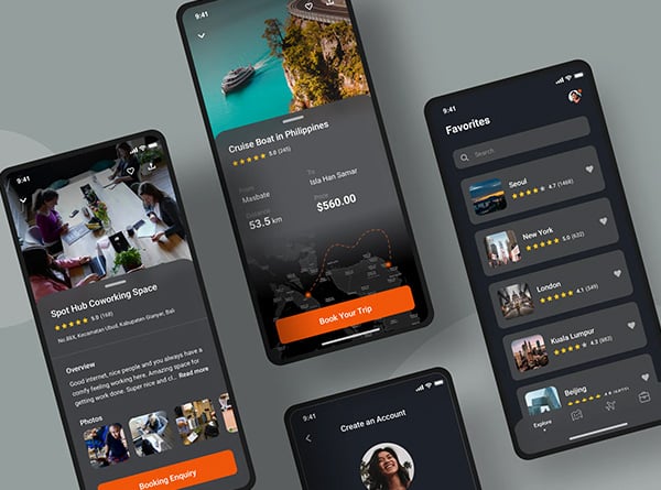
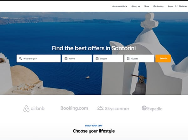
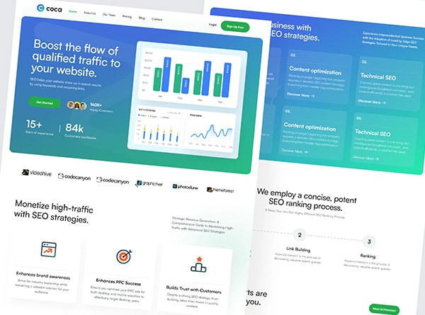
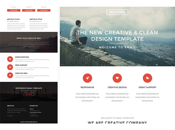
When we say good, clean design we mean something that is elegantly structured and give viewers an option to choose and select from. This kind of design offers lots of white spaces, so that you can immerse your services and products in such a way that they look as a part of the narrative.
In 2020, minimal web design has become the rage among the designers and business owners and most significant reason behind this demand is the fight to grab the user’s attention.
A populated design can mar user’s attention within 50 milliseconds of its exposure. It means that a design only has few fraction of second with it to make or break the user’s perception.
This is what the survey suggests:
This is why it is so crucial to make those seconds count in your favor and give users the things you want them to concentrate upon.
Do’s:Remove unnecessary clutter from the website. Keep the information clear but to bear minimal. String together all the important piece of content but string them together using minimal visualization and words.
Don’t: Don’t bombard your page with visuals and words that disrupt the flow and synchrony of the page. Don’t be tempted to put in as many keywords as possible to gain SEO love from Google. This will result in over stretching the content of the page which in turn will disrupt the flow of the message you are trying to put across.
- Guide your viewers with systematic structure
When someone is at your door step it’s imperative to welcome them in and show them around. This is what you practically need to do with your website. Have a structure in place. Make sure that the first thing client see on your website is the thing you want him to see.
Don’t annoy him with unwanted pop ups or exaggerated stories of how and what you are doing. People aren’t interested in stories when they are on your website. They come with an intent to look at your product or service. So give them what they want right away.
On your pop-ups make sure you ask relevant questions. For example: if a person is about to exist within few seconds of him landing on the page, you can questions like:
- Did you not find what you are looking for?
- Is there anything we can help you with today?
These kind of structured questions with guided intentions can help you turn bounces into paid conversions.
Do’s: Have a goal in mind and trace your customer journey based on it. Make sure you employ proper fonts and colors so that they experience a top notch user experience while browsing your site. Inform them about the benefits if you’re running any promotional offer or scheme.
Don’t: Don’t force anything on your users. For example: Don’t greet them with a pop-up which they have to sign in before they move in to your website. Don’t stuff things on them. Give them the freedom to choose and select.
- Use videos
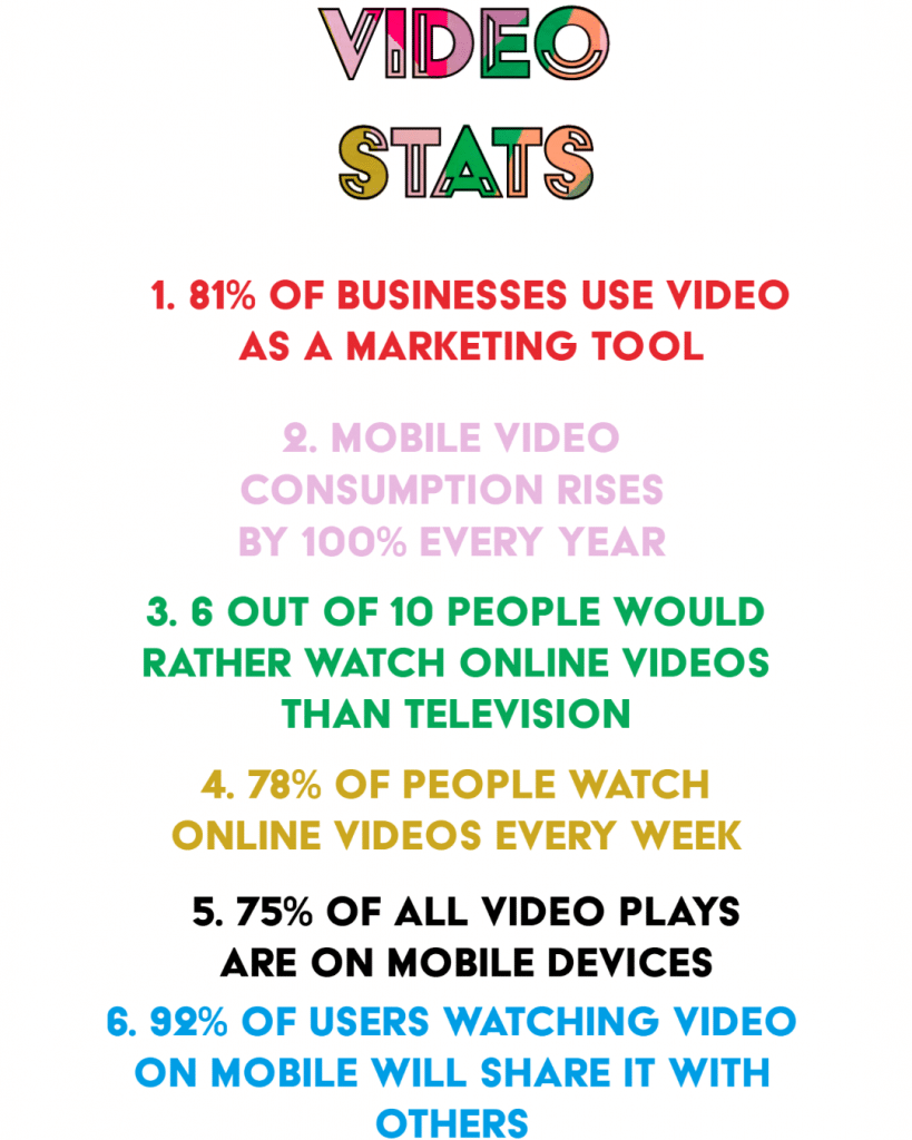
So it’s evident that the data consumption of the users have changed drastically over the years. So it make sense that you embrace this trend in your designing strategy as soon as possible.
Do’s: Make sure that your business has a definitive narrative and serves some purpose. It shares information that is of good value and serves the brand well. Even if you are not shooting with high equipment’s make sure that the quality of your video is top-notch.
Don’t: Don’t just make a promotional video which is only talking about how great your service or product is. Self-bragging videos are fading away and are one of the most efficient way of turning people off from your website. So refrain from such kind of stuff.
- Use Subscription boxes
Email marketing campaigns are effective but only if they are systematic. People like to listen from websites they have subscribed to. So make sure that you have a visible subscription box placed on your website, which your visitors can subscribe to.
Please understand that Subscription is different from fill up forms. Both serve different purposes so make sure that integrate both of them properly on your website.
Do’s: Make sure you inform your visitors what purpose that Subscription box will be serving. Tell them what customers will be receiving and in what quantities. When designing strategy around it make sure that you have only one focus and that focus is your customer. So plan and execute everything keep them in mind
Don’t: Make sure you only keep that button if you intend to use it properly. It will serve you no benefit if after one email you don’t anything new for months. Also, make sure that emails you send have some purpose and benefit for your users. Just random emails about random stuff aren’t going to impress anyone or gain clientele.
- Site Loading time
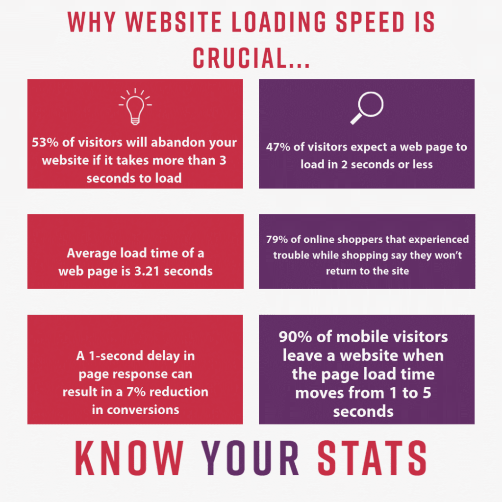
Irrespective you have great visuals on your site or site offers valuable information if it is not loading fast enough, it won’t get any Google love. Not only Google but other search engines are also very particular about site speed.
Here are the stats that reveal why Search engines pay so much of attention to the loading time.


