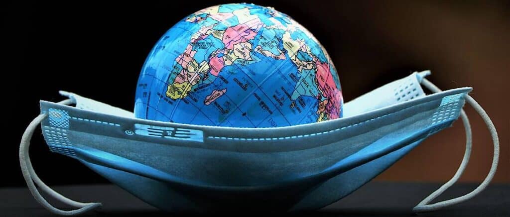
These aren’t normal times. The whole world is struggling with the effect of the COVID-19 pandemic, especially businesses across the globe.
With a halt on people’s movement, companies have no option but to take their businesses online to survive.Now the question is, how do you continue to win your audience’s trust? By building a website that showcases your potential.
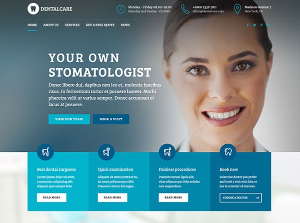
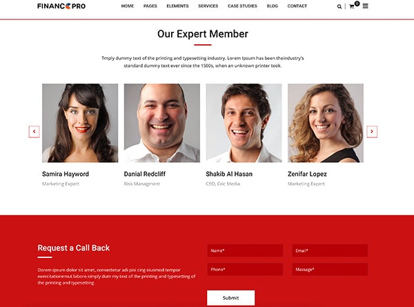
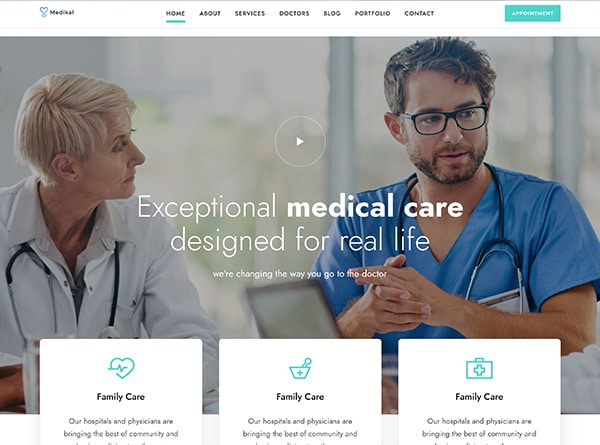
There are a plethora of trends to keep up with when it comes to web designing. In this article, we have outlined the trends that will dominate web designing in 2020.
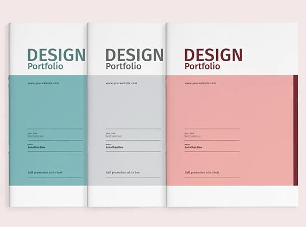
Minimalist Web Designing
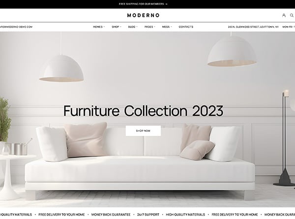
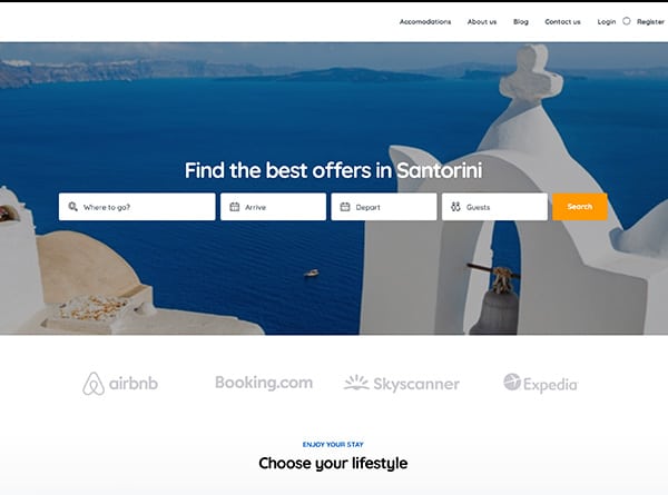
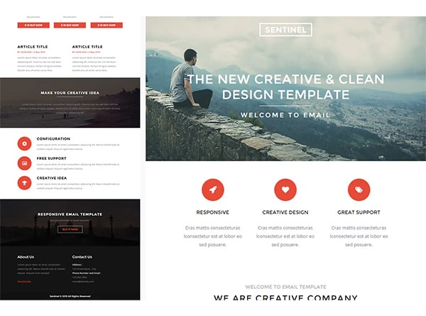
Minimalist web design is often misunderstood as something that is less creative and takes lesser efforts to build. This notion could not be any further from the truth. This idea works on the principle of taking away anything that is not necessary.
It is a popular approach to modern web designing and a go-to aesthetic for many designers. You can experiment with minimalism with different colors, transitions, layouts, and broken compositions.
With decreasing attention span of users, designers have been pushed towards making navigation simpler through the website.But remember, minimalism is as much about functionality as it is about aesthetics.
Dark Mode
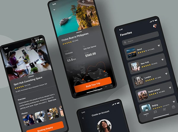
All of us know how beautifully light-colored elements go with a dark background. Successful app companies like YouTube and Instagram introduced this design and swept the online world off its feet.
Why did this design become so popular?
It’s simple. On top of providing a sleek and elegant look, it cuts the battery consumption of the device as well. The use of light pixels results in the overall brightness of the screen, causing less strain on the eyes of the user.
3D Elements
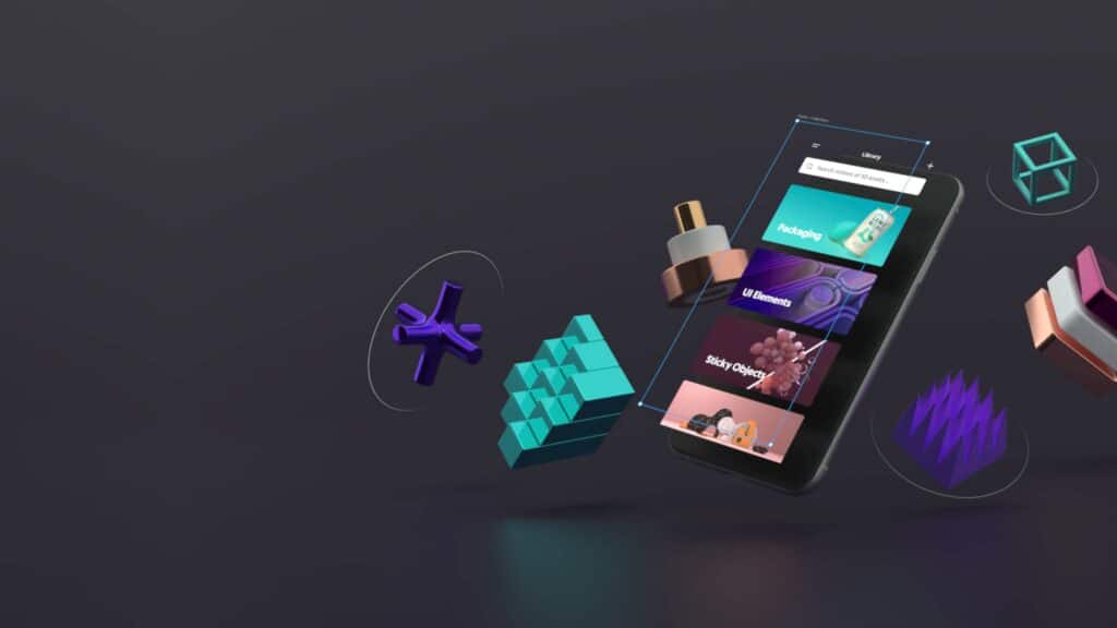
One thing to remember is that 3D elements take much time to load. Hence you should not over-do while adding them to your web design. It might take a toll on all your SEO efforts.
Broken Grid Layouts
Most websites are grid-based. It is so apparent to say that it has conditioned people to overlook important information. When they see a grid, they think that the content on the website will be more or less similar. And, this is when some companies decided to use a broken grid to hold the viewer.
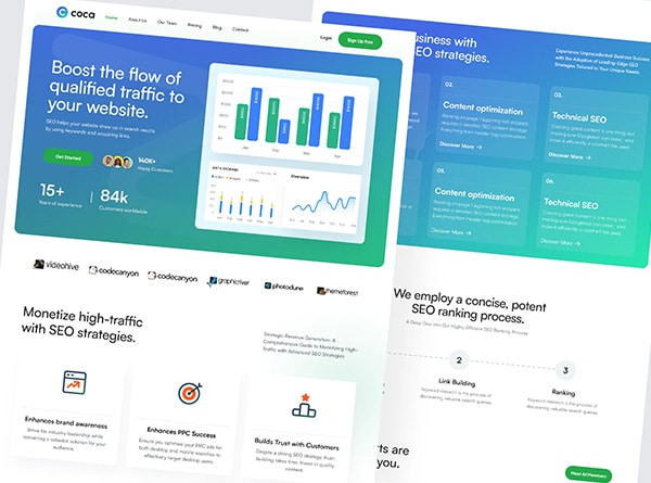
It is essential to realize that the asymmetrical layout doesn’t work by just putting things randomly on the screen.To create an asymmetrical hierarchy, you must bring all elements together. You can do this by using uncommon positioning patterns, layers of textures and colors, repeating irregular patterns, white space, and typography over visuals.
Custom Elements and Graphics
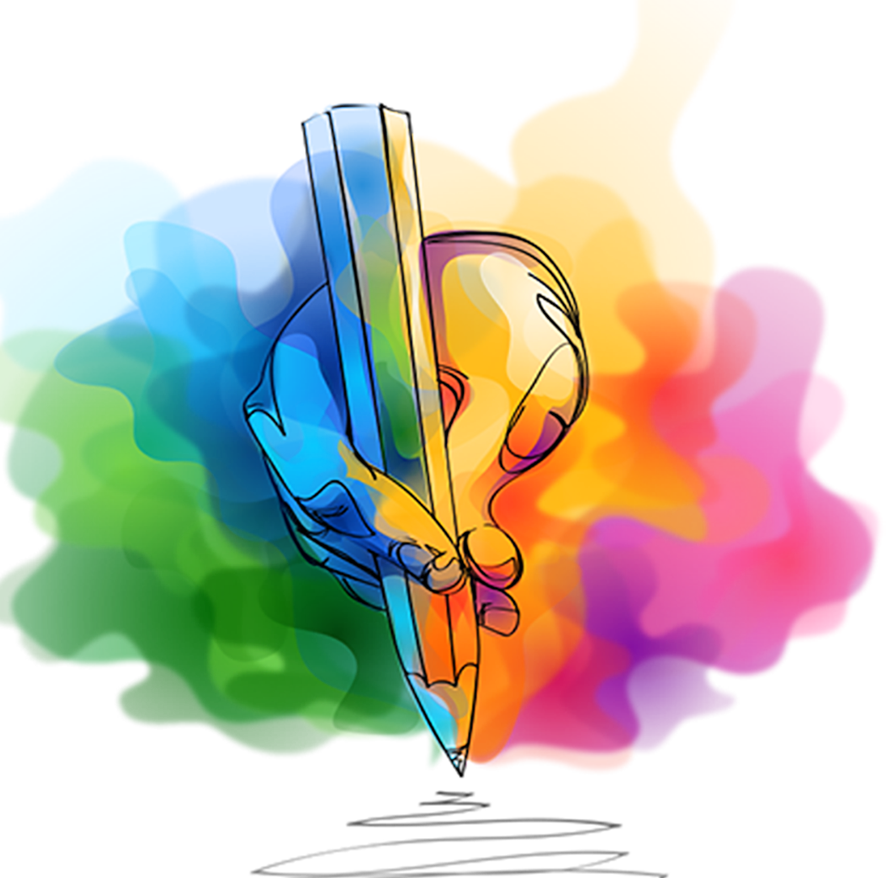
However, designers should remember one thing- do not build illustrations that are too abstract in the name of creative liberty.
The audience must interpret what you’re trying to say; then, only your illustrations will be of some business value and not just a work of art.
Are you planning for a website revamp post COVID?
Get in touch with us if you are looking for a web designing company that will help you dominate the competition. We have thrived as a leading web designing company in California. We have completed a range of online marketing projects, web hosting, and web designing in California from San Francisco to San Diego. Contact us for a web design proposal today!
