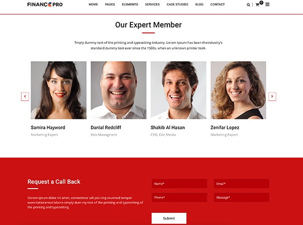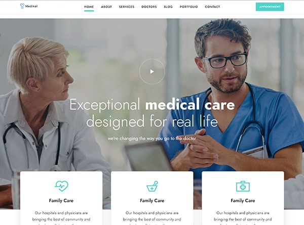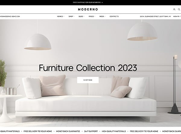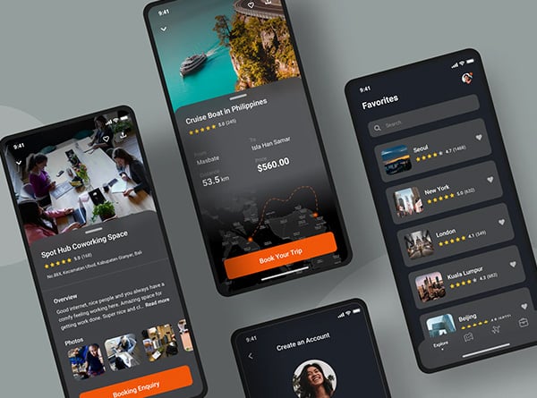
Insights from a WordPress Web Design Expert in OC
As a WordPress web design expert in OC, I’ve seen my fair share of websites that miss the mark. It’s not just about pretty pictures and fancy fonts – your website has an impact on your bottom line. When potential customers land on your site, they’re looking for a smooth user experience that guides them right to what they need. But all too often, businesses make mistakes that send those visitors running for the hills.
In this article, I’m going to spill the beans on five common web design blunders that could be costing you customers. We’ll dive into why mobile responsiveness matters, how to nail your site navigation, the need for speed when it comes to loading times, the power of clear calls-to-action, and why SEO-friendly website design is a must. By the end, you’ll have the inside scoop on how to level up your web presence and keep those customers coming back for more.
Neglecting Mobile Responsiveness
As a website designer Orange County professional, I can’t stress enough how crucial mobile responsiveness is today. It’s not just a fancy feature; it’s a necessity that can make or break your online presence.
Mobile responsiveness importance
Let’s face it: we’re living in a mobile-first world. With more than half of all website traffic coming from mobile devices, having a responsive website isn’t just nice to have – it’s essential [[1]]. A responsive design ensures that your site looks great and functions smoothly on any device, from smartphones to tablets to desktops.
But why does this matter so much? Well, it’s simple. When a visitor lands on your site using their phone, they expect a seamless experience. If they have to pinch, zoom, or struggle to navigate, they’re likely to bounce faster than you can say “mobile-unfriendly.” This not only frustrates potential customers but also sends a signal to search engines that your site isn’t up to snuff.
Mobile user statistics
The numbers don’t lie, folks. Let’s break it down:
– A whopping 58.43% of website traffic comes from mobile devices [[2]].
– 92.3% of internet users access the web through their mobile phones [[2]].
– There are approximately 4.32 billion active mobile internet users worldwide [[2]].
These stats paint a clear picture: if your website isn’t mobile-responsive, you’re potentially missing out on a massive chunk of your audience.
How to implement responsive design
So, how do we fix this? Implementing responsive design doesn’t have to be a headache. Here are some quick tips:
1. Use fluid grids that adjust to screen sizes.
2. Make images flexible so they resize automatically.
3. Employ CSS media queries to detect device screen size and adjust layouts accordingly.
For WordPress users, the good news is that many themes now come with responsive design built-in. But if you’re working with an older theme or a custom design, it’s worth investing in making it mobile-friendly with our responsive web design services.
Remember, a responsive website isn’t just about looking good on mobile – it’s about providing a consistent and enjoyable user experience across all devices. This approach can lead to higher engagement rates, better SEO rankings, and ultimately, more conversions for your business.
Poor Website Navigation
As a WordPress web design expert in OC, I’ve seen my fair share of websites with navigation nightmares. Let me tell you, poor website navigation is like a maze without an exit – it’s frustrating and can cost you customers faster than you can say “404 error.”
Clear menu structure
First things first, let’s talk about menu structure. Your website’s menu is like the signage in a shopping mall – it’s there to guide visitors to their destination. Without clear direction, your visitors will get lost and bounce faster than a rubber ball. To keep things tidy, I always recommend limiting the main menu to a maximum of seven items [[1]]. Why seven? Well, our short-term memory can only juggle about that many things at once. Plus, with fewer options, the remaining items become more relevant and easier to scan.
Intuitive user flow
Now, let’s dive into user flow. Think of it as the path your visitors take through your site. A well-designed user flow feels natural and doesn’t make people think too hard. It’s all about creating an experience where users don’t get lost or frustrated [[2]]. To achieve this, I focus on designing flows that cater to different needs and preferences. For example, I might offer multiple ways to complete tasks, like providing alternate paths or shortcuts.
Search functionality
Last but definitely not least, let’s talk about search functionality. Did you know that more than 40% of visitors say a search bar is more important than anything else on a website [[3]](? That’s right – a simple search box can make or break your site’s usability. It’s like having a personal guide for your visitors, helping them find exactly what they’re looking for without clicking through endless pages.
When designing WordPress websites, I always make sure the search bar is front and center, usually near the main navigation. Hiding it or placing it inconveniently is like telling potential customers, “Hey, I don’t want your money!” And trust me, that’s not a message any business wants to send.
Remember, good navigation isn’t just about looking pretty – it’s about creating a smooth, intuitive experience that keeps visitors engaged and coming back for more. By focusing on clear menu structure, intuitive user flow, and robust search functionality, you’ll be well on your way to creating a WordPress website that not only looks great but also converts visitors into happy customers.
Slow Loading Speed
I can’t stress enough how crucial loading speed is for your website’s success. It’s not just about user experience; it has a direct impact on your bottom line. Let’s dive into why speed matters and how you can rev up your site’s performance.
Impact on user experience
Picture this: you’ve crafted a beautiful WordPress website, but it takes ages to load. Guess what? Your visitors won’t stick around to admire it. Studies show that users expect websites to load within 2-3 seconds [[1]]. Anything longer, and they’re out the door faster than you can say “bounce rate.”
But it’s not just about impatience. A slow website screams inefficiency and frustration, pushing potential customers away before they even see what you’re offering. On the flip side, a speedy site builds trust and keeps users engaged. In fact, users who experienced load times of 3 seconds or less visited 60% more pages [[2]] —that’s a lot more opportunities to convert visitors into customers! With our expert user experience design in Orange County, we ensure your website not only loads quickly but also provides a seamless, engaging experience that keeps your audience coming back.
Factors affecting load time
So, what’s slowing down your WordPress site? There are several culprits:
1. Heavy content: Large images, videos, and uncompressed files can bog down your site.
2. Code clutter: Messy HTML, excessive CSS, and unused JavaScript add unnecessary seconds to your load time.
3. Server sluggishness: Cheap hosting or overloaded servers can cause major slowdowns.
4. Plugin overload: Too many plugins, or poorly optimized ones, can significantly impact your site’s speed.
Optimization techniques
Don’t worry, though. There are plenty of ways to speed up your WordPress site:L
1. Optimize images: Compress those hefty images without sacrificing quality.
2. Minify code: Strip out unnecessary characters from your HTML, CSS, and JavaScript.
3. Use caching: Implement browser caching to store static files, reducing load times for repeat visitors.
4. Choose a solid host: Invest in quality hosting that can handle your traffic and provide fast server response times.
Remember, even a 0.1-second improvement in load time can lead to significant increases in conversion rates [[3]]. So, as a WordPress web design expert in OC, I always prioritize speed optimization. It’s not just about creating a pretty site; it’s about crafting a responsive website that delivers results and keeps your visitors coming back for more.
Lack of Clear Call-to-Actions
I’ve seen my fair share of websites that miss the mark when it comes to call-to-actions (CTAs). Let’s face it, without a clear CTA, your visitors are like lost sheep – they might wander around your site, but they won’t know where to go next. And that’s a surefire way to lose potential customers.
CTA placement
Where you put your CTAs can make or break your conversion rates. I’ve found that placing CTAs above the fold (the part of the page visible without scrolling) can be a game-changer. In fact, 57% of visitors spend more time on content above the fold [[1]]. But don’t stop there – strategically placing CTAs at the end of blog posts or on the right side of the page can boost conversions by up to 47% [[2]].
Effective CTA copy
Now, let’s talk about the words you use in your CTAs. Your button text needs to pack a punch and clearly tell visitors what to do next. Forget wishy-washy phrases – go for strong, action-oriented language that gets people clicking. For example, when one company changed their CTA text, they saw a whopping 192% boost in conversions [[3]]. That’s the power of good copy!
A/B testing CTAs
Here’s where the magic happens. A/B testing is your secret weapon for creating CTAs that convert. By testing different versions of your CTAs – whether it’s the color, copy, or placement – you can figure out what resonates best with your audience. And the results can be mind-blowing. Some businesses have seen conversion rates skyrocket by up to 86% just by tweaking their CTAs [[4]].
Remember, when it comes to CTAs, there’s no one-size-fits-all solution. What works for one WordPress website might not work for another. That’s why testing and optimizing is crucial. Keep experimenting, analyzing the results, and refining your approach. With the right CTAs in place, you’ll be well on your way to turning those website visitors into happy customers.
Ignoring SEO Best Practices
I’ve seen many businesses overlook the importance of SEO-friendly website design. It’s a mistake that can cost you big time in terms of visibility and potential customers. Let’s dive into why SEO matters and how you can avoid this common pitfall.
On-page SEO elements
On-page SEO is all about fine-tuning various website components to help search engines crawl, understand, and rank your pages for relevant queries. It’s the foundation for maximizing your search visibility. Some key on-page elements include:
– Title tags: These snippets of code tell both visitors and search engines what they can find on your pages. Make sure to include your focus keyword in each page’s title.
– Meta descriptions: While not a direct ranking factor, well-crafted meta descriptions can boost your click-through rates from search results.
– Header tags: Use H1, H2, H3, etc., to organize your content and help search engines distinguish the most important parts.
Content optimization
Creating high-quality, relevant content is crucial for both users and search engines. Here are some tips to optimize your content:
– Focus on E-E-A-T: Demonstrate experience, expertise, authoritativeness, and trustworthiness in your content.
– Use keywords strategically: Incorporate relevant keywords naturally throughout your content, including in headers and body text.
– Keep it fresh: Regularly update your content with new information and insights to maintain relevance.
Technical SEO considerations
Technical SEO involves optimizing your website’s backend to improve its crawlability and indexability. Some key aspects include:
– Site speed: A slow-loading site frustrates users and hurts your search rankings. Optimize images, enable compression, and leverage browser caching to improve load times.
– Mobile responsiveness: With mobile searches surpassing desktop, having a responsive design is crucial for SEO success.
– URL structure: Use SEO-friendly URLs that include relevant keywords and accurately describe the page content.
By paying attention to these SEO best practices, you’ll be well on your way to creating a WordPress website that not only looks great but also ranks well in search results. Remember, SEO is an ongoing process, so keep learning and adapting your strategies as search algorithms evolve. Contact our local SEO Orange County team to find out more.
Conclusion
To wrap up, the key to a successful WordPress website lies in avoiding common design pitfalls that can drive customers away. By focusing on mobile responsiveness, intuitive navigation, speedy loading times, clear calls-to-action, and SEO best practices, you can create a website that not only looks great but also delivers results. These elements have a significant impact on user experience and can make the difference between a visitor bouncing or becoming a loyal customer.
Remember, your website is often the first point of contact between your business and potential customers. By implementing these design principles, you’re setting the stage for a positive first impression and increased conversions. Get in touch with our web development agency Orange County team today to schedule your complimentary 15-minute consult and discover how our local web design services can help you avoid common mistakes and create a WordPress website that truly works for your business.
## References
[1] – https://www.webfx.com/web-design/learn/why-responsive-design-important/
[2] – https://www.seattlenewmedia.com/blog/why-responsive-design-is-important
[3] – https://www.linkedin.com/pulse/importance-mobile-responsive-design-digital-marketing-digidzn
[4] – https://www.dotcominfoway.com/blog/importance-of-responsive-web-design/


