Let’s be honest the concept or aim behind every web design is to create stunning world class material that can improve or add to the conversion of the business. No brand pays to have an attractive looking web design that cannot lure the customer’s in. Therefore it is imperative to get correct ideas at the foundation level itself.
No doubt your web design have to be powerful enough to leave an impact on the perspective client, it should be clear and precise but it will serve your brand no good if it is not covering the fundamental element of its existence which is sales.
This is what Jeremy Smith has to say on this:
“Every aspect of marketing is entirely useless unless it produces conversions.” – Jeremy Smith on Marketing Land | Want to win fights with your web designer? Use these CRO tactics.
Keeping this in mind, in our Orange county website designblog we will look upon and cover 5 proven concepts in web designing that have helped businesses see more conversions and sales.
Let’s go straight in:
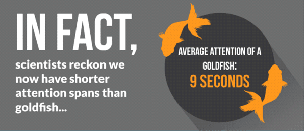
- The fight is for consumer’s attention, so grab it right away:This following graphic will explain magnificently what we are trying to say here.
To put in a different perspective that as a website company you are trying to sell your products or services to goldfish, which is difficult but certainly not impossible.
So the concept here is simple, try and grab the attention of your user within 8 seconds. Yes, your design has to be laid out in a way that it gives information to the customers within seconds of its loading on any browser.
Your design should not only be clean and clear but also should load super-fast.
There is an interesting quote on this by Tommy Walker, which goes like this:
“A good first impression isn’t just about design, but also how fast that design loads.”
You have to understand and get this fact right that when you are fighting for attention speed is crucial.
You anyways have a very small window with you to work with so you need to make sure that you have all the resources available to make an impression in those split seconds of time.
A part from speed here are few other Web designing elements you can add to your web design to grab the attention of your users right away:
- Use power keywords in your content to connect with the customers immediately
- You can play with hover effects on buttons that also adds to style
- Don’t over populate your page with unnecessary pop-ups use only what is required
- If possible try and add videos explaining more about the products, services or overall company’s vision
- Add colors to your design pact your web page with powerful multiple colors:
Colors have a language of their own, they are still the number one factor in creating an ever lasting impression on the customers who visit your website.
A good color combination adds a lot of grace to your design and gives it a distinctive look which further helps in sales and conversion.
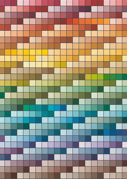
Here is an interesting color chart image that you can go through to see what different variations and verities you can use to enhance your web design.
Many of the web design experts themselves don’t know the significance of color in selling. For example: A website that is dealing in real estate will do much better conversion if it using vibrant and bright colors.
The idea is simple, you are selling someone their dreams so it is obvious that they will only like buy from you if you can show them that in a colorful and vibrant form.
Most big brands including Amazon and health care specialists have been successfully using this color psychology to sell more to their customers and attract more sign ups on their website.
So make sure that next time when you are sitting with your designing firm you are aware and conscious about the color combination you want to settle with for your brand design.
- Seo is not dead, it is very much alive and kicking:
How many times we hear this? Believe it or not but I have been hearing about this since 2012, and here are few latest facts around Seo and what it is still capable of:
- 61% of marketers believe that Seo is the key to their ventures online success
- 78% of locations searches results in an offline conversion
- 88% of customer will call or visit a store within 24 hours of making search from mobile device
- 82% people who implement and use Seo effectively finds it extremely helpful
- Number position on Google still enjoys 34.36% CTR
- 70% of clicks in Google search results gets organic attraction which is double than that of Google Ad words
You still need facts and figures to believe in this? I am sure by now you are convinced about this simple fact that web optimization is powerful and much needed for your web design success. Most designers can add elements of this in their design from the very beginning.
Most companies think that Seo starts when the design work on the website is finish and this is where most of them get it wrong. It is not separate from design rather it’s an integral part of it.
Factors like placing right schemas, using right tag structure and most importantly optimizing images can add a lot of flair to your design, which can result in you getting the best position on Google which eventually help you sell well.
Another area where a good design can contribute heavily in page optimization is with its mobile responsiveness. Y
Yes, it is an established fact that only web designs with great mobile flexibility performs well on search engines but what most people don’t understand is that 70% of On page is sorted if the design is well adaptive and responsive.
So never take this element lightly and make sure that this process of optimization is well included in the designing process itself.
- You are interacting with real people, so use pictures of real people only:
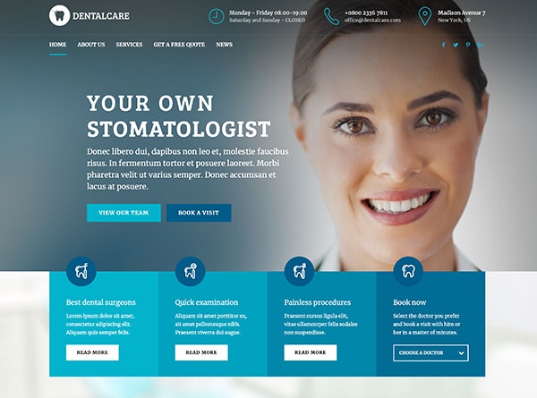
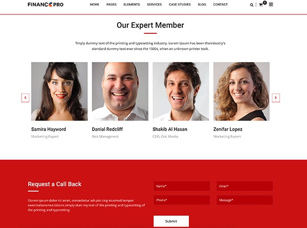
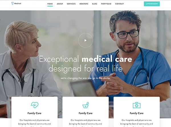
This adds so much of authenticity on your web page when you show your customers who they are dealing with.
This is such a good practice to show real pictures of real people and locations to deal with the customers. It adds so much of ownership and trust that most people believe that they are not browsing but interacting directly with the person they are seeing on screen.
In fact there is a market study around this as well, which found that 80% customers are more likely make a purchase from a business that provides them with a personalized touch.
Images of you and your team can help your brand achieve this.
I don’t think that you need any other reason to believe and invest in this fact. In fact to show your business images or your people you don’t have to be a large enterprise. Your venture can be of any scale or size, all you have to do is be real about who you are and from where you are operating.
Some small scale industries are doing this brilliantly they are showing real images of their business and services and are engaging with their customers regularly to build a much needed trust that is crucial to bring about any kind of conversion or sales.
- Include whatever creative element you want but keep it simple:
This perhaps is single most effective and important tip this is why we kept it at the end.
No matter what you do, you need to keep things simple. Now don’t confuse simple with boring, rather see it like this.
Whenever you are working on your web design keep this question buzzing how you can further simplify this process for your customers. How can you make elements on your design more interactive and simple?
What can you do so that customers who are browsing your website can retrieve the required information with utmost simplicity? All these question are going to help you add more to your design which will further improve its usage which in turn will bring more conversions.
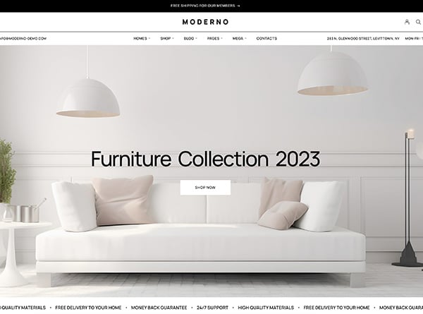
You need to add all the elements that are necessary to grab the user’s attention but you need to do it with a lot of cleanliness and simplicity.
Remember the first point we discussed about the attention span this point in a way is an extension to that. You need to win the attention of your customer and that can only be done if your website doesn’t appear to him a colorful maze.
Once you start getting good attraction on your website so add heat maps to further track the journey of your customers to see, what is the most common followed path on your website? Is there any patterns you can detect in their movement on your website? See how you can reduce the numbers of clicks for them to reach to the desired information.
All these little things add a big impact on user’s interaction. This goes without saying that a person who spends more time on your website is more likely to purchase from your website.
Conclusion:
Web designing is a crucial process, it involves so much planning and scanning from the start that you cannot take this lightly. You need to make sure that you work only with designers who are on the top of their games and understand what it takes to deliver you a winning design.
From our perspective a winning design is a combination of various different elements of which conversion is the prime one.
No one is going to rave about a design that looks colorful and attractive but take minutes to load, thereby losing out on potential sale. So you need to understand the power of your design and make sure that it serves you the purpose for which it is built.
