Running a consulting business is not as easy as it sounds. This business thrives on public image, creating trust among people and forming a strong bond with the customers. When you are selling high value service it is imperative that you present it with great enthusiasm and in a way that infuses great confidence in them. This is where a great Business consulting website comes in the picture. After all a good website must:
Attracts the right kinds of visitors. Guides them to the main services or product you offer. Collect Contact details for future ongoing relate ― Mohamed Saad |
Everything from the theme you choose to the kind of visuals you show leaves an impact on people who are browsing your website. Therefore it is key to keep these elements polished and updated so that even before people come in touch with you they have a certain confidence in your work.
So in this blog, I will be mentioning 5 key elements that every consulting website must have so that it can create just the right kind of impact that is needed to strive and thrive in this industry.
- Visuals with lots of human images:
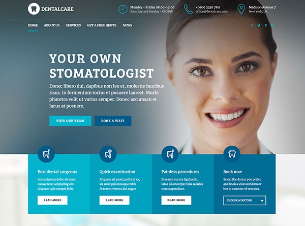
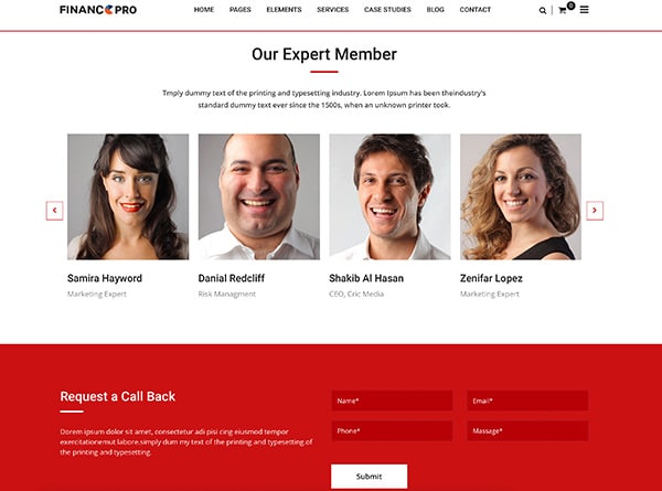
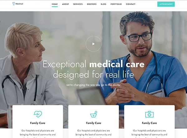
Consulting business means a lot of human interaction. This is why it is crucial that your website reflects exactly what your business stands for. If possible, try and add real images of people on it. Add as many authentic testimonials of the people who are satisfied with your services as possible.
People love to listen from people who have gone through and successfully conquered the hindrances that you are going through. Also real human faces on the website add more value to it, it gives much real feel to it and that is what your business is based upon. The more a person is able to relate with your website the more he will be able to connect with your services.
Here is what intechnic.com has to say on this:
| “We are so drawn to human faces, they present a fantastic opportunity for design. Faces help a designer create emotional and visual impact and influence user behavior. Expressions and line of sight can direct a users’ eyes, create a feeling of shared desire and emotion, or efficiently boil down crowded text” |
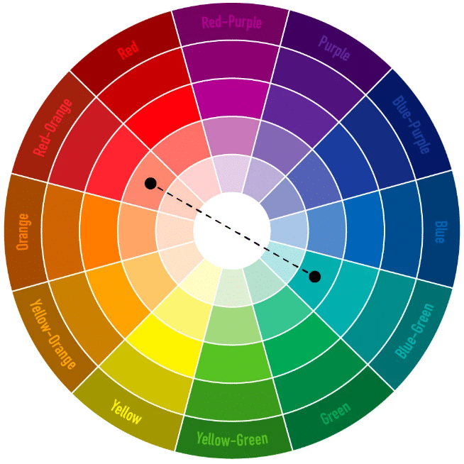
- Using right fonts and color themes:
Most people under value this and believe that a font on a website doesn’t matter. Well, if you are one of them, think again. Not only fonts are imperative but they also helps in generating trust among your audience, yes that is true.
Here is a scientific backing around this, according to the study conducted by Psychologist Kevin Larson:
“Readers felt bad while reading the poorly designed layout. Sometimes, this feeling would be expressed physically with a frown”.
On the other hand:
“Participants who read content from the good reading layout, felt like it took less time to read and felt better”.
So results are in front of you and when it comes to consulting website you cannot take this thing casually because you are in business that works only on trust.
Just a good to know information: People prefer fonts like Baskerville or Helvetica over Times New Roman or something similar. So you can work around that as per your likings.
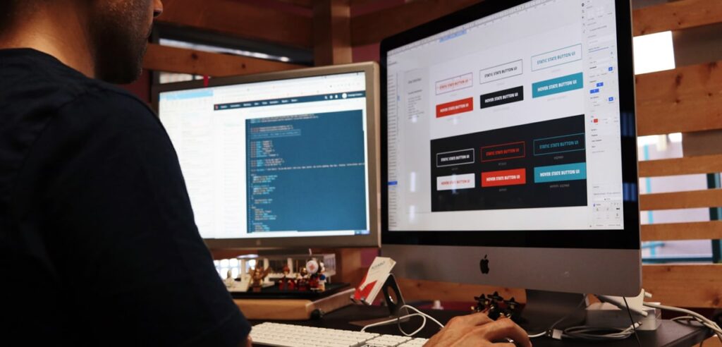
- Right time and space for your call to action buttons:
Always keep in mind that you create a good website to impress and not to irritate the customers who is browsing it. Too many irrelevant ‘call to action’ button is like forcing someone to buy your service even if they are not half convinced about it. That is a terrible way to throw someone out of sync.
On the other hand a systematic placement of ‘Call to action’ button allows customer to sign in as per his wish or willingness, which far more beneficial.
Your website must clearly mention everything about the service you are offering, the process through which those services will be carried out and most significantly what will be the desired outcome of those services. You need to educate your customer about everything in detail so that they are sure what they are singing in for.
The most hazardous way of doing up a web design is: Put a good header and place a pop-up for sign up on it. Boom you lose your impression and a potential perspective. Safeguard your design from such a disaster.
- Add a blog and consistently maintain it:

Some people add blog on their websites to stuff keywords in. Others just add it for Seo purposes. In reality, blogs are the backbone of any website and if you are in business of consulting then they are your life line.
Content is king and is present everywhere and to you as a consultant it gives a wonderful opportunity to express your knowledge with people who are browsing the web. It helps you add value and with time gain loyal readership of people who believe in your skills.
For those who believe that blogging is an art of past, here are some staggering stats:
If you need any further that blogs still work and will work, you can read any good blog around this same topic.
- Keep you About us page complete and up to date:
After your service and home page the third most relevant page on your website is you’re about us page. In fact most people at times even before viewing your services will have a look at your ‘About Us’ page.
Those who are reading about you are seriously considering to hire you and that is when strong element you must never ignore. This is why, you must add in as to what you story is and what value you can add to your customer’s experience.
You need to be precise and honest with your story. Your about us is your non-verbal communication with your client so keep it real. Make sure that it doesn’t have a ‘sales pitch’ hidden within it as it will kill all the rapport.
Have you real, confident image on that page so that people who are viewing it can picture you in their mind. One tip we strongly recommend to all out customers is to write their own ‘About us’ section. This is your story, your content, your space so it will have a mighty impact if it has your words in it. So don’t share this space with anyone else.
To conclude, your business is this niche depends only and only on trust and website is your gate or first stop where an impression will be made. So make sure that you have the best and the most authentic picture of your work presented in front your customer.
