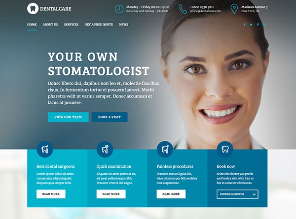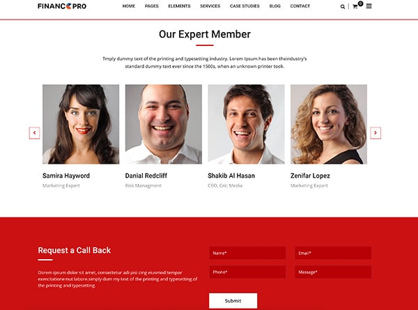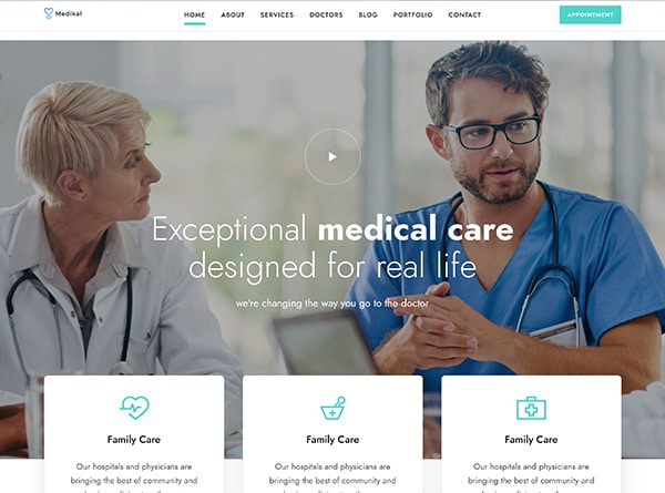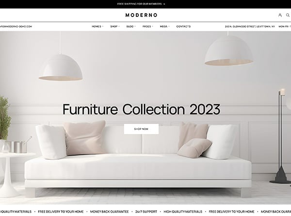
Give them the most relevant information on their first glance
When users enter your website don’t make them feel as if they have entered the maze. They have come in looking for important information so make sure they get that information on the first look. This is what their mind should say when they are on your website.
“Yes, this is what I was looking for.”
Not:
“Oh dear, what is going on here?
For example, you are Orange county web designer, a user who will be visiting your website will be looking for 2 most relevant things:
- a) Your portfolio
- b) Your contact information
So make sure that your UI/UX design put out that information that is clear and effective so that the user is not puzzled with tons of information and doesn’t have to navigate through contents to reach what he wants to read.
This is how Google likes it this is how you should do it.
Create useful and simple navigation to keep things simple and tidy:
Now this one should not be a surprise rather this is something that is being spoken for years now, still, most of the websites and apps don’t get this right. When a user is browsing your app or website the last thing they want is to read a manual to set things up.
This usually happens when you put up too many things that are doing more or less the same work. Most website owners are strangely passionate about their website with irrelevant details, why? We are not sure. However, too much information is always a piece of bad information as it makes users work hard on your website for the relevant information.
Also, please put a halt to those irritating pop-ups. They use to be fun in 2014 but not anymore. Not only they are irritating but they put off the visitors completely. A person who is interested in your content will anyways contact you. Putting these unnecessary pop-ups at every step will turn them away from your App or website and will only make them more determined to never return.
Power up your Search bar:
Your search bar should have great power. When the user is on your website and is looking for information that he cannot locate on your home page, his next got to option should be your search bar.
For E-commerce Apps and websites this is the lifeline. This is where prospects are converted into live paying loyal customers. If your search bar is not working accurately be assured that your visitor will not bother navigating your site further.
So search bar working at its best is a MUST, however, we recommend you to take it a notch further. Make it intuitive and as predictive as possible, just like what Google does. When the customer is posting his/her inquiry put out the possible options based on your database that will help him better reach the decision.
These predictive searches are like holding the hands of your customers and taking them to the place where they want to be. A good predictive and efficient search bar will positively add to the customer browsing experience but will also help you gain a better understanding of visitor’s behavior on your website.
Never settle for what you have settled:
This is a creative niche, people are always looking for something and exciting, so as a website owner or an App owner you must comply with your user’s demand. Keep refreshing their moods with layout changes based on their feedback to enrich their journey on your app or website.
I know a lot of effort and time goes into designing a great layout but that layout does not matter how good it is after a while starts looking stale, so make sure that you are on top of it all the time. Also, continuous improvement always suggests and reflects that you are growing and adding on. There is no end to improvement.
You can always maximize the customer experience on your app or website by simply reviewing the data from your analytics every month.
For example: If one page of your App or website isn’t performing well you can do some work on it to see what is in it that is turning customers away or using heat maps you can see the points from where customers are exiting from your portal. Make a note of those points and see what you can add or change to make them stay on your website.
See you cannot keep everyone happy but at least you can make sure that you try and take in as much information directly or indirectly that is coming from your visitors and implement on your portal to keep it growing and buzzing.
Always keep in mind that in the end, it is the user’s experience that matters the most.


