Designing a website can be a daunting experience and not for the faint of heart. Therefore, you need to ask yourself one simple question before you start: ‘What type of design will give my users a more pleasant experience?’ Your wonderful, unique product will go unnoticed if your site is too hard to read or navigate. A lot of flashiness, or pages that are too graphically intent and hard to load will be a turn off to consumers and will take attention from the main reason you created the website — your product. The need to keep your customers interested is much more important than state-of-the-art graphics and visual aspects. With this in mind, web developers and marketing agents should keep up with the latest design trends that are out there.
1. Video Storytelling
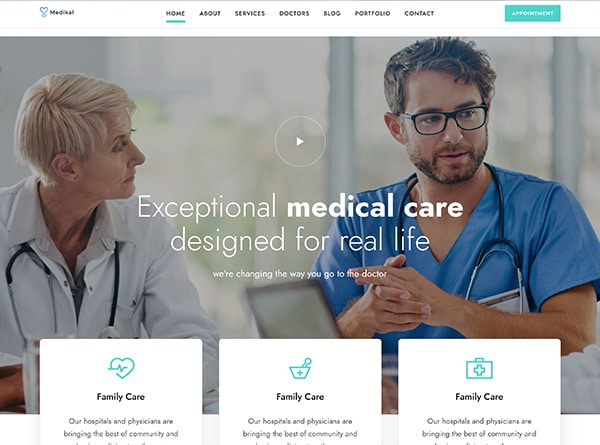
Have you ever heard the statement, ‘show not tell’? Most people want to see your story instead of reading it. Although video has been used in web design for many years, it is becoming more prominent than in days past. This is because of the storytelling aspect that a video has. When someone visits your website, you have a short amount of time, merely seconds, to grab their attention. The use of video is a great way to tell your story quickly and engagingly, and elicit an individual’s emotions. Statistics show that more than 60% of individuals are visual learners – they want to see, not read, the story.
2. Less Text, More Visuals
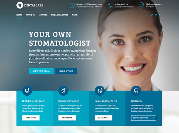
In the early days of SEO, landing pages were overflowing with text, which, at the time, was to make the search algorithms happy. These days, Google favors the user experience more than in the past, so large blocks of text are no longer required to rank highly in the search engines. Most people will only skim through about 20% of the text in front of them. Adding design elements and visuals in place of extra text will keep visitors moving through the page instead of losing their interest by implementing large blocks of text. A great example of this trend is the Nike website. They use large, bold images as the main focus of the pages, accompanied by small portions of text that are purposeful and not overwhelming to the eye.
3. Google Fonts
Google fonts are free and easy to download. By adding these fonts to your site, you can show the uniqueness of your brand in over 135 different languages. Using unique fonts will help showcase your brand’s personality as well as improve things like load time, site performance, and even the number of visitors.
4. Mobile-Friendly Design
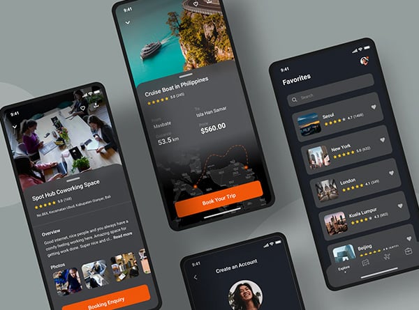
When creating your website, making it mobile-friendly should be high on your list of priorities. It is a well-known fact that mobile technology is helping to change the way we do business. What’s more, consumers in today’s markets actually prefer to use mobile applications for much of their business. Creating mobile responsive pages will create for a hassle free digital experience for consumers, thus boosting your success.
5. Buy Buttons
Now that the patent of Amazon’s one-click-buy has expired, there will be much more opportunities for e-commerce companies to add more seamless shopping for consumers. As time goes on, the “buy” button will be of the utmost importance in allowing for an easier and simpler sale
6. Accelerated Mobile Pages (AMP)
Whether you’re a local business or a book publisher, your website should always include AMP. These pages are the first ones that mobile users see when they search, and are therefore crucial in driving more traffic to your website and getting your brand noticed.
7.Minimal but Impactful Design
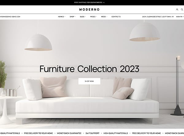
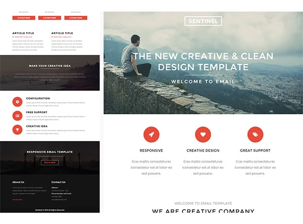
Creating your site with extreme visual aspects can be overwhelming and is not the best way to market or advertise your brand. Clean design has been wonderfully useful for many years and will continue far into the future. Keeping it simple and clean is a very useful tool for your website and much more appealing to your potential customers. The best way to achieve this is to create a balance between beautiful design and useful content. Both the Apple and Mail Chimp Mail Chimp websites are created with valuable white space, eye-catching colors, and simple, easy-to-read fonts.
8. Chat Bots and Live Chat
Many companies have added live chat sidebars, or chat bots, for their users that may have questions they would like a quick answer for. The bottom right side of the screen is normally where these exist. Once the chat is clicked on, it opens up for consumers to see who they are speaking to and creates a history of past chats.
9. Interactive Experiences
Nowadays, people know what they want and have high expectations. It’s important to exceed expectations as soon as someone visits your site. Now that HTML5 has finally knocked out Flash, providing interactive experiences for users is easier than it once was. HTML5 has enough power to make 3-D games work in the browser and play videos without having to download a file to make it run. You might even consider creating a mobile game that your users can engage with. By offering a pleasant interactive experience to your customers, you can connect with them in a meaningful way.
Window Wonderland, for example, exemplifies beautiful interactive features that put users right in the heart of New York City’s holiday window displays. The website features a unique 360 degree parallax effect that allows users to “walk” through 18 different stores by scrolling down the page.
10. Web Content Accessibility
In the past, websites have often ignored users with disabilities, hearing impairments, or visual impairments. Finally, this is changing rapidly and most sites are more user friendly than they once were. Be sure to read the WCAG (Web Content Accessibility Guidelines), and ensure that your site complies with them. Make this one of the top priorities in the development stage. Several of these updates, such as alt text, can also help with your SEO efforts.


